by Beth Herman

DCMud: What is the genesis of the 623 M Street building, your eighth building in 20 years in Shaw, which we understand didn't start as a housing project at all.
 Reatig: The existing building with eight apartments was in terrible shape, next to a church. The occupants were elderly, and they could walk to the church, though the building had a lot of exterior steps which made it hard for them. The client, with whom I'd worked on another project, asked me to design a ramp. It really didn't make sense because there were also stairs inside the building these people would have to negotiate on their way to the ramp. I was able to convince the client that something more drastic was needed: a new building.
DCMud: But how did that work in terms of displacing an elderly group of residents - even temporarily?
 Reatig: I was doing another building for the client on 7th Street and told him we would have some of the units accommodate these people for a while. Then we could bring them back. Interestingly, some of them loved the other building so much, they let us know they were going to stay.
DCMud: Did this alter the M Street design in any way?
Reatig: When we realized the elderly residents were not coming back, we added a mezzanine (with staircases) to three top floor units, making them larger and fancier. These could be rented at market rate and there were nine units in all.
DCMud: What about the site itself, which we understand was a real challenge?
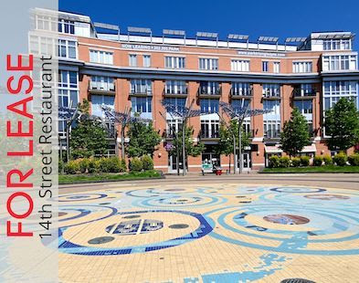
Reatig: We were dealing with only a 4,700 s.f. site, including building and parking, and all the zoning regulations. But we achieved the design, in three stories, with an elevator though it was no longer critical in terms of the residents' needs. The exterior is concrete and has brightly-colored panels.

Reatig: We could have built it like you build houses, but it's an urban design, so for noise and fire safety purposes we do it the way highrises are built.
DCMud: Some may say there's an absence of sustainable elements in the M Street building, but you have other ideas about that.
Reatig: To build sustainably, you want to build something that will stand a long time and that people will want to use. It's not about LEED points but rather if it's built well, it will endure and people will continue to be comfortable living there.
DCMud: Tell us about the interiors, with your signature focus on light and ventilation.
 Reatig: The lower six units are one bedroom, 800 s.f. The top floor (three units) are 900 s.f. with the mezzanines, and a roof deck. Some apartments have three exposures so they are more like a house. Glass is low-E with a mix of fixed and operable windows. The units have cross-ventilation. There are exposed polished concrete floors.When they were marketed, they rented immediately. I've said before that whenever we design housing, we do something we would want to live in.
Reatig: Actually it's very different than the surrounding buildings, which are very old and a brown brick - very monotone. We have a building that is cheerful and makes people smile. You can always see the light inside and lots of color.
DCMud: In what ways does your considerable stint as a carpenter in the '70s affect your work today?
Reatig: It gives me something important in terms of understanding materials as we don't always consider how things are built. I also have a great appreciation for these people who do the work. I always tell the contractor that as architects, we do a small portion of the work. They are the ones who build and are much more important than us, though the teamwork is also very important.
 DCMud: Speaking of a city that thrives on teamwork, is there a particular D.C. site that appeals to you?
Reatig: There are a lot of buildings I love in D.C. like the Corcoran and I.M. Pei's National Gallery. I love buildings like the Freer that have courtyards. The Portrait Gallery enclosed theirs in glass, but I loved it when it was open and you could sit there with fountains and trees. It was lovely - a real oasis.
Photos courtesy of Alan Karchmer.


26 comments:
No!! Please no more Suzane Reatig garbage in our neighborhood--I beg of you! The awful color splotches that litter the outside of her buildings have absolutely no place in our neighborhood. Her buildings are gaudy, tacky, and ugly. With such beautiful architecture in Shaw, Reatig is a plague that I hope will soon be torn down.
nah they're good.
I agree, her stuff is trash. She thinks she is avant-garde, but its just ugly. Its even worse on the inside.
This looks like a bad mashup of mondrian and Tel Aviv Bauhaus.
Looks cheap and ugly.
While walking past this the other day we realized it was a condo building and not part of the equally gaudy church buildings surrounding it.
This building actually makes the surrounding housing projects and parking lots look dignified. Unfortunately this is located on the border of historic mt vernon and was required to get approval. I'd rather see a vacant lot then this garbage in Shaw.
"What I've realized over the past couple years, relative to housing design, is that people will never abandon the traditional American home"
I think it is a beautiful house and very pleasent to live in. It looks like an art. I wish they will be more modern houses in the neighborhood.
what is the traditional american home?
Finally good Architecture in Washington DC.
Gotta love the renderings of M st rather than an actual photo. The building definitely doesn't look as crisp and neat after it's been subjected to the elements for year or two. I give it another 2 years before the colored panels fall off.
I was so disappointed when this building went up. Ugly design that doesn't incorporate well with the neighborhood. Also, the original building in the lot had lots of potential and was discarded. I love modern architecture but let's not kid ourselves - this is a cheap and heinous looking building that was put up with little community involvement.
i love the IDEA of Reatig's designs. Contemporary architecture can complement historic properties. However, Reatig's buildings are always poorly executed and utilize cheap materials. And the warts keep spreading...
Love it! It looks so happy and sun-filled.
the ugliest cheapest looks, so much of the same. PLEASE STOP with your arhitectual torture!!!
Cheap cubes does not an architectural style make. They're just cheap cubes.
Suzanne, please leave our neighborhood and never, ever come back. Your projects are eyesores and the neighbors hate them. The Crayola building on M is a monstrosity.
Wow, people are really mean. I think its a nice project and DC could use a few more talented architects like her.
I was just thinking the same thing. I don't know why people have to be so nasty and uninformed to boot. It's great to have an opinion but much better to present it with some dignity.
It's bad, bad, bad. These designs will not stand the test of time. The colors are very mod. Dated. Hello? This is not the 1960's. I can't believe people are applauded her misguided attempts to brighten these neighborhoods. They are eyesores.
As someone who has worked with Suzane Reatig Architecture these are facts: her buildings are not cheap, her multi-family residential structures are built out of masonry and steel, the way expensive commercial building are constructed which make them sustainable, completely sound-proof for the residents, fire-proof and durable for the long run. The finishes she uses (which you probably don't see often because they are expensive for most developers) are top-quality and durable. We should revere architects who put so much emphasis on quality structure and materials. If they are not your taste, that is your opinion to hold, but please hold off on such vile and mean spirited comments.
it would be interesting to have a follow-up interview. i'd like to see you ask questions about how she got involved with UHOP and how their exclusive relationship has helped to further her vision of how to change the neighborhood.
Here design is absolutely disgusting. It has ruined the blocks where it is now and and I have to close my eyes and divert the eyes of any visitors when we have to drive by her "work." PLEASE NO MORE Reatig in DC, especially in NW DC.
I would like for you to ask neighbors and nearby residents what they think of the horrible, tacky, cheap looking buildings popping up with her design. They look so cheap, so temporary, so pop-up. They will never hold any resale value. Aweful.
These aren't cheap shots, they are legitimate criticisms of a building that gives the neighborhood the middle finger, and now that finger is pointed right back at the building's architect.
" I don't know why people have to be so nasty and uninformed to boot."
Oh, I am informed. I am informed every day I walk by the terribly tacky Fisher Price-esque building pictured here and am reminded of hwo truly awful it is.
I am not a fan of her architecture, and I think her buildings have contributed negatively to Shaw's development. Exactly much more informed would you like me to be?
Please do not let Reatig develop any more properties in Shaw. Her pink cinderblock palaces in the vicinity of the Shaw metro are particularly awful. It would be a travesty if her design is selected for 7th and Rhode Island. Please Suzane, we beg you, leave Shaw alone.
Post a Comment
Commercial ads will be deleted, so don't even think about it.