Tuesday, October 18, 2011

NoMa's 'Three Constitution Square' Underway

3 comments
Add another project to the list for the NoMa BID: breaking ground yesterday morning was
Stonebridge Carras, Noma development, Constitution Square, US Department of Justice, Doug Firstenberg
StonebridgeCarras' 345,000-s.f. office building "Three Constitution Square" with 13,000 s.f. of ground floor retail. Like the developer's previous Constitution Square ventures, the building is being built completely on spec, neither office or retail space has been leased, confirms Doug Firstenberg, a founding principal of Stonebridge. The 12-story building, designed by HOK, will be complete by summer of 2013 with delivery to tenants possible the following fall, said Firstenberg, adding a simple endorsement: "It'll be a great building." Three Constitution Square at 175 N St, NE, is part of Phase II in the overall Constitution Square development, bounded by N Street to the north, M Street to the south, First Street to the west, and the red-line metro track to the east. 
Stonebridge Carras, Noma development, Constitution Square, US Department of Justice, Doug Firstenberg


Three Constitution Square will be adjacent to the Department of Justice and the New York Avenue metro stop, and across the street from the ATF.  Completed in the first phase of Constitution Square: two office buildings with ground floor retail occupied by GSA and DOJ, a Hilton Garden Inn, and "Flats 130," a 440-unit apartment with ground floor Harris Teeter. The other half of the second phase, underway now, is an apartment-and-retail building, which broke ground this spring. The third and final phase, also an office-and-retail building, is yet to come. StonebridgeCarras built phase 1 entirely on spec, but leased the entirety to GSA before selling it off. 

Washington D.C. real estate development news

Monday, October 17, 2011

DC's Land Grab

4 comments
Federally-owned property islands throughout Washington, D.C. puncture the District government's urban domain, often for obvious reasons, but in some places that seem without rationale for federal jurisdiction. Recent efforts by Congresswoman Eleanor Holmes Norton and the Deputy Mayor for Planning and Economic Development have begun to sew together some of the holes, parcel by parcel, adding more territory of the city. The Louisiana Purchase it is not, but a recent bill in the House of Representatives may transfer a cluster of lots from the Department of the Interior to the District. The lots are:

1) Square 336, Lot 828, the site of the Shaw Junior High School recreational fields, valued at $14,689,890.00 as of 2009 (all property values according to the DC Citizen Atlas)

2) Square 542, Lot 85, the site of the Southwest Library, valued at $15,318,280.00 as of 2008,

3) Square 2864, lot 830, the site of Meyer Elementary School (across from Howard University), valued at $13,378,420,

4) Reservation 277-A, a small traffic island at Florida Ave. and North Capitol St.

5) Square 2558, Lot 803, part of the Marie H. Reed Community Learning Center, valued at $519,570, and

6) Square 2558, Lot 810, part of the Marie H. Reed Community Learning Center, valued at $4,758,510.

Shaw Junior High Rec Fields
As part of an effort to consolidate administrative rights on land within the District's jurisdiction, Congresswoman Norton (D-DC) introduced a bill (H.R. 5494) to the House of Representatives on June 9th. The bill mandated that the Director of the National Park Service and the Secretary of the Interior transfer six properties to the District of Columbia, gratis.

Southwest Library
Valerie Santos, Deputy Mayor for Planning and Business Development sat on the panel that addressed the subcommittee on National Parks, Forests and Public Lands on June 24th, testifying in favor of the transfer of the parcels to the District. While Santos advocated for the transfer, her office explained the rationale:
Meyer Elementary School
"There are no defined uses identified at this point in time. The parcels in question were aggregated through a variety of means. In some cases, the transfer was borne out of community-based discussions on possible future alternatives for these properties. In other cases, the parcels were selected by virtue of the existing uses on the site and the possibility of future co-locations at some educational campuses," said Jose Sousa in the Deputy Mayor's office.

Florida Avenue
The two Department of Interior parcels present a pertinent example of how one building - the Marie H. Reed Community Learning Center - constructed over multiple parcels, sits on both Federal- and District-administered land. The Deputy Mayor's office reports that while there have not been any problems with the administration of the building as is, "complete site control guards against the possibility of any difficulties in the future." There are no plans to redevelop this site. The Shaw Junior High School Recreation fields and Meyer Elementary School are unoccupied, and the intersection of Florida Ave. and North Capitol St. is a traffic island. This intersection is slated as a mixed-use zone under the District's 2006 Future Land Uses map. The city shut down the Meyer Elementary School because of persistent poor performance and violent crime on the premises.

Marie H. Reed Community Learning Center
"This administration is committed to the re-activation of fallow sites across the District. Our office will work with the communities in which these parcels are located to determine what possible uses are best suited to the sites. Similarly, we will continue to evaluate whether there are other parcels in the Federal inventory that would benefit the District in the same fashion," said Sousa. On a large-scale perspective, he compared the city's efforts to redevelop these parcels to the Hill East Project, another federal acquisition, which began the master planning process in 2002 with the intent of better connecting DC to the Anacostia waterfront through a mix of uses. Time will tell if that means new developments on any of the city's newfound property.

Washington DC real estate development news

Sunday, October 16, 2011

Your Next Place

1 comments
By Franklin Schneider

Imagine my surprise when I showed up to tour a house and realized that I was walking towards a mansion. I mean, I don't know what the technical definition of 'mansion' is, but this has got to meet it. A huge four-level house on a hill with five bedrooms and 6.5 baths? This could be that elusive holy grail of family homes – the one that's so big you never have to see any of your family members again. For god's sake, sign me up!

Where to start? The exterior is beautifully shingled, something you don't see all that often. I was definitely won over by the texture. Inside, the place is incredibly roomy. The great room (and it is great) seems to go on forever, and has coffered ceilings, and a beautiful fireplace. The open floor plan gives the house a real feeling of space and flow; if some psychopath broke in and came after you with a scythe, you could probably elude him forever just by running in circles through all the ground floor rooms, like some weird vaudeville routine accompanied by kazoo music.


The chef's kitchen sports a marble-topped island larger than my parking space, as well as the holy trinity of granite countertops, recessed lighting, and stainless steel appliances. Out back is a lovely landscaped courtyard, and there's a fully-finished basement downstairs and the aforementioned five bedrooms, 6.5 baths upstairs. I mean, this place is so big that I literally got tired out from walking through the whole thing. Though this might be a reflection of my fitness level too. True story: I had a bunch of writing projects due last week and I sat in my chair for so many hours consecutively that when I finally stood up, I threw my back out. I'm like a thirty-year-old senior citizen!

2989 Arizona Avenue NW 5 Bedrooms, 6.5 Baths $2,290,000


Saturday, October 15, 2011

The Gamut of Organic Glam: Inside N. Bethesda Market

0 comments
By Beth Herman

Winning the recent National Association of Homebuilders (NAHB) National Pillars Award for Multi-Family Interior Merchandising, designers Carlyn Guarnieri and JoAnn McInnis of Carlyn & Company spent years in an unwitting fits and starts execution of the mixed-use North Bethesda Market, 11351 Woodglen Drive.

Commissioned with interior architecture and design for all of the Market’s residential amenities and common areas in the high-and mid-rise buildings, the resulting design accommodated a cost revision process that went through numerous economy-dictated iterations.
“The challenge was to make sure the job retained some integrity with the budget we were handed after it was value engineered to within inches of its life,” McInnis quipped, citing the project’s original start date in 2007 vis-à-vis a capricious economy. The other challenge was to aesthetically knit together two structures, which share amenities, and which was ultimately achieved with a kindred color palette and textures. The design approach that characterized the two interiors was affectionately labeled “organic glam” by Guarnieri and McInnis, defined by earthy but elegant components.
“We knew there was going to be a Whole Foods (retail anchor) in the North Bethesda Market community,” said Guarnieri. “In a very subtle but sophisticated way, we wanted to pick up some of the (store’s) natural textures and colors, with the idea to create a dramatic presence in the residential spaces of this high profile project.”

Beginning with a 1,370 s.f. high-rise lobby, the designers were challenged as much by the ovoid shape of the space as its exceedingly high ceilings. Several marble-clad columns were added around an existing structural column to create a rhythm that just made the space feel right, and cove-like detailing and lighting and an undulating ceiling form offset the space’s height. Floor tiles are a combination of neutral stone and porcelain—also seen in the tower’s 15th floor 1,570-s.f. fitness center. 


A wall behind the concierge desk has a custom plaster detail with undulating waves that complement the ceiling piece, a motif continued in the club area of the mid rise building to help tie the two structures together.

Behind the high-rise lobby seating area, a taupe metallic back-painted wall flanks a giant giraffe graphic that, according to Guarnieri and McInnis, was not intended to trumpet the fact that at 24 stories, the building is the tallest in Montgomery County (though it’s OK to presume so!). “We also put some very unusual furniture in there,” Guarnieri said, referencing a natural woven Hyacinth Reed art bench in front of the giraffe image in limited edition: only three are currently in existence. “The pieces of furniture overall had to have a very sculptural look to them because the space had so much volume—with kind of a stark look to it, though not severe,” Guarnieri said.

Fabric, flow and fun
In the four-story mid-rise building, a mohair lobby banquette received a tufted fabric panel on the wall behind it. Comprised of textured one-inch marble squares of varying depth, with a stainless steel reveal, the wall itself adds dimension to a quiet space in neutral hues. Surrounding chairs are linen with metallic, and a fluid oval coffee table is stone with a stainless steel base. In a cost-saving measure, the wood column isn’t millwork but rather drywall with a wood vinyl wall covering.

Upstairs, “drama and flow” were achieved in a 1,000 s.f. club room area with bar and pool table, some of which wrapped around a pool deck, with few windows and low ceilings which prescribed another design challenge. Manifested in drywall, paint and red oak plus walnut flooring, a bright design element was teased over the bar, down the back wall and then through the floor. A long white acrylic horizontal strip with a silky texture to it—and which is backlit—completes the design and illuminates the bar area beneath two flat screen TV’s. The front of the bar is corrugated stainless steel colored laminate, with a brown IceStone (recycled glass) countertop. Recessed and simple pendant lighting gives warmth and dignity to the area, and cozy, distinct, modular seating groups in earth tones, some of which contain leather upholstered boomerang chairs, provide comfort and intimacy. The chairs and some retro art lend a fun, edgy quality to the space.
“We definitely tried to use green materials from the beginning,” McInnis said, reaffirming the challenge to create warm, prominent spaces in light of evolving economic parameters.

“In the end, the design is very approachable and comfortable,” Guarnieri affirmed. “We have great shapes, great forms and great drama.”
Photos courtesy of Alan Goldstein

Friday, October 14, 2011

Riverfront Area South of the Ballpark: Out With the Old, Nothing New Until 2013

5 comments
Just south of the Nationals stadium, one of the last remnants of the area's industrial past will soon fall, making way for 1.1 million s.f. of residential, office, retail and public access to the riverfront. Despite the progress, the wait time for new apartments, condos, restaurants, shops and water features continues to increase, with construction likely pushed back to 2013, at least.

The development team behind the long imagined mixed-use RiverFront on the Anacostia, located along the unit block of Potomac Avenue, SE, in the Capitol Riverfront area, asserts that the project is moving forward, albeit slowly due to the decision to deliver a residential building in the first phase, and not office space, as the PUD currently allows.

David deVilliers
, president of Florida Rock Properties, the project developer and wholly owned subsidiary of land owner Patriot Transportation Holding Inc., confirmed that the first phase switch - announced this summer - is still being pursued, and that an informal process is currently ongoing in order to prepare a formal filing with the Office of Zoning to rezone the PUD in the "next 30 to 60 days."

deVilliers said he hopes Zoning will be "quick" to approve the request, but he is realistic about the time required to pursue the market-driven change. After approval, if granted, construction drawings will take approximately 9 months, followed by the several-month-long permitting process, resulting in construction likely to begin in 2013.

Meanwhile, the defunct concrete plant - Florida Rock - currently on site will be razed in the coming months. Activity at the plant wound down in mid-September, and a raze permit was issued last week, allowing demolition to begin, to be followed by environmental remediation.

In the year-long interim, the site could be used for something, but just what remains to be seen. Ted Skirbunt with the Capitol Riverfront BID acknowledged that while there probably won’t be any use before next summer, the BID has, and continues, to discuss potential uses with MRP and FRP.

Coinciding with the July announcement of the rezoning pursuit, was disclosure that local Midatlantic Realty Partners LLC, (MRP), founded by Fred Rothmeijer, came on board to partner with Florida Rock Properties on the stalled development, bringing with it $4.5 million in capital. Due to previous difficulty securing financing for the project - conception of which dates back to the '90s - the PUD was given a two-year time extension in 2009.

deVillers added that the partnership with MRP, under the leadership of Rothmiejer, is going well and the team is "fully engaged" in the project and committed to moving forward with the rezoning process, soon.

Washington D.C. real estate development news

Thursday, October 13, 2011

Buildings Gone on Wilson Boulevard, Construction "By November"

5 comments


Zom Inc., developer of USAA Real Estate's transit-oriented residential and retail project at 1900/1916 Wilson Boulevard, asserted in July that construction would be underway "this fall;" and today, Graham Hatcher, VP of construction for Zom again stood behind a November start date, adding that general contractors are bidding on the project this week.

Both buildings previously on site - Hollywood Video and an office - have been razed in anticipation of new construction; however, according to Arlington County Inspection Services, two building permits applied for by Zom, in July and September, are trudging through inspection and zoning reviews, with one permit ready to be picked up by the developer, revised and resubmitted, and the other awaiting review by zoning before it will be released back to the development team.

The design, by Torti Gallas and Partners, was approved by the County last year, with only a few minor changes taking place in the schematics since that time, explains Michael Parker, project manager and Torti Gallas architect.

For one, the residential entryway was relocated further down Clarendon Boulevard, where it could have 20' high ceilings, combating digs by Country reviewers that the initial entryway location (at the corner of Troy and Clarendon) was "cavelike." Additionally, Juliet balconies were added to 33 residential units along Troy, Clarendon and Wilson Boulevard to "add texture to the building." Lastly, a darker red brick was introduced to frame main elements of the building and residential bays along Wilson, a change that created more of a warehouse feel.

Parker also notes how the design came together after a relatively minor land acquisition, by USAA, of an approximately 20,000-s.f. surface parking lot owned by property neighbor NSTA. With the extra land on the eastern edge of the property, the building design could be reconfigured from an initial "pan-handle scheme" into the "W" formation shown above, allowing for two courtyards (versus one) and an extra dozen or so apartment units.

With 191 apartment units in all, the units range from a 450-s.f. studio to 1400-plus-s.f. 3-bedroom layout. The building is 230,000 s.f. above grade, and will rise 5 stories, as is allowed in the Rosslyn-Ballston Corridor plan which affects land along Wilson and Clarendon Boulevards, although the land was zoned to allowed for 16 stories. There is ample parking on site, 256 spaces will be included below grade (18 more than is required by the County).

As for retail to enliven the Corridor, 17,500 s.f. of street-front retail will be divided into several storefront spaces: one on the corner of Wilson Boulevard and Troy Street, one on the corner of Troy and Clarendon, and three further down Clarendon Boulevard; if any retail space has been claimed, Zom wasn't ready to announce it.

With County approval, owner USAA, who bought the property/project from Zom in 2010, will also be required to create a public park worth $100,000 on a triangle swath of land nearby.

Also located nearby in the Court House district, is the future Tellus, a planned 16-story, 254-unit apartment building, expected to break ground next spring; in order to move forward, developer Erkiletian partnered with Jefferson Apartment Group.

Arlington Virginia real estate development news

Wednesday, October 12, 2011

Forest City to Begin Construction of 225 Apartments, Harris Teeter in Southeast

6 comments
With a building permit to construct the next component of the Yards in hand, Forest City says construction of the Harris Teeter and new apartment building is less than two months away. Permits were issued a month ago, and Forest City's Gary McManus confirms that "[e]xcavation [at Parcel D] will commence within the next 60 days... construction will be underway on that site prior to the end of this year."

Currently, Forest City is focused on phase one (of three) of its 42-acre Yards development in Southeast, D.C. With the first-phase Riverfront Park and Foundry Lofts already completed, and the Boilermaker Shops underway, the developer now turns to construction of Parcel D: a 225-unit apartment with a 50,000-s.f. Harris Teeter, 30,000-s.f. Vida fitness center, and 30,000-s.f. of additional retail space.

Parcel D's site runs along the east side of 4th Street, between Tingey and M Street. The project, under general contractor Skanska, aims for late 2013 completion.

Designed by Shalom Baranes, the site includes two buildings that will appear as having three distinct components: two residential towers (one above the Harris Teeter on 4th Street), and a shorter retail and fitness center building on the southernmost section of the lot (as seen above).

Directly across from Parcel D's retail building is the 2-story Boilermaker Shops (Parcel K) which includes 34,500 s.f. of retail with 12,000 s.f. of office space above, expected to deliver in the fall of 2012.

Rounding out phase one of the development are parcels E and N, both still in the design phase.

Along with Forest City's summer announcement that the Harris Teeter was a done deal at Parcel D, the developer revealed that two concepts - one being an artisan brew pub - will be crafted by the Neighborhood Restaurant Group for the Boilermaker Shops. NRG's concepts will share a roof with Buzz Bakery, Huey's 24/7 Diner, Austin Grill Express, brb (be right burger) and Willie’s Brew & ‘cue by Xavier Cervera, who is also remaking the Hawk 'n' Dove on Capitol Hill, and opening a pizzeria with raw bar in Southeast's Canal Park.

Also nearing completion in Southeast is a one-mile stretch of river-walk trail linking Yards Park and Diamond Teague Park & Piers. According to Ted Skirbunt with the Capitol Riverfront BID, the completion - next month - of this connection will create enhanced public access and enjoyment of the Southeast riverfront.

Washington D.C. real estate development news

Tuesday, October 11, 2011

Back to School: The ABC's of Architecture

2 comments


By Beth Herman

It’s regarded the same way inhabitants of a European village might revere their cathedral, according to Principal Chuck Swartz of Reader & Swartz Architects, P.C.

Located on a 40-acre Olmsted Brothers-created site, inspired by Thomas Jefferson’s University of Virginia and emblematic of history’s Progressive Education Movement (PEM) in its open form and structure, iconic John Handley High School had been eroded by time and convention. On the National Register of Historic Places since 1998, the Winchester, Virginia school’s legacy was also tied up in an anomalous decision by Washington’s Corcoran Gallery of Art: For the duration of WWII, $1 million dollars’ worth of paintings had been secretly squired to a vault in the school’s basement— its Whistlers, Rembrandts and Degas’ under 24-hour armed guard to shield them from the possibility of a District attack. Opened in 1923 and renovated in the ‘70s, Handley’s programmatic mission, mechanical and electrical systems, fire safety resources and handicapped accessibility were increasingly marked by obsolescence and changing education models. In the case of a school-wide communications system, there was none.

With VMDO Architects as architect of record, Reader & Swartz Architects, P.C. collaborated in a seven-year, three-phase expansion, renovation and restoration of the original 122,000 s.f. structure (310,000 s.f. with later additions) that would, among other things, increase the number of classrooms for approximately 1,190 students. Aspects of the original Walter McCornack design—having undergone late 1970s incursions such as dropped ceilings (that impeded sunlight) and “hermetically sealed” windows that flailed at the energy conservation practices of the day—would be restored and/or reimagined into multi-functioning, aesthetically pleasing spaces. And, working with standards set forth by the Secretary of the Interior, essential tax credits available in restoring landmark buildings would accrue. “The building was literally a sacred cow,” Swartz said.

Sounds like school spirit

Affirming the community’s feverish support for the school, which translated into a $5 million to $8 million dollar local fundraising effort spearheaded by Sen. H. Russell Potts, Jr. to help defray some of its $63.9 million cost, Swartz, a Handley alumnus himself, said the redesign task was monumental on so many levels.

“We wanted to be true to Winchester, true to the historical vision of the school, true to the philosophy and spirit of the school,” he explained. But the architects also wanted to integrate 21st Century educational ideals into the redesign. “We wanted to keep Handley’s soul but make it better than it was,” Swartz added, explaining their intention to make each space more than just a room, a passageway or a wall, but rather a teaching tool in itself—actually in the original style of the PEM.

According to VMDO Architects Principal Bob Moje, “Handley High School was a restoration but it wasn’t just putting it back the way it was. We rethought the whole educational process from top to bottom, reorganized where everything was in the school, and saw what the building’s existing assets were—what we could use and what we could reinterpret.”

Believing the school may be the only public high school of its kind to maintain extensive archives, of which the architects readily availed themselves, Swartz drew a parallel between early Handley/PEM design principles where students had access to natural light and the outdoors itself, and today’s education mandates for the same. Though a massive “nature study court” created in the original plans, conceived of as a greenhouse for observational purposes, was never realized in that its glass roof for some reason was never applied, the 1970s saw the application of a solid roof, but the empty court assumed no purpose, Swartz said. During the current renovation, the team exchanged the conventional roof not for glass but fiberglass, allowing light into the space below and turning it into a second cafeteria/cafe for socializing and meal options. Located just outside the school theatre (the largest in the city, according to Swartz), the space can also be utilized for special events like proms or après-theatre events. Busts of Founding Fathers and other historical elements lend a kind of dignity and education value to it.

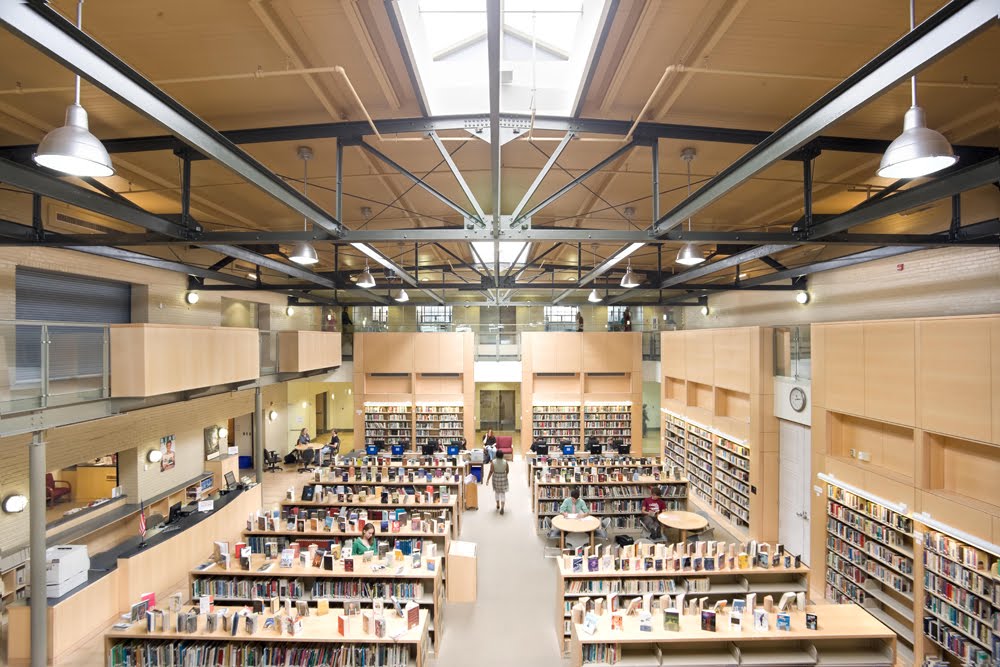
In the next phase, a two-story trussed space—used as a gym in its original design—had received another floor during the ‘70s and had become levels of windowless classrooms. In the current renovation, part of the second floor was removed and a staircase was added to knit both levels together (access was previously gained through fire stairs), with the result a two-story gym and two-story state-of-the-art media center, where historical trusses were exposed and retained.

Of Picassos and partnerships

Originally created as a school for grades k-12, an arcade at one end of the building was designed to gild a kindergarten where children could go outdoors and play. For more than 80 years, it was never used in that or any way whatsoever, so the team closed off adjacent doors and created a brand new entrance into the school by using the entire arcade as a front portico.

The school’s main hallway had a previous, informal moniker where it was known simply as the wooden hallway. In the original Post WWI drawings, it was called the Gallery of Art and History: its intent to be filled with art or objects to provide students with a learning opportunity. Presently known as the James R. Wilkins Gallery (named for its current benefactor), or also as the school’s very own Corcoran Gallery, the space is now an arena—or teaching tool— of high quality art reproduced from Corcoran negatives, courtesy of a donor-sponsored partnership between Reader & Swartz, Water Street Design (graphics) and the Corcoran Gallery of Art. “Before we worked on it, it had some paintings of principals and random displays, but now it’s been elevated to gallery status,” Swartz said.

On the exterior, in addition to reconfiguring the arcade into the new main entrance, a balustrade across the top was rotting and had to be repaired and restored; cupolas and roofs needed repair and bricks repointing. Waterproofing was a huge component in the redesign, as among other things an esplanade had experienced structural problems over the years and was leaking substantially.

In the back of the building, a second floor was inserted and braced with steel, as the school had been built prior to lateral force requirements. “On the one hand you’re fixing caulk and rotten wood on windows and balustrades, and a leaky esplanade, but on the other you’re adding like a city block of modern classrooms that sit behind a parapet, making sure they aren’t seen from public areas so they are really quiet (and don’t intrude on the building’s historical integrity),” Swartz said. “It’s basically a new school inside an historic shell with as much history retained as possible.” The building was also reorganized to feature math and science classrooms on one side, with art and literature on the other, much like the left brain/right brain landscape of the human brain. Phase III of the redesign addressed the 1962 additions in the back, which were repaired and updated, though historic elements were not at issue.

“Architects make as many mistakes by doing too much as in not doing enough,” VMDO’s Moje said, “and this is a very interesting project in that regard. In some ways, it may be our best work but you cannot see a lot of it. It’s an amazing piece of sleight of hand to expand the school, but the front appearance has not changed at all,” he said, referencing the second floor that was stepped back considerably.

All in the family–and community

Citing choreography concerns in restoring and renovating a project of this magnitude, Swartz said the high school had to remain operational during construction, which took four years. “You had to meet all the education standards, help get kids into college—all those things while you’re tearing a building apart and putting it back together,” he said, adding the job was so extensive the first $30 million was just to tear things out and put in new systems—within the same walls.

“I went there, my mother went there and later worked there, my brother currently teaches there and my daughter goes there,” Swartz said of a project that resonated as much for him personally as it did professionally. “Clearly John Handley High School is an amazing edifice in this town.”

Said Moje, whose firm has designed many hundreds of educational environments in the past 35 years, “Probably the vast majority of articles you read in the news media are negative about public education. The fundraising efforts of the high school and its graduates show there is still an awful lot of good about it, and this building is representative in a lot of ways.”

Douglas Apartment on 14th Street, Financed and Waiting for Permit

7 comments


With construction financing secured a little less than a month ago, Douglas' 6-story, 30-unit apartment at 2221 14th Street, NW, is moving forward, having awarded the general contractor position to Donohoe Construction last week.

As reported in June, the project was expected to be underway around this time, however, a building and raze permit for the site (applied for in May and in August, respectively) are still pending.

Designed by Sacha Rosen of R2L: Architects, the building is a contemporary assortment of glass, metal, brick and terra cotta panels with sharply angled bay windows fronting 14th Street and Florida Ave. Not going condo - as several projects on 14th Street are - the building is designated as apartments with ground-floor retail space and 10 below-grade parking spaces.

Demolition of the defunct auto shop on site will take place before construction can begin. A large mural will cover the exterior wall of brick (the building's backside) that will rise over the adjacent 3-story building to the south - a requirement put in place by the Board of Zoning Adjustment.

Douglas had previously worked on bringing a 10,000-s.f. retail structure, designed by George Myers of GTM Architects, to the site.

Amendment: Permit application filing dates were transposed; raze permit was applied for in August, and building permit in May

Washington D.C. real estate development news

Monday, October 10, 2011

Your Next Place: Solar Decathlon Edition

0 comments
By Franklin Schneider

The future is not often pretty. Take, for example, old age, a concept best exemplified for me by the memory of my father drunkenly dancing the “Soulja Boy” at a recent wedding, while wearing one of those tattoo-sleeve t-shirts and an Ed Hardy trucker cap cocked to the side. (When I gently suggested take a song or two off, he told me to “chillax.”) So last week's U.S. Department of Energy Solar Decathlon was a pleasant surprise, presenting as it did a rosy, hopeful picture of the future of home design.

The contest pitted 20 teams of (very eager) college students against each other to see who could build the most energy- and cost-efficient house. While some teams (Purdue, Virginia) went for the familiar, most of the entries were strikingly modern. I wholeheartedly applaud this: I was promised hoverboards and jetpacks as a child, and here I am twenty years later, still watching VHS tapes. Clearly, the future needs to get here faster.


A special emphasis was placed on quick assembly and easy alteration. A team from Belgium designed a house out of wood and glass panels that you can arrange and rearrange according to your tastes and needs, sort of like big Legos. It was rather spartan to look at, but on the other hand, if that southern exposure you thought was such a great idea is turning your house into a blazing inferno in the summer, you could just move the windows to another wall for the hottest months. Think about the practical applications. (I once shared an apartment with a girlfriend that overlooked a roof deck popular with female sunbathers. I was unemployed at the time. One night my girlfriend stopped next to the big chair in the living room, looked at the hardwood floor, and then at the window, and asked, “Why are there all these drag marks between the chair and the window?” The subsequent breakup could've been avoided had I been able to move the goddamn window instead of the chair.)


The New Jersey entry was similarly modular. Made entirely of concrete (insert New Jersey joke here), it's made so that you can quickly assemble various concrete panels and slabs into any size or type of house you need. All the electrical systems are in a central core, which you build the house around, so the possibilities are endless. This house had a band of windows where the wall met the roof, so it looked like the roof was floating; very cool. And the concrete didn't look prisonlike or crude so much as appealingly spartan and modern. This might've been my favorite house.

Another highlight was the Caltech entry, an asymmetrical pod covered in quilted vinyl insulation, making it look vaguely like a Japanese sex toy. (Apparently exterior insulation is more efficient.) Inside, the living areas were separated onto vertical levels, lowest to highest, rather than with walls. I loved this, if only because I'd never seen anything remotely like it before.


UMD won the top architecture prize, which is sort of ironic considering that downtown College Park has all the aesthetic appeal of a mall food court from the mid-Seventies. But their house really was pretty sweet, a house built around a mini-wetland that recycled water through a garden on the roof. It's also the only house to make the bathroom the central area (most built around the kitchen) – it made me wish I'd brought a newspaper.


The main thing that struck me about the Decathlon was how nice the houses were. Not just the materials, but the way they utilized space. These were smallish “green” houses, and like a lot of people, I guess I went in assuming that less would be, well, less. But no, less is actually more. It really made me reconsider a lot of the things about houses that we take for granted as “the right way” - big rectangular spaces with holes in the wall to let sunlight in – but are perhaps done out of laziness or because “they've always been done like that.” (The worst reason to do anything, I'm convinced.) It's like when I moved into my first apartment, I just pushed all the furniture up against the walls to make a big open space in the middle of every room. It just seemed like the obvious sensible thing to do. It wasn't until a few years later, when a woman I was dating came into my apartment for the first time, looked around, and said, “What's wrong with your brain? Go stand over there,” and then dragged all my stuff into a far less crackhouse-ish arrangement, that I realized that the obvious, “sensible,” way doesn't necessarily equal livability or quality of life. You may roll your eyes at feng shui (you racist) but isn't it just a fancy name for getting people to stop pushing their sofa up against the wall and calling it a day? And while saving the planet is obviously more important than improving the “vibes” of your sunroom, there's a parallel there with the green retrofitting that some people are calling the “Third Industrial Revolution” (never mind that I missed the second – was it the nuclear bomb? Computers? Elastic-waisted pants?). Point is, it would be a terrible missed opportunity if we just stuck solar panels on top of our doublewides and McMansions, patted ourselves on our backs, and stumbled tackily into a zero-emissions future. This is our chance to reinvent the wheel! Let's not blow it. I'm so tired of this wheel.


All photos by Jim Tetro/U.S. Department of Energy Solar Decathlon


DCmud - The Urban Real Estate Digest of Washington DC Copyright © 2008 Black Brown Pop Template by Ipiet's Blogger Template