Q&A with Carol Freedman of Carol Freedman Design
By Beth Herman
Celebrated for the abundant colors that define her work,
interior designer Carol Freedman of Carol Freedman Design spoke with DCMud about an unusual commission:
designing a house around the colors in a tote bag.
 DCMud: So much of your world is
about the unabashed use of color, accordingly what made the redesign of this residence
different?
DCMud: So much of your world is
about the unabashed use of color, accordingly what made the redesign of this residence
different?
Freedman: The inspiration for this 8,000 s.f. Bethesda house
was a tote bag that the client really loved. It had geometric patterns of leaves:
a rust leaf; turquoise leaf; an olive leaf; a caramel leaf; a black leaf. And her
color preferences were also deeper than many I’ve used before, as exemplified
in the tote which was our canvas.
DCMud: So how did the tote manifest itself in the home?
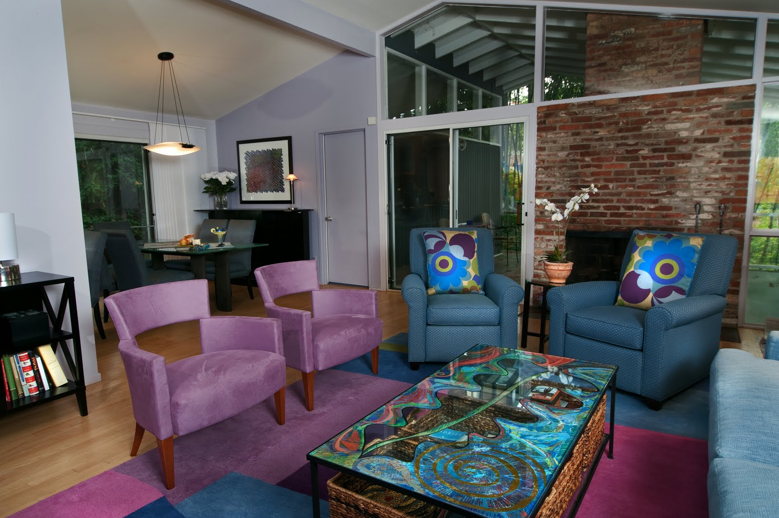
 Freedman: To
begin with, there are three floors, and the back of the house faces dense forest
with a beautiful woodland view. We started in the great room with a large
custom round patterned Odegard rug from Nepal. I then found this geometric fabric
that picked up all of her colors and decided it would be great to use a fair
amount of it, but not too much to overpower the room. So we used solids for the
base of the couch and the chairs, applying the fabric for all the sofa’s throw
pillows and back pillows. A complementary floral fabric from the same company
is on some chairs, which pick up all those beautiful colors.
Freedman: To
begin with, there are three floors, and the back of the house faces dense forest
with a beautiful woodland view. We started in the great room with a large
custom round patterned Odegard rug from Nepal. I then found this geometric fabric
that picked up all of her colors and decided it would be great to use a fair
amount of it, but not too much to overpower the room. So we used solids for the
base of the couch and the chairs, applying the fabric for all the sofa’s throw
pillows and back pillows. A complementary floral fabric from the same company
is on some chairs, which pick up all those beautiful colors.
DCMud: In a previous story we did
together, the inspiration for a home came from a painting. Though this home’s design was predicated on a tote bag, what about the
spirited artwork in so many of the rooms—particularly the diptych in the living
room?
Freedman: We
wanted some really dynamic art on the walls, and my client and I fell in love
with Susan Finsen who does exquisite work at the Torpedo Factory Art Center in
Alexandria. This was a custom commission we did, based on one of her previous
designs, where she employed our colors with her artistic sense.
DCMud: The home’s master bedroom
also appears to reflect the tote’s theme.
 Freedman: I
found the rug first, which picked up a lot of the same colors I used in the
great room. The client already had the custom wood furniture, so I wanted a
color on the walls that would make the furniture sing. We used turquoise from the tote, and
then found this wonderful Duralee geometric pattern with turquoise and orange
in it. Though many clients would be afraid to use such a bold pattern, this
client was daring enough to use it on the window treatments. My favorite kind
of person! The fabric on the bed is Donghia—more subtle with intricate designs
that complemented the bold area rug.
Freedman: I
found the rug first, which picked up a lot of the same colors I used in the
great room. The client already had the custom wood furniture, so I wanted a
color on the walls that would make the furniture sing. We used turquoise from the tote, and
then found this wonderful Duralee geometric pattern with turquoise and orange
in it. Though many clients would be afraid to use such a bold pattern, this
client was daring enough to use it on the window treatments. My favorite kind
of person! The fabric on the bed is Donghia—more subtle with intricate designs
that complemented the bold area rug.
DCMud: What about the art which, in
the best sense, appears almost indistinguishable from the space—as if it was
born there.
Freedman: It’s
another piece by Susan Finsen—a spectacular artist in our region.
DCMud: How did you design spaces for
family fun in this residence?

Freedman:
Because the game room is adjacent to the great room, we used a deeper caramel
color (seen in the tote bag) which flatters the rich-looking pool table. The
client already had a suspended art deco light fixture. She and her family are
avid baseball fans, and coincidentally Susan Finsen had designed these
silkscreens of baseball fields around the country, so she custom colorized them
for this space.
DCMud: Embracing your color
addiction, it seems you might be drawn to D.C. spaces that speak to this.
Freedman: One
of my favorite parts of D.C. is the area of 14th and U Streets. I
absolutely love jazz, both of my sons are jazz musicians, and the area is
riddled with jazz clubs. We also love the great restaurants there, particularly
Masa 14 and Estadio. What I love about Masa 14 is the juxtaposition of natural
wood finishes, brick and metal, and the use of black, with a pop of red in the simple
pendant light fixtures. It’s got that urban modern aesthetic going on with exposed
metal ductwork. It feels hip, modern and earthy all at the same time.
photos courtesy of Anice Hoachlander
photos courtesy of Anice Hoachlander