Sunday, May 17, 2020

We're Back

2 comments
We're back!  Really, it was us, not you.  Its been a long, strange road, and much has changed since DCMud last published our love letters to the city, not the least the city itself.  Back in 2012 downtown DC still had plenty of surface parking lots, a brand new convention center, the Navy Yard was getting some of its first apartments and factory conversions, and Douglas Development was starting its Ivy City Development.  And while development has continued, DCMud took a break from the high expectations we had for ourselves, consumed as we were with first-in-time reporting and from-the-source research.  And while our format was simple, the effort, coordination and resources that went into this humble blog were monumental, consuming more resources than it generated.  It distracted us from ordinary commerce, and what started as an impulsive post on a hastily chosen blog domain (DC Dirt not being available) soon became a heavy labor and then an obsession.  But the community that supported and absorbed us always counterbalanced the cost of our efforts.  We missed our interactions with you, and some of you even missed us.


Among the changes was the dissolution of my old company, DCRealEstate.com, that supported this blog, and much more recently the creation of my new company, City Grid Real Estate.  I have spent the interim years in the business of commercial real estate, representing many of the regions more recognizable retail tenants and restaurants (if you're curious), marketing for landlords and selling commercial real estate, and City Grid represents a return to the independent, creative roots that started DCMud.

The intent of the new DCMud is not to replicate the previous format. I have always been immensely proud of the site, having generated more than 10 million page views and earned a Washingtonian "Best of" in the process.  But as I move through the city marketing and analyzing commercial property, I will also be photographing, documenting the change that never stops.  There are now ample alerts about zoning decisions and groundbreakings (ceremonial, mostly), so my attempt will be capture and display the construction as it happens, changes that often take us by surprise as we pass a new building that seemed to appear spontaneously.  I hope you find this helpful, and I look forward to your contributions - photographs, information, comments - as part of this new endeavor.

Thursday, May 14, 2020

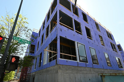
14th Street Short-Term Family Housing Project

0 comments
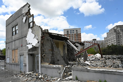
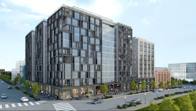
A family housing shelter is now taking shape in Columbia Heights, replacing the former Rita Bright Family and Youth Center.  The $20m project will provide 50 family rental units - 35 for short term housing and 15 for seniors, and will recreate a recreation center that existed prior to construction, all on land currently owned by the District government.  Cunningham Quill, which has designed such notable buildings as the Yacht Club at the Wharf and Wooster & Mercer Lofts, designed the project, which is expected to wrap up in the fall of this year.

click for photo gallery

Project:  14th Street Family Housing Center

Developer: District of Columbia

Architect:  Cunningham Quill

Construction:  GCS Sigal

Use: Homeless Shelter

Expected Completion: Summer / fall 2020


Columbia Heights

Columbia Heights homeless shelter

Washington DC real estate

Washington DC real estate development

Rendering

Washington D.C. retail and real estate development news

Wednesday, May 13, 2020

City Ridge - the Former Fannie Mae Site

0 comments
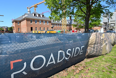
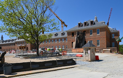
The City Ridge project will transform the former Fannie Mae headquarters just south of Tenleytown into a mixed-use development including the city's first Wegmans, scheduled to open in 2022.  Roadside, which developed City Market at O in Shaw nearly a decade ago, initiated construction in 2018 and employ an impressive 5 construction cranes to cover the entire 10-acre site.  More impressive still is the need to lift and support the entire Georgian revival building to allow the old foundation to be removed and excavate a further 8 feet, supporting the existing building on micropiles and creating a new base added that will house Wegmans.  The completed project will feature 690 residential units, 153,000 s.f. of retail, and 174,000 s.f. of office space, for a "mixed-use urban village."

On top of adding Wegmans to the roster, Roadside and partner NASH (North America Sekisui House) also signed International Baccalaureate, a global non-profit that designs educational curricula, now based in Bethesda, as the signature tenant for the historic building, vacated when Fannie Mae decamped for their new downtown campus.  The successful relocation of three 600,000 pound heritage oaks from the construction site to the front yard was yet another upbeat element for the project.

New construction Washington DC
click for photo gallery


Project:  City Ridge


Developer:  Roadside Development

Architect:  Shalom Baranes

Construction:  Whiting Turner

Landscape Architect:  Michael Vergason

Use: 690 residential units, 153,000 s.f. of retail, 167,000 s.f. of office

Expected Completion: Early 2022


Tenleytown Fannie Mae redevelopment

Washington DC commercial real estate

District of Columbia real estate development news


Friday, May 08, 2020

The Brooks at Walter Reed

0 comments
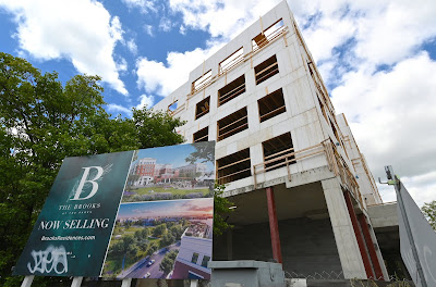
Construction has topped out on the Brooks, a wood-framed, 77,000 s.f., 89-unit condominium fronting Georgia Avenue as part of the Parks at Walter Reed, one of the first of numerous projects replacing the historic medical campus.  The Parks will ultimately deliver 2100 residential units, 175,000 s.f. of retail, 300,000 s.f. of office, and a hotel, for over 3m square feet of very mixed use development, spearheaded by Urban Atlantic and Hines. Whole Foods has already signed on as an anchor tenant within the master planned community, a section for the Children's National Research & Innovation Campus and the State Department's Foreign Mission Center is also underway.  Sales for the condominium began early last fall.

click for photo gallery


Project:  The Brooks

Developer: Urban Atlantic, Hines, and Triden


Construction:  Paradigm

Use: 89 condominium units

Expected Completion:  Winter 2020


new condos for sale

Brooks at Walter Reed, Washington DC


Walter Reed redevelopment

Georgia Avenue construction

Washington DC retail and real estate development news

Wednesday, May 06, 2020

Work Starts on Silver Spring's Tallest Building

1 comments
Washington Property Company began work this past week on Silver Spring's tallest building in the Ripley District, which will clock in at 26 stories.  The Solaire will be the 5th Solaire-branded apartment building by Bethesda-based WPC, with 6 levels of above-grade parking and 18,000 s.f. of retail, part of which was expected to be a 15,000 s.f. food hall designed by Eimer Design of Philadelphia.  WPC partnered with Cresset-Diversified QOZ Fund on the $163 million project to provide equity.  The site was formerly known as Progress Place and housed Shepherd's Table, which was moved to Georgia Avenue prior to demolition.


Project:  Solaire


Architect:  Design Collective

Construction:  Clark Construction

Use: 420 residential units, 17,000 s.f. of retail

Expected Completion:  Early 2022


Tuesday, May 05, 2020

Foulger Pratt's Press House

0 comments

The Press House in Noma's east side is being developed by Foulger Pratt, repurposing the old National Capital Press building and adding significant new construction for a 3-building mixed use project adjacent to Union Market.


Project:  Press House


Developer: Foulger Pratt

Architect:  Torti Gallas, AA Studio

Use: 356 residential units, 27,000 s.f. of retail, and 25,000 s.f. of office space

Expected Completion:  Spring 2021


Press House Noma by Foulger Pratt

Noma development, Washington DC retail for lease


Washington DC real estate development and retail news

Thursday, January 16, 2014

Diplomacy by Design

6 comments
Q and A with Chris Snowber

by Beth Herman

In an effort to reconcile the discerning but disparate tastes of a homeowner couple in Cleveland Park - she liked sleek and modern and he preferred traditional - Chris Snowber of Hamilton Snowber Architects diplomatically embarked on a renovation of a 1910 Foursquare. Also, because the historic district site projected deep into other residential lots, a previous owner had received what Snowber calls "a lot of push back" from the neighbors when seeking a rather large addition to the home. The house was eventually sold, sans addition, and the proposed three-story new addition for the current homeowners was smaller, receiving the community's imprimatur. The redesign involved a new 1,400 s.f. addition on three levels, as well as renovating the original 4,200 s.f. residence's two floors, basement and attic space. DCMud spoke with Snowber about the multifaceted project.

DCMud: First, what was the program for this renovation?

Snowber: The rooms were segregated with small openings between them. As with a lot of these older homes, the kitchen was broken off and small. Our mission was to expand it and have it connect to some living spaces, specifically a family room and playroom space. We then wanted to connect those spaces to a screened back porch and deck which opened to the yard. We wanted to extend the house but not overtake the substantial backyard.

DCMud: And how did you address the clients' divergent tastes under one roof?

Snowber: The real difference between them was about the style of the finishes and the image of the house. For instance the idea of an open kitchen that would connect to the rest of the house was a common denominator, but the character of the spaces - use of traditional moldings, elaborations of fireplaces, choice of cabinetry - was different.

DCMud: So there was agreement soon after take-off?

Snowber: Even though we started off with a more transitional design - paneled cabinet doors, etc. -  when the wife discovered some very modern oak and stainless steel Bulthaup kitchen cabinets, this really set the tone for the rest of the work.

DCMud: If you jettisoned the idea of transitional, or middle ground, can you elaborate on how the design was executed?

Snowber: Quite often the resolution for that is a design with a mixture of more modern furnishings and cabinetry and trim that is less heavy and more abstract than the existing house might have had. But in this case went to two extremes: The kitchen and family room (new addition in the back of the house) are very modern, both in the cabinetry and window detailing and also the fireplace surround. In the rest of the house, like the living room, dining room and front hall, we went even more traditional. We removed all of the existing trim - all of the crown, base, all of the window treatments, replacing them with heavier and more elaborate trims than were there in the first place. The house had a Craftsman look, and we actually made it much more formal.

DCMud: So rather than compromising, you played these two styles against each other.

Snowber: That's right. Then when we started furnishing it, both in the new and existing parts of the house, the furniture is very modern. So while the dining room has a brand new fireplace and traditional but new coffered ceiling, the table and light fixture are quite modern. In short these rooms have very modern furniture in this very traditional context.

DCMud: Did you retain the original flooring, which appears to be rough-hewn?

Snowber: We did - and it's a narrow oak. In the kitchen, though, the floor is granite pavers.

DCMud: What about the second and third floors, and the basement.

Snowber: The home had six bedrooms and ended up that way, but they're configured differently. On the second floor, the whole back of the house is the master suite. The wife has an office on that floor also. The third floor has a guestroom for the client's parents who visit, plus an office and a playroom with loft and balcony for the kids. The basement contains a large playroom with desk area, a side entrance mudroom and an au pair suite.

DCMud: From the exterior, the back of the house appears to be more open.

Snowber: Whenever you're dealing with historic houses in D.C., there are different standards for what goes in the front and back of the house. We got to use two-over-two windows in the back, where preserving the historic fabric was less important, whereas in the front the openings had to be of a more traditional scale. Interestingly the two-over-two windows are also from an historic area - more Victorian in nature. And they gave the windows some scale, so as not to be wide-open pieces of glass.

DCMud: Speaking of modern, traditional and historical, is there a particular structure in the area that informs your work - and your spirit?

Snowber: There's a building I like that many do not know about. It's the River Road Unitarian Church in Bethesda. Built in 1964 by Keyes, Lethbridge, Condon, it won a number of architecture awards. It's both modern and traditional in a lot of ways and has a certain Alvar Alto-esque (Finnish architect) quality. Whenever he designed buildings, he'd design them along with the furnishings. Here it's the use of natural materials - wood, brick and steel. It's asymmetrical but still feels like church with a masterful manipulation of light - a real spiritual space. This makes it pleasant to be in at all different times of the day and in all seasons.

Photos courtesy of David Reeve Photography.  Washington DC real estate news


DCmud - The Urban Real Estate Digest of Washington DC Copyright © 2008 Black Brown Pop Template by Ipiet's Blogger Template