Monday, May 30, 2011
The Tellus: Arlington's First LEED Gold Project Delayed Further
Labels: Arlington, Clarendon, Erkiletian, Lessard Group
The apartments that will replace an outmoded apartment building at 2009 14th Street were approved by the county in early 2009, with an expected late 2009 start date. "The economy had a little bit to do with it" says development manager Bill Denton of the delay. Erkiletian is now hoping for an early 2012 construction start. The Tellus will replace one of Arlington's least attractive office buildings, and would be the first residence to earn LEED Gold certification in the county, if built according to the original plans. Erkiletian originally planned for environmentally-friendly facilities such as storm water retention, on-site irrigation, drought-resistant native plants on a green roof plaza, low-flow plumbing fixtures, bicycle and smart car options, power derived from a green sourced grid as well as on-site solar, a sustainable power source that has yet to achieve commercial viability and is rarely used on multi-family buildings.
Lessard Group designed the building to achieve the 2nd highest LEED ranking, but Denton says specifics are still in flux. Regarding use of solar panels, Denton says "we hope to, it will be part of the consulting document, trying to reach LEED Gold," but that such options are still being weighed.
Arlington Virginia real estate development news
Friday, May 27, 2011
Old Town, New Plan: Extending Alexandria's Waterfront
The City of Alexandria wants to capitalize on King Street's appeal and foot traffic and is reaching finality on a plan to connect Old Town's thoroughfare with the adjacent but less accessible waterfront and to extend foot traffic along the Potomac. Since 2009, city planners have had visions of art installations and historical/cultural markers amongst expanded parks and public spaces within a three-mile stretch (see map, above) from Daingerfield Island Park to Jones Point Park, with three possibilities for moderate future redevelopment at Robinson Terminal North, Robinson Terminal South (both owned by a Washington Post subsidiary) and the Cummings/Turner properties (surnames of the private owners).
A Waterfront Small Area Plan - released by the City's Dept. of Planning and Zoning in February of this year - is currently under review by Alexandria's City Council, which aims to address the most recent community concerns stemming from a May 14 public hearing. According to Faroll Hamer, Director of Planning and Zoning, the plan is getting closer to approval by the City Council, which will meet again June 11 for a Work Session, where they will "meticulously" go over the current plan, said Hamer, who “hopes to have a resolution in place before the end of June,” when the Council breaks for recess.
Right now Alexandria’s Potomac waterfront remains what has been called a “disjointed collection of various land uses,” by the Alexandria Gazette.
The possibilities for future redevelopment at the Robinson Terminals and the Cummings/Turner properties (at the 200 block of South Union Street) include restaurant, retail, office and residential construction - uses for which these areas were rezoned for in 1992. Alexandria is considering a re-zoning option to include hotels and additional density to capitalize on the fact that “on average a square foot of hotel space generates six times the tax revenue of a square foot of housing.”
The potential of added density and hotels has proved to be a sensitive spot with the community, and the topic has been re-addressed at several of the 18 public meetings held throughout the past two years. This led the Planning commission recently to stress the fact that hotels are not “required” in the plan, and that the plan would only incorporate “boutique” hotels, which for this purpose are defined as 150 rooms or less, sans ballroom.
An early estimate for the costs that the city will incur from the plan was pegged as just over $50 million - however the City's Deputy Director of Planning and Zoning, Karl Moritz, is currently crunching numbers to yield a more accurate estimate.
The City released one suggested timeline for phasing of redevelopment: within 3 years, redevelopment of the Beachcomber, the Cummings warehouse at 220 South Union Street, and adaptive reuse of the historic buildings in that block; in 4 to 6 years, redevelopment of Robinson Terminal North, and the balance of the redevelopment of the Cummings/Turner block; and in the next 7 to 15 years, redevelopment of Robinson Terminal South.
As of now all development would be in the private sector, as the City has no immediate plans to purchase any of the private property at the Post-owned terminals or Cummings/Turner land, according to Deputy Director Moritz.
The City asserts that the Plan aims to balance costs and revenues, and to implement a plan that will not rely heavily on (largely unavailable) city revenues.
The core purpose of the plan, says Moritz, is to increase park area, public space and waterfront access, and also to prevent the water from coming to meet them, in the form of recurrent flooding. Alexandrians are familiar with high water at the foot of King and Union streets, and visitors come across driftwood-strewn streets from time to time. Flooding, according to the Mayor of Alexandria, William D. Euille, has required thousands of dollars of cleanup on both public and private land in Old Town.
In a May 6 op-ed column in the Washington Post, Mayor Euille says that the Waterfront Plan would not only create "5 acres of new park" and “world-class public spaces” but would actually mitigate flooding through the Plan’s incorporation of raised pedestrian walkways, street paving and low retaining walls.
But physical and legal obstacles persist - particularly surrounding two parking lots. The current design incorporates half of a privately owned parking lot just south of Waterfront Park, and another (more hotly disputed one) that is owned by the
The ODBC first stood in the way of an early concept involving a public pavilion with 200-ft pier extension reaching out from the end of King Street. This idea would have required the club to relocate its parking lot to an area off site, which the club would not consider, and the idea was scrapped. ODBC doesn't seem to be budging on a lesser request from the planning commission either, which is to rotate the club's parking lot 90 degrees (to hug the building more).
Hamer, of Planning and Zoning, said that negotiations over both parking lots are currently “ongoing,” however an unofficial spokesperson who answered the phone at the ODBC said they are “fighting tooth and nail to keep it [as it is].”
Even without the lot, it seems there may be several gains by the City of Alexandria, and the community, through waterfront improvements.
Alexandria, Virginia real estate news
Tuesday, May 24, 2011
Hoffman Towers Will Stand Tallest, Despite Being Two Stories Shorter
Labels: Alexandria, DCS Design, Eisenhower East, Hoffman Managment
As reported by the Washington Post in 2006, Hoffman paid $200,000 - “every nickel” to his name - a small fortune amassed by trudging through the ranks; from a lowly rank in the back of a bakery, to become a successful agent at New York Life. The payment didn't seem to match the parcel, and onlookers scoffed at what appeared to be a risky financial move for Hoffman. “My learned friends, other developers, assured me I would lose my family,” he told the Post.
Why blow it all on one place? According to Hoffman, the real estate salesman “promised that the Beltway would be coming through.”
He was right. The Capital Beltway was included in the Federal Aid Highway Act of 1956 and today it cuts right into the Eisenhower Valley, just south of Hoffman's land, and loops itself into the Eisenhower Avenue Connector interchange.
Hoffman kept his land, his family and his dream – to build a “35-story skyscraper on the site."
The Hoffman Company/Hoffman Management - the development company founded by Hoffman - has been developing a mixed-use “urban center” known as the Hoffman Town Center across 56 acres in Eisenhower East for the last decade. Upon completion, the area will contain approximately 7m sf of built area (orange buildings on the master plan below) and includes commercial, residential, and hospitality enterprises.
The signature built element of HTC - The Hoffman Towers - is comprised of 3 towers of mixed-use residential/retail, rising up from block 11 and 12, with big-name tenant Harris Teeter in the ground floor of block 11. An additional 17,000 sf of retail will be incorporated, including "pockets" of 200-sf spaces. The grocer will take up two stories and approximately 50,000 sf. First phase of construction will need to be completed before December 31, 2013 as Harris Teeter has a legal agreement to assume the space on or before that date.
Approximately 1200 residential units will be spread across the 3 towers, including a percentage of affordable housing.
The rendering shown here is the most current design - by architect DCS Design - submitted by the Hoffman Company to the City of Alexandria. Original plans were for two mirrored 24-story towers; new plans are for a three-tower configuration, tiered in height (33, 28 and 22 stories).
Although the tallest tower will be 33 stories, two shy of Hubert Hoffman's vision, and also of Monday Properties' 35-story office building underway at 1812 North Moore in Rosslyn, it has been designed to stand 396 ft from the ground up. Monday Properties' building design is 390 ft tall. However, the Eisenhower Valley sits at approximately 18 ft above sea level, and Rosslyn 80 ft above - this means that the Hoffman Towers will claim the crown of the tallest high-rise inside the Beltway by a mere six feet, with a structure that is one-seventh the height of the Burj Khalifa, but will reach a skyline height approximately 55 ft below 1812 North Moore, thanks to a low-lying valley locale.
Although structural heights in the DC-metro area are scrutinized, Eisenhower East combined with the Carlyle Neighborhood is increasingly building up, as well as building out, thanks to generous amounts of land. Development is further spurred by the proximity of the Beltway, the interchange, and the Eisenhower Avenue Metro stop.
The area is home to significant public and private sector organizations, among them the U.S. Patent and Trademark Office and the U.S. Federal District Courthouse, as well as a massive 22-screen AMC theater, fringed with national retail chains.
The Towers will sit adjacent to the Metro stop – which currently spits passengers out into parking lots - and will be boxed by new access streets including Port Street, Anchor Street and Dock Lane (which cuts through the towers). Port Street can be blamed for delays with site plan approval. Gwen Wright, Development Division Chief with the City of Alexandria confirmed that negotiations are currently taking place between the Hoffman Company and the owner of private land that falls into the future Port Street area. The Hoffman Company could not be reached for comment.
Wright estimated that a site plan will be approved by the end of the summer. If a general contractor is awarded shortly thereafter, construction should be able to take place before the end of 2011, and the first phase (of two) should in that case be completed in 2013. Wright says the city is currently trying to facilitate negotiations in order to move the project along, as it is viewed positively. “We are excited,” said Wright. “It’ll be a game changer for the Eisenhower Valley.” For the past few years, the Hoffman Company has been in cooperation with the City of Alexandria's Office of Planning & Zoning.
Hubert Hoffman might not be around to see it, he passed away in 2002, but it's happening, skyscrapers are rising out of the Eisenhower Valley. The Towers may not be 35 stories, but they aim to have a better story to tell, to be the tallest high-rise building (from the ground up) in Metropolitan DC. At least for awhile, 396 feet may send builders skyward.
Update: A previous version of this story was published May 25 which did not address from-the-ground-up heights.
Monday, May 23, 2011
Stairway to Change: The Links, Incorporated
For 65-year-old powerhouse African-American women’s volunteer and service organization The Links, Incorporated, finding the right team to expand and modernize its outmoded national headquarters at 1200 Massachusetts Ave. NW was key to facilitating its future. Plagued by antiquated structural elements and inadequate electrical, cable and mechanical systems last addressed in a 1984 renovation, the organization was profoundly challenged by issues surrounding the desired integration of two distinct historical buildings from different eras into a single 21st century workspace.
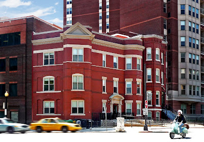
The first structure, which housed the organization’s current offices, was built in the 1930s as a single family home that became commercial space, with the other, consistently an apartment building, built in 1908 and more recently acquired though not yet utilized as office space. Seeking a design that embraced its mission and supported a visiting national staff, as well as accommodated expansive meetings and training, the organization would charge its architects with bringing state-of-the-art efficiency and sustainability components to an historical space, commissioning R. McGhee & Associates for the evolving task.
Defined by floors of varying elevations (there was no way to join them efficiently for the two buildings) and deficient structural systems in both buildings, the 1908 structure was also marked by multiple interior changes resulting in a substandard framing system. Additionally, the architects’ efforts to expand the headquarters from the first building’s 6,168 s.f., to a combined nearly 9,400 s.f. of office space, was fraught with unanticipated D.C. Historic Preservation Office hurdles.
Formerly on its board of directors, Principal Ronnie McGhee said his firm thought it had initially understood HPO’s objectives for this project. “Usually it’s the building’s exterior they want us to save,” McGhee explained. “But in this case, they wanted us to save some of the structure inside which really hamstrung us with the idea that we couldn’t change or manipulate all of the interior framing.”
Assiduously retaining historical elements such as existing joists and beams, among other items, McGhee said project manager Cary Blackwelder-Plair spent a great deal of time melding history with the organization’s quest for LEED Silver which, when attained, the architects say will make it the first LEED Silver building for an African-American organization.
Ratcheting it up on the LEED scorecard, sustainable elements include a green roof with drought-resistant plants, double hung windows, DIRTT System glass panels for interior office walls to help channel natural light, 58 percent FSC-compliant wood, low-VOC paints, carpeting and finishes, LED and CFL lamps and occupancy sensors, removal (where sanctioned) and reuse of existing wood structural elements and flooring, walls and insulation with an R- value of 20, renewable bamboo and cork flooring, and the use of vinyl and rubber in lieu of VCT . According to McGhee, working closely with Monarc Construction, Inc., and Jacobs Engineering Group, Inc., 91 percent of demolition and construction waste was diverted from landfills.
Expanding space and agendas
With a membership of 12,000 professional women of color in 274 chapters spread among 42 states, the District and the Bahamas, a staff of 14 occupies the D.C. headquarters with accruing meetings, training, programs and philanthropic planning on its daily, weekly and/or monthly dance card. Divided into two entities: The Links, Incorporated, and The Links Foundation, Incorporated, the latter of which was founded in 2006 and is the organization’s philanthropic arm, respective needs and activities vary and a variety of spaces to support these pursuits were mandated, with shared common spaces like a kitchen/break room.
“One of the constraints of the original structure was the conference room was very small and there was very little flexibility of the building,” said Blackwelder-Plair. A conference space that barely accommodated eight or 10 could not be utilized for typically larger meetings and events, with the organization forced to rent hotel space. To that end, in the new design, a glass-walled conference room accommodating 16 opens with sliding doors to a lobby space for even larger functions. A second, basement-level conference/training space holds up to 32 people. Also in the basement, a library that houses and makes accessible the organization’s extensive archives replaces the former “compact” method of storage not uncommon to an organization experiencing growing pains: standard cardboard boxes.
Where the floorplan itself was concerned, the organization opted for a mix of defined office space with solid walls and more open spaces, though private offices contain glass corridor walls to utilize available natural light. “The building is an odd shape and is very tight,” Blackwelder-Plair said. “In fact once we started the demolition and (many) walls were gone, it felt like a huge, open building which is a big advantage for them.”
According to the architects, integral to the design was the inclusion of swing spaces or touch down office spaces. With officers scattered throughout the country (the former president was from Illinois and the current one is from Ohio), D.C. headquarter visits warrant spaces that facilitate work and even take “internal geography” into account. For the national treasurer, a touch down space for her abuts the finance group’s space for immediate access to like personnel.
For the organization’s Midwest-based president, a third floor executive suite replete with office, full kitchen, bedroom and bathroom facilitates work, economic and time factors, precluding the need for a hotel commute.
Light on the program
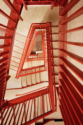
“One of the major elements for the project to be successful was the ability to be on one floor and see up an open stair to the other floors, though there’s a 5 to 7-ft difference in (each building’s) floor height,” McGhee said of the joining of the two structures. “Technically, you could have had a situation where a staircase was behind a wall, and you could have taken an elevator and gone up five feet to one level, then four feet to another, then five feet to the next,” he said, adding that all you’d really see is the inside of an elevator. Though there is an elevator with eight stops, the open stair which feeds the variegated levels provides a visual connection from one side to the next so the single-building concept is firmly established. The addition of both a skylight and roof window above the open staircase paints the area in available light.
Advocating green education and green housekeeping programs, McGhee said the client strongly supported the firm’s ideas, inching it higher on the LEED ladder.
“The biggest key to this project was getting an efficient layout out of all the programmatic, code and historical preservation requirements that came out of the building,” McGhee said. “It’s a very important project for our firm, but also for The Links, Incorporated and the African-American community overall.”
Washington DC architectural design news
Saturday, May 21, 2011
The Great Race
Labels: BF Saul, Design, Hartman-Cox, HITT Contracting
Thursday, May 19, 2011
Southwest Ecodistrict to Replace Concrete Jungle?
Labels: L'Enfant, NCPC, Office of Planning, Southwest
DC might join these two in commonality – along with a handful of leading cities worldwide that are engaged in creating large-scale sustainable urban areas, sometimes referred to as EcoDistricts – if it moves forward with a 110-acre redevelopment plan for a “21st century sustainable community” in Southwest D.C. known as the Southwest Ecodistrict Initiative.
Tonight, the National Capital Planning Commission, the driving force behind the initiative, will hold its third public meeting on the SW Ecodistrict from 6:30 to 8:30 at Waterfront Station in Southwest: 1100 4th Street SW (2nd Floor Conference Room, Complete details).
The initiative came onto the scene early last year under the name “10th Street Corridor Task Force” and the first public meeting was held in February of 2010.
NCPC’s initiative was in response to a federal mandate – Executive Order 13514: Federal Leadership in Environmental, Energy, and Economic Performance – calling for the reduction of the fed’s greenhouse gas emissions, but also stemming from a desire to reinvigorate the concrete desert around L’Enfant Plaza, and turn 10th Street into a true corridor – connecting the National Mall (to the north) with Banneker Park (to the south) and creating pedestrian-friendly sidewalks, outdoor cafes, and tree coverings.
(Below: 10th Street now, versus what it hopes to become)
10th Street's possibilities as an attractive thoroughfare was clearly the inspiration behind the initiative’s original name; however, public feedback and market studies led NCPC to expand its vision, and notably to include the Maryland Avenue SW corridor. Potential SW Ecodistrict boundaries are now Independence Avenue SW and Maine Avenue SW (north to south) and 12th & 4th Streets SW (west to east).
The boundary for the SW Ecodistrict (shown in red, below) encircles a 15-block area south of the National Mall, and loops within it several monolith government agencies – GSA, FAA, Dept. of Energy and the Postal Service to name half –as well as several important sites: 12th Street Tunnel, Southwest Freeway, 10th Street Overlook/Banneker Park and L’Enfant Plaza.
The Office of Planning (OP) is currently in charge of a Maryland Avenue Plan and will finish a study of that corridor at the end of the summer. Along with NCPC and OP, the Ecodistrict is being mentally sculpted by a task force of 15 federal and local agencies, among them: the Architect of the Capitol, DDOT, GSA, the National Park Service and the Smithsonian Institution.
Public meetings, like the one tonight, continue to provide NCPC, OP, the greater task force, and all invested parties with important public feedback. Tonight’s meeting will focus on the plan’s visibility, connectivity and sustainability and will truly be a hands-on affair; according to Elizabeth Miller, senior urban planner at NCPC and project manager of the SW Ecodistrict Initiative, there will be three stations for attendees to rotate through, with the goal of critically assessing all alternatives to redevelopment in the 15-block area of Southwest.
Another public meeting will likely take place at the end of July, giving another chance to contribute to or critique the initiative’s plan before NCPC and OP take it to the Council, likely at the end of this year.
Wednesday, May 18, 2011
Your Next Place...
If they were making a remake of "Family Ties," they'd shoot it in this victorian rowhouse near U Street. That's how wholesome this place seemed, from the soft yellow-walled open living room, to the classic bay windows, to the multiple fireplaces and impeccable woodwork. (Though if the remake was true to the original, Alex P. Keaton would have to be a birther. So maybe scratch that idea.)
With four bedrooms over five levels, you've got suburban-type space but without the drawbacks of actually living in the suburbs (inexplicable lack of sidewalks, cultural irrelevance). The palatial master suite is on the top floor, and has a master bathroom with a jetted soaking tub and separate shower. The chef's kitchen has stainless steel appliances and granite countertops, and there are two, yes two, decks. I have just one deck and when I had a party last week I had to cram the people I liked and the people I secretly disliked onto the same deck, so I had to constantly switch from sincere sincerity to fake sincerity. It was exhausting. Two decks is definitely the way to go. There's also a surround sound system installed throughout the house, so you can inflict, er, share your music with everyone else in the house. Also, the house is just blocks from U Street, with its profusion of fantastic boutiques, restaurants, nightclubs, and endless crowds of people walking up and back, looking for something they can't quite name and will mostly likely never find.
Downstairs is a legal, one bedroom rental unit to rent to a gullible intern to defray the cost of your mortgage, and upstairs is a spacious attic, convenient for storing all those things you don't want or need but can't quite bring yourself to throw out, like birthday presents from your parents. (For my last birthday, my mother bought me an XXXL Tommy Hilfiger stars-n-stripes rugby shirt. I burst into laughter, thinking it was a hilarious joke, but then I saw her expression. Oops! )
2134 13th St NW
Washington, DC 20009
4 Bdrms, 3.5 Baths
$1,039,555
Tuesday, May 17, 2011
Mixed-use: A Safe Way to Go in Tenleytown?
Labels: supermarkets, Tenleytown, Torti Gallas
As reported by the Washington Post, the nationwide grocery chain is looking to move forward with new, yet-to-be-fleshed-out plans for a mixed-use development where a low-slung, red-brick Safeway store currently resides just off of Wisconsin Avenue in Tenleytown.
The Safeway, built in 1981, sits with its backside to 42nd Street – the building was built to face away from the main drag – while conversely, Safeway execs are facing a call to action from the Office of Planning and Ward 3 ANC 3E-03 to address specific problems both groups had with a previous version of redevelopment, one which merely raised the Safeway to 2 stories and added a touch of retail.
The problematic PUD was submitted by Safeway in August 2009. Things began to unravel for Safeway as early as October – only two months after submitting plans –when substantial criticism arose from both OP and the ANC. Safeway chose to “indefinitely suspend” its plans in January 2010. OP expressed concerns about various elements of the plan, but was pointedly critical of Safeway’s request for rezoning.
As seen in the 2005 OP land use map (at left) the Safeway-owned land between 42nd and 43rd street and Ellicott and Davenport Street, is a mix of low-density residential (yellow), low-medium density residential (peach), local public land (navy), and commercial (pink).
The yellow-peach areas are what caused Safeway the most trouble, and led to a mixed-use plan.
Designed by Torti Gallas and Partners, the redevelopment was initially meant to expand and renovate the out-dated Safeway store there – which turns (gasp) 30 this year – and also tack on additional retailers on site: a coffee shop, dry cleaners, and florist.
Now, a year-and-a-half since scrapping plans Safeway is back at it, yet, taking it slow, and contrary to what was reported by the Post, Safeway has not yet issued a request for proposals. Craig Muckle, manager for public affairs and government relations in the region, says that Safeway is first gathering input from the community and is paying particular attention to the opinion of residents in the immediate area.
Jon Bender, chair of ANC 3E, noted that he and other ANC 3E commissioners suggested to Safeway more than a year ago that some kind of mixed-use development at the site could make sense.
Given that single-family homes immediately abut the Tenleytown site, he added, the details of the project matter a great deal. "A majority [of ANC3E commissioners] views this development positively in principle, but I think we’ve got a good distance to go before a majority could support a specific project," Bender explains.
Bender observed that Safeway’s preliminary, conceptual description of what it intends for the site raised concerns, and Safeway has stated that - until it selects a developer - it will not discuss significant changes to the project, share detailed renderings, or produce perspective drawings of the view of the development from adjacent residences.
This time around Safeway is looking for a plan that will work, but not before getting the go-ahead from the community, and that community has proven to be a difficult client many times over.
Update:
At left: Office of Planning Future Land Use Map (as designated in 2007)
This map shows more accurately that the land in question is zoned for moderate residential and light commercial development. The Office of Planning was opposed to rezoning in order to accommodate Safeway's 2009 PUD, and ANC 3E03 suggested that Safeway consider a mixed-use development for the site.
The yellow and peach areas at 43rd St and Ellicott St. on the Office of Planning Land Use Map from 2005 (within article) are currently residential areas - with residents - and it is these folks who are particularly concerned about Safeway's redevelopment plans for the site as it is quite literally in their backyard.
Correction: In paragraph five, "Safeway-owned land" is incorrect, and the article should read "the affected area"
Washington D.C. real estate development news
The Rainbow Stops Here
It's like unwrapping a bright, shiny birthday gift, with the cake, ice cream and confetti on the inside. From the outside, the traditional 4,500 s.f. "almost" Greek Revival -style house resembles its genteel Oak Hill, Va. country cousins, replete with an attentive group of dormers, a koi pond, Bernese Mountain dog and a couple of horses in the newly-built barn and dressage ring. In fact it's one of the few remaining horse properties in the Dulles area, which is what had attracted the homeowner in the first place.
But following a long interior structural renovation in 2004 where walls tumbled and open space prevailed, the homeowner’s affinity for all things bold and beautiful finally sought expression in a robust rainbow of fabric, furniture, fixtures, finishes, faux-design and glass. With details that include a fiesta of red, pink, blue and yellow Kitchen Aid small appliances to pump up the color volume even more, the home’s eclectic (and electric!) interior reflects the joy and optimism of its singular client.
"Initially, what we’d presented was very different,” said JDS Designs Inc. associate Nicholas Beck of the firm’s first meeting with the homeowner. “She’d mentioned she wanted color, and she wanted to use pink and purple, but the palette we did was definitely more subdued.” When it became clear she didn’t fear color the way most people do, and in fact mandated what some may consider risky peacock blue and hot pink hues over more traditional, muted tones, the designers embarked on a spirited treasure hunt to satisfy the tastes of its special client. With three full and two half baths, a foyer that flows into an open living room, dining room, kitchen and morning room, and multiple bedrooms—some of which became a sitting room, wife’s artist’s studio and husband’s study, the team recruited a legion of artists, custom furniture makers, upholsterers and craftsmen, and scoured New York, Seattle and New Orleans shops and galleries, to create spaces that fit the profile of its color-centric owner.
Past a mudroom with a multi-colored tweed window seat and raspberry walls, and on the two-story foyer wall, a vibrant, faux-painted damask pattern by Baltimore’s Valley Craftsmen Ltd. involved a multi-step process to build texture into the space. Designed by JDS Designs Inc. Principal David Herchik, a custom-made pink, purple, blue and lime green striped banquette by furniture maker Al Soussan of Custom Furniture and Wall Upholstery fits the curve of the foyer’s entryway, where one is tempted to pause and study a dynamic glass sculpture.“The client is very much into glass,” Beck said, explaining that “The Stinger,” a giant green and orange orb with sword-like protrusion, is part of a series in the vivid colors of super heroes from Seattle artist Nancy Callan. Because the homeowner is an artist with a predilection for hearts, Herchik acquired a painting of the same in bright colors from Rehoboth, Del. artist Murray Archibald to flank the banquette.
A purple dining room with green-shaded chandelier is visible from the foyer, as is the living room in the open-space design. Iced with peacock-blue walls, a custom-made rug that incorporates the room’s audacious turquoises, pinks, purples (and a little cream for good measure) underscores a largely azure-blue Nancy Corzine sofa with Osborne & Little cut velvet fabric. Small Odegard white marble tables, a larger gold leaf table, wing-back chairs upholstered in white patent leather, a taxidermy peacock and lamp shades dressed with actual peacock feathers completed the room, that is, until the homeowner and her husband returned from New Orleans with two unanticipated antique paintings. “Most of the artwork was intentioned and worked in to the ‘paletteing’ of the space, but it’s amazing how good these look—and their size and scale—it’s one of those finds,” Beck affirmed. Because of the client’s penchant for old mercury glass balls, the designers had a sizeable acrylic bin made to accommodate the collection. A marble fireplace surround was tiled on the inside with multi-hued Bisazza Mosaico tile, also seen in the master bath.
Though more traditionally programmed as a breakfast room, because the home owning couple takes an early meal at the kitchen island, a re-designated “morning room” with floor-to-ceiling windows is awash in sunlight. Window treatments for the room include vibrant striped drapes with sheers to help disseminate light to the space’s indoor plants and trees.
In the master bedroom, with its pink and lime green motif, Herchik designed the custom-made bed which included a gilt, antique-mirrored headboard carved in Italy. The client’s proclivity for bed trappings was manifested in embroidered sheer fabric from Etamine, a French collection from Zimmer & Rohde, and Zimmer & Rohde also did the striped silk fabric for the drapes. Trappings, suspended by a custom circular gilt ceiling rod, notably have a glass bead trim from Osborne & Little down the sides and across the bottom, and the master bedroom’s ceiling is light green glass beaded wallpaper, called “Bedazzled,” by Maya Romanoff. According to Beck, the embroidered sheers theme was carried over to windows, and the room’s back wall was draped to eliminate a tiny, rogue set of windows. "Like in all good decorating, it’s all about layers in this house,” Beck said. “When you get a client who is really invested in the project and wants to see it all the way to fruition - not stop short - that’s when you get these spectacular homes. This house is all about the details.”
To that end, bed linens were embroidered in Italy where a sample of the room’s embroidered sheers informed the process. “It was all very intentioned,” Beck affirmed, adding that a large, custom lime green with hot pink flecks rug for the space was designed by Herchik and executed by Rosecore.
Friday, May 13, 2011
DCMud Posts
Thursday, May 12, 2011
Constitution Square Breaks Ground on Phase 2
Labels: NoMa, SK and I Architects, StonebridgeCarras
Stonebridge just now completed Two Constitution Square, which it also built without a tenant, and though Firstenberg initially banked on another large federal tenant, focus has now shifted to private tenants with the expected slowing of the expansion of the federal government and with it federal leasing.
Washington D.C. real estate development news
Wednesday, May 11, 2011
Your Next Place
If the recent Royal Wedding left you with a taste for something English, but you're put off by monarchy, driving on the wrong side of the road, and Russell Brand's pants, this could be the house for you. An excruciatingly rustic and sophisticated brick home, complete with manicured gardens and a white picket-type fence, this house wouldn't look out of place in the British countryside. If it was any more British, it would be named “Neville” and wear a monocle.
There's a very sunny mint green-walled living room (windows on three sides), with fireplace, a golden yellow-walled dining room, and a sumptuous master suite with a tangerine-walled master bath. I like the clean simplicity of white walls, especially in a bright room, but I found the colors in this house to be very soothing and pleasing to the eye. It's a nice change from the same old thing, and besides, if, like me, you're the type of person who occasionally (four times a week) comes home a little stumbly, white walls can equal a smeared-handprint visual diary of all your worst nights.
My favorite part of the house was the huge sunroom, with a wall of glass that opens onto a spacious deck. If I lived here I'd move all my stuff into the sunroom and spend all my time there, like a crazy person. The house is right up against the park, so from the deck you get a breathtaking view of the woods. Stare out there long enough and you might forget that you live in a society that forces you to repress almost every natural urge you feel. Though to be fair, it's also the society that brought you frozen waffles, which you have to admit is a pretty good consolation.
1719 HOBAN RD NW
Washington, DC 20007
4 Bdrms, 4.5 Baths
$1,699,000