by Beth Herman

In his quest for an unembellished life, transcendentalist Henry David Thoreau took to the woods with perhaps a not-so-novel battle cry. "Our life is frittered away by detail," he famously wrote. "Simplify. Simplify."

 In their pursuit of a renovation and addition to a 1950s modern house that would reflect a Thoreau-esque aesthetic, and also court the abundance of mature trees around their Arlington, Virginia property, homeowners Jed and Marie joined forces with award-winning architect Patrick Carter of Reve Design Studio to achieve their goal.
'The client had a 1 1/2-story house with a master suite, kitchen and living room on the first floor and a tiny hallway with two secondary bedrooms on the second," Carter said of the 1,666 s.f. residence. "It was an open floorplan and though not really a formal space, there were no informal places for the kids to play." At certain times of the year, it also provided a view of the D.C. skyline.
.jpg) Parents of two young children, Jed grew up in a modern Michigan home designed and built by an architect father. Marie is a card-carrying minimalist, according to Carter, and creating a modern-minimalist residence for a growing family that tipped its hat (or roof slope) to nature was a tall architectural order.
Parents of two young children, Jed grew up in a modern Michigan home designed and built by an architect father. Marie is a card-carrying minimalist, according to Carter, and creating a modern-minimalist residence for a growing family that tipped its hat (or roof slope) to nature was a tall architectural order. With a program to keep the master on the first floor and add 549 s.f. by reconfiguring the upstairs to maintain the two children's bedrooms, but add a family room, home office/music room (the family plays multiple instruments), and also retain a portion of the roof deck as a second floor balcony, Carter reached out to Mike Madden and John Page of Madden Corporation (construction) and Andrew Greene of Potomac Woodwork. A prodigious use of custom millwork came to define the new space, including a strong display of sandblasted rift-cut oak door panels between the family room and office/music room.
"Sandblasting eats away at the soft grain and leaves a physical texture - not just a visual one," Carter explained. The result of a "tricky" treatment in the drywall, when the closet doors are closed there are five equal segments: two wood and three wall.
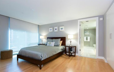
 With the design driven largely by Marie's need to compartmentalize and eliminate clutter, the house, which had virtually no storage, received a series of ample closets with double doors in the new space. Keeping the rooms open, furnishings are sleek and spare, including designs by LeCorbussier, Marcel Bruer and Charles and Ray Eames. And because you're up in the trees, Carter explained, keeping a clean color palette was imperative to draw attention out to the home's exterior. To that end white oak flooring, originally found on the first level, is carried through upstairs, along with pristine white walls and ceiling.
Room with a view
"Because the house is on a hill in the woods, and there's no yard, having a way to be outside was important. We wanted to keep that outdoor space on the second floor," Carter said of the now Ipe-decked balcony with tongue-in-groove cedar ceiling, citing the tree house effect as a key design component. Double-paned, low-E floor-to-ceiling windows, operable at the bottom and at full length on the ends, give the effect of "stepping out into the trees," as does the bay that cantilevers out, extending beyond the building's main box envelope.
With Jed an Air Force Academy graduate, the idea to represent the roof line as an inverted wing also provided the opportunity for a Frank Lloyd Wright Prairie-style moment inside the home. As the roof butterflies with the low point at the center of the house, the occupants' experience of the space is compressed, beginning with the 8-foot. ceiling height, and then swept up and out through the expansive glass, where the ceiling is 10 feet.
 On the exterior, bronze accents and siding in muted green
tones - specifically Benjamin Moore Nantucket Gray and Celery Salt -
harmonize with the surrounding Evergreens and other arbors. Carter worked to preserve the
existing 1950s brick and matched its natural-hued mortar with the exterior paint choices so
not to create additional maintenance issues for the homeowners.
On the exterior, bronze accents and siding in muted green
tones - specifically Benjamin Moore Nantucket Gray and Celery Salt -
harmonize with the surrounding Evergreens and other arbors. Carter worked to preserve the
existing 1950s brick and matched its natural-hued mortar with the exterior paint choices so
not to create additional maintenance issues for the homeowners.Cable rails, creating an open and closed railing system, were a device to open up the outdoor space as much as possible. Though the house is in the woods, there are neighbors on either side and across the street. "It was a balance of privacy and openness, of taking advantage of the views and still allowing privacy if you're out on the deck," Carter explained.
Showing you the door

Recalling that the first time he went to the Arlington house a solid wall atop a brick wall prevented him from finding the front door, opening the front to engage the street was paramount for the architect. "It was a little foreboding and unapproachable," Carter said, identifying a rhythm of open and closed cable railing systems that now punctuate the building.
Seinfeld and I
With a nod to the episode where Jerry's new girlfriend, a victim of capricious lighting, looked alternately angelic and haggard, Carter's lighting tenets include horizontal lighting as opposed to direct, overhead, which he firmly eschews. "Some architects tend to fill a room with recessed lights, somewhere in the middle, which is not always flattering when they shine down on you," he explained, adding the key is to light the room's perimeter so it bounces off the walls for a gentler result.
Delving into his architecture philosophy, the professed closet Frederick Law Olmsted said the way he thinks about work is in terms of something "subtractive.
"A lot of architects think about design as additive," he explained. "They say you're creating a building on the land, so you're adding something to it. But when I get into design, it's a lot like pushing and pulling of volumes so you're breaking the box - carving out spaces. In this project you see it on the front porch and how it works with the bay window above above that protrudes. On the second floor the deck is recessed."
Citing a personal mantra and phrase, "levels of 'insidedness'," as a student Carter recalls an architecture professor who told him a door is more than a hole in the wall. "It's all about approach and that level of 'insidedness,'" he affirmed. "Are you inside when you climb the stairs to the front porch? Are you inside when you cross the threshold of that beam and column? What about when you're covered but then you take a step to the right and you're not? Architecture is about creating a progression - a series of stills."

Photos courtesy of Paul Burk


