The grandson of a gifted
 painter, and with a childhood penchant for creating fine art himself, landscape architect and Principal Bruno Carvalho of Carvalho & Good, PLLC couldn’t have anticipated that requisites for the post-9/11 world in which he plied his craft would include the use of elements such as Jersey barriers, concrete blockades and bollards, and terms such as kinetic impact, all informing his profession.
Practicing for about a dozen years, Carvalho cut his designing teeth in explosive South Florida, careening through the real estate and condo boom but leaving a stalling market in 2006 for D.C., where security - aka perimeter - design was the new black.
"Before 9/11, except if you were dealing with very secure sites, usually military, it wasn’t mainstream at all,” Carvalho said, referring to evolving ideas of barrier design – or more or less making art out of harsh, prison-like barriers hastily erected after the World Trade Center incident. In fact, after 9/11, an incalculable number of cement blockades and barriers feverishly went up around federal buildings in cities throughout the U.S., Washington DC key among them of course, until security proponents began to take stock of the war zone ambience they created.
The challenge for landscape designers in the realm of security/perimeter design, in an area like Washington, according to Carvalho, is to incorporate reinforced but disguised security elements into park-like public spaces that evoke more of a sense of respite and harmony than duck and cover.
Beware of Trucks Bearing Bombs
In the case of the Office of Personnel Management, 1900 E St. NW, a retrofitting of the existing building included in an overall landscape upgrade involved redesigning the perimeter to include security outlets, Carvalho said. “Instead of simply designing a typical streetscape with trees, benches and bus shelters, all of these eleme
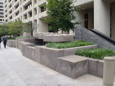
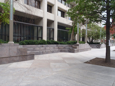
 nts now serve to provide a secure perimeter,” he explained, adding that the former practice of simply placing intrusive Jersey barriers everywhere (3 ½-foot high tapering concrete walls originating in the NJ highway system) has been replaced by elements such as giant concrete planters teeming with flora, hefty, anchored benches or reinforced concrete bollards that are highly aesthetic, all of which meet rated security standards based on “kinetic impact.” In short, Carvalho noted, you can’t drive a truck through them. Even light poles, redesigned for heft and anchored differently, qualify in security/perimeter design, with the grand prize going to covert pit design. According to Carvalho, though quite rare, some entities have a camouflaged pit in the landscaped area where unknowing pedestrians can walk right over it, but the weight of a truck will surely collapse its camouflaged covering.
At the Federal Trade Commission, 600 Pennsylvania Avenue NW, a low, 2-foot seating wall where people can linger, made of granite for aesthetics, serves as a vehicle barrier with landscaping for shade just behind it. “This wasn’t as involved as the OPM,” Carvalho said, “but it’s a simple element you can incorporate within the landscape to provide a required safety perimeter. If a developer wants a federal tenant, Carvalho explained, it has to incorporate some kind perimeter security, now more than ever an integral part of D.C. develop
 ment. You don’t always perceive they’re safety elements, and that’s the contribution of the landscape architect.”
Furthermore in our nation’s capital, security design needs to be more than a barrier: it needs to be a functional part of the urban streetscape, which in some cases means excluding vehicles as was achieved at 1600 Pennsylvania Avenue. “You don’t lose anything by not having everyday cars drive in front of the White House,” Carvalho noted, also citing similar pedestrian projects in cities such as New York and Philadelphia, “and you gain this great linear plaza.”
Dressing the Fortress
Listing the Israeli Embassy and the Vice President’s residence on their dance card, Carvalho maintained that sometimes it is incumbent upon the landscape architect to address - and dress - security elements that are already in place such as looming walls and cameras. “Security has always been part of high profile site design in Washington, D.C.,” he said, “regardless of the condition of the country.” To that end, and particularly with regard to the Vice President’s residence, planting schemes designed to upgrade the property could not obscure security cameras, and in other areas were devised to enhance or reveal existing security measures.
Earlier this year, Carvalho & Good was charged with landscaping the World Bank headquarters in Yemen where, Carvalho said, the country is almost a failed state. “There’s a lot of radicalism and extremism, and obviously there were tremendous security elements going on in that project: a huge perimeter wall and tons of cameras.” He noted their task was to work within those walls, designing a beautiful plaza and garden for the everyday use of employees, so that they would not feel as though they’d stepped out into a battle zone for lunch. Yemen’s World Bank, Carvalho reflected, is a symbol of world unity in a place that doesn’t have much unity.

Recently embarking on a project to landscape the Suitland Parkway entry road to the new headquarters for Homeland Security, where safety elements will clearly dominate the site, Carvalho said at the same time it will be important not to have them detract from the existing aesthetic of the parkway. “The main point of what our firm does is to bring balance to perimeter design,” he said. “Anyone can put a row of Jersey barriers around a building, based on the standard, and call it secure, but the difficulty comes in providing that same standard and making it beautiful.”
Washington DC commercial real estate design news


6 comments:
Too bad some of these nicer elements weren't more subtly incorporated into the hideous ATF building. Between the plastic sheet hiding behind the rounded fortress to the N street prisonscape. It's a beautiful gateway to this city.
Interesting post. I could swear that three out of four of those pictures are of the barriers outside the IMF buildings, but it's not really mentioned.
im sorry, but this is hideous work. the composition of the design elements and as landscape architecture...its just really bad design. sorry.
The images are of the IMF building. Some of the solutions utilized here represent a more extreme solution to perimeter security.
The images are primarily general examples of security perimeter design. - Beth Herman
if you had dug deeper, you would have found a lot of other designers and landscape architects doing work that meets security perimeter design, but with much more sophistication for the design of the landscape.
Post a Comment
Commercial ads will be deleted, so don't even think about it.