By Franklin Schneider
The future is not often pretty. Take, for example, old age, a concept best exemplified for me by the memory of my father drunkenly dancing the “Soulja Boy” at a recent wedding, while wearing one of those tattoo-sleeve t-shirts and an Ed Hardy trucker cap cocked to the side. (When I gently suggested take a song or two off, he told me to “chillax.”) So last week's U.S. Department of Energy Solar Decathlon was a pleasant surprise, presenting as it did a rosy, hopeful picture of the future of home design.
The contest pitted 20 teams of (very eager) college students against each other to see who could build the most energy- and cost-efficient house. While some teams (Purdue, Virginia) went for the familiar, most of the entries were strikingly modern. I wholeheartedly applaud this: I was promised hoverboards and jetpacks as a child, and here I am twenty years later, still watching VHS tapes. Clearly, the future needs to get here faster.
A special emphasis was placed on quick assembly and easy alteration. A team from Belgium designed a house out of wood and glass panels that you can arrange and rearrange according to your tastes and needs, sort of like big Legos. It was rather spartan to look at, but on the other hand, if that southern exposure you thought was such a great idea is turning your house into a blazing inferno in the summer, you could just move the windows to another wall for the hottest months. Think about the practical applications. (I once shared an apartment with a girlfriend that overlooked a roof deck popular with female sunbathers. I was unemployed at the time. One night my girlfriend stopped next to the big chair in the living room, looked at the hardwood floor, and then at the window, and asked, “Why are there all these drag marks between the chair and the window?” The subsequent breakup could've been avoided had I been able to move the goddamn window instead of the chair.)
The New Jersey entry was similarly modular. Made entirely of concrete (insert New Jersey joke here), it's made so that you can quickly assemble various concrete panels and slabs into any size or type of house you need. All the electrical systems are in a central core, which you build the house around, so the possibilities are endless. This house had a band of windows where the wall met the roof, so it looked like the roof was floating; very cool. And the concrete didn't look prisonlike or crude so much as appealingly spartan and modern. This might've been my favorite house.
Another highlight was the Caltech entry, an asymmetrical pod covered in quilted vinyl insulation, making it look vaguely like a Japanese sex toy. (Apparently exterior insulation is more efficient.) Inside, the living areas were separated onto vertical levels, lowest to highest, rather than with walls. I loved this, if only because I'd never seen anything remotely like it before.
UMD won the top architecture prize, which is sort of ironic considering that downtown College Park has all the aesthetic appeal of a mall food court from the mid-Seventies. But their house really was pretty sweet, a house built around a mini-wetland that recycled water through a garden on the roof. It's also the only house to make the bathroom the central area (most built around the kitchen) – it made me wish I'd brought a newspaper.
The main thing that struck me about the Decathlon was how nice the houses were. Not just the materials, but the way they utilized space. These were smallish “green” houses, and like a lot of people, I guess I went in assuming that less would be, well, less. But no, less is actually more. It really made me reconsider a lot of the things about houses that we take for granted as “the right way” - big rectangular spaces with holes in the wall to let sunlight in – but are perhaps done out of laziness or because “they've always been done like that.” (The worst reason to do anything, I'm convinced.) It's like when I moved into my first apartment, I just pushed all the furniture up against the walls to make a big open space in the middle of every room. It just seemed like the obvious sensible thing to do. It wasn't until a few years later, when a woman I was dating came into my apartment for the first time, looked around, and said, “What's wrong with your brain? Go stand over there,” and then dragged all my stuff into a far less crackhouse-ish arrangement, that I realized that the obvious, “sensible,” way doesn't necessarily equal livability or quality of life. You may roll your eyes at feng shui (you racist) but isn't it just a fancy name for getting people to stop pushing their sofa up against the wall and calling it a day? And while saving the planet is obviously more important than improving the “vibes” of your sunroom, there's a parallel there with the green retrofitting that some people are calling the “Third Industrial Revolution” (never mind that I missed the second – was it the nuclear bomb? Computers? Elastic-waisted pants?). Point is, it would be a terrible missed opportunity if we just stuck solar panels on top of our doublewides and McMansions, patted ourselves on our backs, and stumbled tackily into a zero-emissions future. This is our chance to reinvent the wheel! Let's not blow it. I'm so tired of this wheel.
All photos by Jim Tetro/U.S. Department of Energy Solar Decathlon
Monday, October 10, 2011
Friday, October 07, 2011
Southwest Waterfront's Wharf Waved Forward by NCPC
0
comments
Posted by
Anonymous on 10/07/2011 11:15:00 AM
Labels: JBG Companies, Madison Marquette, NCPC, PN Hoffman, Southwest
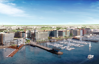
Yesterday, the National Capital Planning Commission waved forward the First Stage PUD of PN Hoffman and Madison Marquette's $2-billion development of the Southwest waterfront known as "The Wharf". The vote to "comment favorably" was raised before Matthew Steenhoek, development manager for PN Hoffman, even had the chance to make a final remark.
NCPC commission members noted that the PUD honors NCPC's request from November 2010 to "strengthen the physical and visual connections to the Banneker Overlook." Subsequently, Market Square (below Banneker) was expanded, and the opening between two residential towers at the end of 10th Street was widened.
A pedestrian connection from Banneker Overlook to Maine Avenue was also added into the plan, which will be included in phase two of development.
The Zoning Commission reviewed the First Stage PUD and related map amendment in mid-September, and may take final action this month, after which the development team can submit the Second Stage PUD, which will detail design and architecture specifics, whereas the First Stage deals with building massing, land uses, open space development, waterfront development/improvement and related map amendment.
Hoffman-Madison hopes to submit the Second Stage early next year, in order to begin construction on the first phase (of three) in the first quarter of 2013.
Of the 3.2 million s.f. to be developed on land abutting the northeastern shore of the Washington Channel, the first phase of construction will be on the middle four parcels ( 2 through 5) which constitutes 40 percent of the entire development.
Parcel 3 will be the location of Carr Hospitality and InterContinental Hotels Group's four-star, 268-room hotel. And, according to Steenhoek, the JBG Companies will operate two hotels - a limited service and an extended stay - at parcel 5. Parcel 2 will be two residential towers above a 4,000-seat multi-purpose theater.
All of the buildings include ground floor retail.
A significant aspect of the entire development is the creation of Wharf street, a main avenue along the waterfront for cafes, cars, pedestrians, pier access, bikes and even streetcars. The Wharf will be a privately owned street and will overtake the existing Water Street, the closure of which was approved by the Council in April, and currently awaits approval by Congress.
Washington D.C. retail and commercial real estate news
Thursday, October 06, 2011
Your Next Place
By Franklin Schneider
Ohhhh man. This Robertson/Lakritz Adler townhouse-style condo isn't just dramatic and bleeding-edge luxurious – it's also green. That's right, this place gets 80% of its power from solar panels, making it one of the very few things in life that's both sexy and virtuous. Jump on this now, because this is the future, and trust me, you never want to be the last one to make the transition. Before you know it, if you mention in mixed company that you still heat your home with natural gas, people are going to look at you like you're blowing cigarette smoke onto their newborn baby.
But this is not a Prius of condos – more like a Bentley. The epic living room has a 20-foot-plus vaulted ceiling and massive floor-to-ceiling windows, and there are two (!) floating staircases leading to the upper two levels. (Yes, the unit has three levels.) The upper levels feature three spacious bedrooms, and a splendid roof terrace. Some roof areas are just folding chairs on a tarred roof that you have to awkwardly climb out onto, but this terrace was an extension of the apartment that just happened to not have a roof over it, as thoughtfully laid out and furnished as any other room, and shielded from the wind.
And yeah, the solar panels. The agent told me that the present occupant saved at least 200 dollars a month this summer, compared to pre-solar panels. (Tip: there are tax incentives in the District that will reimburse you for half the cost of the panels. Do it!). So you could be living in this huge place and yet pay less in utilities than someone living in an efficiency. And look at it this way, if all the wackos are right, and the world really is ending in 2012, you'll have a huge edge in the postapocalyptic new world, what with your off-the-grid self-sustaining energy source. I'll agree right now to trade you three cans of beans and my firstborn for a ten-minute hot shower.
1937 12th St. NW #2
3 Bedrooms, 3 Baths
$1,369,000
Wednesday, October 05, 2011
New Tryst/Diner Project in Columbia Heights to Begin Construction Next Week
Constantine Stavropoulos says that he will begin full construction on his New Tryst/Diner Project in Columbia Heights next week, with all building permits now in hand.
Located at Monroe and 11th Street, NW, along an eclectic strip of restaurants, the 7,000-s.f. diner/bar/coffee shop will eventually stand out as "a third place," according to Stavropoulos, but has become most notable to date for the prolonged petitioning of its existence by several neighbors.
In February, in response to an outcry over the possible influx of boozy patrons to the site, Stavropoulos said, "My restaurants attract students, construction workers, freelancers...people are going to and from work all the time. We're not in an era of 9 to 5 anymore."
While some have found reasons to protest the size, liquor licensing, and proposed 24/7 operation, others remain in support of these same things, hoping neighborhood vitality follows suit.
Nestled within Madison Development's 4-floor, 28-unit condominium on open-house display tonight, the interior of the varied-offering concept is designed by Stavropoulos and his father George Stavropoulos, the architect behind Stavropoulos Associates. New to the Columbia Heights area, Stravropoulos' previous D.C. ventures have been in Adams Morgan (Tryst, Diner) and Woodley Park (Open City).
Stavropoulos purchased the ground floor of 1020 Monroe Street from Madison early this year for $1.9 million. Madison bought the entire 1920s-era building in 2010 for $3.2 million. Originally hoping to be opening up for business around this time - to coincide with the completion of the building's condos - Stavropoulos is now aiming for early 2012.
Stavropoulos also confirmed, "The working name is The New Tryst/Diner Project." There is no official name yet; the oft-referred-to " Margot's Chair" is only the name of the holding company, and there's still a chance that it could become "The Fishbowl."
Update 11/30: According to Stavropoulos, his father is not involved with the interior - like he was for Tryst, The Diner and Open City - but will be responsible for the restaurant's facade. The design of the interior is under the control of lead architect Michael Cross, of R. Michael Cross Design Group, and is being executed by Allen-Built Construction. "The Fishbowl" is not a name contender for the new concept, which is currently referred to as "The New Tryst/Diner Project," while the right name remains to be found.
Washington D.C. retail and commercial real estate news
Disabled Veterans Memorial's Struggle Near its End
1 comments
Posted by
Anonymous on 10/05/2011 10:30:00 AM
Labels: Monuments, national mall, Shalom Baranes, Tompkins Builders
A 2.4-acre site next to the U.S. Capitol, home of the future American Veterans Disabled for Life Memorial, is about to see extensive prep work in advance of what its backers hope is an imminent start of construction. Located across from the U.S. Botanical Garden at 2nd and C Streets, SW, the site was selected due to its prime location just off the Mall and within view of Congress, but it's caused some headaches.
Conceptualized in 1997, the Memorial's Foundation, a non-profit formalized in 1998, first set out to raise $85 million in private funds through its Capital Campaign. Thirteen years later, and with approximately $10 million coming from over a million disabled veterans through the Disabled American Veterans association, the Foundation is only $250K shy of its goal.
Congress approved the memorial in 2000, and Michael Vergason Landscape Architects' creation "Fire in the Grove" won the Foundation's design competition to solicit architects, in 2001; architects Michael Vergason and Doug Hays then set about to hone the design. After 9/11, however, the section of C Street running through the memorial's site was seen as a dangerous truck-bomb route to the Rayburn building, and the design was reconfigured accordingly, and first presented to the necessary commissions in 2006.
In 2009, the Commission of Fine Arts approved the design, followed by the National Capital Planning Commission in 2010, and construction documents were given the final stamp of approval these past few months. Earlier this year, in April, a general contractor, Tompkins Builders Inc. - who rebuilt the Reflecting Pool and built the WWII Memorial - was selected, followed by a May announcement that sculptor Larry Kirkland had been commissioned to create four bronze pieces.
The Foundation expected to move on construction this summer, but, as project executive Barry Owenby explained in early August, there was a delay in obtaining construction permits from the National Park Service due to continued site-specific difficulties: five utility companies have facilities on and/or through the site that would have to be relocated. Furthermore, the project required additional federal funds in order to manage the necessary street closures and infrastructure improvements that accompanied the utilities relocation.
Yet, finally, the Memorial Foundation reports that "significant offsite work" has begun, including the purchase and fabrication of materials for the Memorial, including fountain pumps and piping, stainless steel, metals, electrical equipment, and granite (a significant chunk of costs): Bethel White for the Wall of Gratitude, Virginia Mist for the plaza paving, and St. John’s Black for the fountain and reflecting pool.
Architect Hays explained that, while the original idea was to use marble, the NPS requested a more durable material be used, and granite was selected.
"It's a unique design," said Hays.
"Sometimes [a design] can become watered down [through the approval process], but that's not the case here. I think it's actually become better."
Three glass walls will be made of "48 laminated, 5-ply panels of Starphire glass, with inscriptions and images embedded in the interior panes." This is the same glass used in the Apache helicopter and B-2 bomber.
A flame will flicker in the center of a star-shaped fountain at the heart of Memorial, and a grove of trees will surround the site, which will also offer a parking lot for the disabled.
Hays, responsible for overseeing the ongoing process of design and document approvals over the past five years, added that, "The design is to say thank you [to disabled vets], to educate the general public, and to serve as a reminder to Congress what the cost of war is." He noted that, although Michael Vergason Landscape Architects is the firm responsible for the memorial's design, Shalom Baranes became the architect of record last year.
The first (fully funded) phase of construction will be the rerouting of communication lines to and from the Capitol, and the second phase will include the realignment of C Street and relocation of utilities, after which construction of the actual memorial can begin. Although Owenby said in August "we are doing everything possible to shorten the Memorial’s construction time," the VFW reported recently that completion is likely to be in November of 2013.
The Memorial Foundation's co-founder, Lois Pope, a philanthropist and former actress/singer on Broadway, was inspired to create a memorial for disabled veterans after singing for Vietnam War vets in the '60s. Actor Gary Sinise, notable for his role as Lieutenant Dan in Forrest Gump, is the Memorial's official spokesman.
Washington D.C. real estate development news
Monday, October 03, 2011
Historic Dupont Mansion to be Sold at Auction
A historic, 128-year-old mansion, home of the Swann House Bed & Breakfast, located north of Dupont Circle at 1808 New Hampshire Ave, NW, and built in 1883, will be sold at auction next Friday.
The 3-story dwelling dangles crystal chandeliers, and is pocketed with 9 carved fireplaces, offering 12.5 bathrooms, and 12 guest rooms dressed-up in varied themed decor like the "Zen-inspired" "Shanghai'daway" in a dim section of the bottom floor, and the "Nantucket" room in breezy blue shades with seahorse-stamped wallpaper on the well-lit top floor.
The 5,405-s.f. lot, with 7,538-s.f. home - zoned for commercial use - was purchased in 2003 for $329,000, but the 2011 tax assessment pegs the value at $2.19 million; with property taxes over $36,000 this year. The property will be auctioned off by Tranzon Fox at the office of Ober | Kaler on H Street, NW.
Update 10/12: Per Tranzon Fox, the auction has been cancelled due to a bankruptcy filing.
Washington D.C. real estate development news
Corner of 7th and H Street to Become Less Noticeable
24
comments
Posted by
Anonymous on 10/03/2011 09:29:00 AM
Labels: Douglas Development, McCaffery Interests, R2L Architects
McCaffery and Douglas' joint development project at the corner of 7th and H Streets, NW - the heart of Chinatown - went before the Historic Preservation Review Board last week, with the Board approving the concept with a contingency - "that the one-story addition on 7th Street is pulled back sufficient to ensure that it won’t be visible from the street."
Disheartened will be those readers who felt that the building's design by Sacha Rosen of R2L: Architects - much smaller than a former one for the site - wasn't noticeable enough.
Washington D.C. real estate development news
Disheartened will be those readers who felt that the building's design by Sacha Rosen of R2L: Architects - much smaller than a former one for the site - wasn't noticeable enough.
Washington D.C. real estate development news
Sunday, October 02, 2011
Into the Woods
By Beth Herman
Around the time a charismatic John F. Kennedy captured the Democratic Party's nomination for president, a far less attractive mid-century modern house began its life on a suburban lot in Silver Spring, Md.
Fronting a quiet street and backing up to 200 feet of abundant trees and open space, and ultimately to Maryland National Capital Park, the emblematic 1960 flagstone structure was defined by small, dark rooms and limited access - from all but one of those rooms— to sprawling woodland vistas.
At 5,613 s.f., the house bifurcated into a typical split level on the left, with bedrooms above and a below grade walkout space with a den—subject perhaps to a future renovation. For the busy attorney/single mom homeowner, addressing a tired, period kitchen, breakfast room, powder room and laundry/utility space—and opening the home to embrace the backyard panorama—were paramount in creating the warm, modern, sunlit environment she desired.
“When we started talking, I believe she’d owned it about a year,” said Carri Beer, Brennan + Company Architects associate. “Most of the home was cut off from the view and had never been renovated.” The original kitchen’s pink laminate countertops, old cooktops and 1960s powder room yellow sink were prominent features. “We had to take it all apart and relocate things. It just didn’t function well,” Beer said.
Counterview
Approaching the renovation as a single space where occupants' views were directed to the back, the architects bumped out nearly four feet of kitchen space, expanding into what was a closed-off combination dining and living room (the only original space with the view), and going from 160 to 215 s.f. Though it wasn’t a huge increase, Beer said in addition to updates and aesthetics, the objective was to fit the space with a utilitarian island. A door was also added to the other side of the kitchen, opening to an angled driveway at the front of the house to facilitate unloading of groceries without having to traverse a large entry hall.
With an eye toward sustainability, usable old kitchen and powder room fixtures were donated for recycling by contractor Corcoran Builders. Desiring modern finishes, the kitchen was gilded with stainless steel appliances, with hard-surface base cabinets painted a durable matte acrylic. Upper cabinets were realized in cherry, with cherry featured abundantly throughout the 680 s.f. renovation in cabinetry, custom work, built-ins, shelving and flooring. Seeking a common palette, the cherry wood, along with manifestations of brown and green hues in different materials, gave cohesion to the various aspects of the redesigned space.
Also in the kitchen, a green tile backsplash is made of 100 percent recycled glass, and eco-friendly (recycled paper) PaperStone countertops lend a softness to the space, according to Beer. Kitchen flooring is a cork and recycled rubber composite tile, which is teased into the adjacent powder room.
A tea bag by any other name
Demolishing the wall and its three-foot opening between the kitchen and breakfast room made it one long open space, and new double wood and glass doors were also added to open the breakfast area to the former living room and dining room space—with their bank of sliding glass doors that access the view.
In the adjacent powder room, the green and brown palette is delivered in a custom blend tile from Modwalls, and cherry cabinets, built in open shelving, tiny stainless steel sink and an IceStone (recycled glass and concrete) countertop complete the design.
Defined by pink laminate counters and vinyl flooring, a nondescript mid-century laundry room got a modern facelift with mudroom flexibility—a custom bench, open shelving and sturdy hooks outfitting the space. Modern Abet Laminati countertops made from recycled tea bags (though the material has been more recently discontinued) were installed, and lower cabinets, though not acrylic in a cost-saving measure, were painted the same color as the kitchen bases for continuity. Upper cabinets were painted green to reflect the palette of the kitchen’s glass tile backsplash.
“The home’s entryway was pretty awful,” Beer recalled of the foyer, describing a dated white door and tired 1960s black and white vinyl tiles, which were replaced with cherry flooring. A new quadri-paneled patterned glass façade and door added elegance to the home’s exterior, and facilitates a view straight through to the back. A brand new curved foyer wall mimics an opposing wall that curves the other way. “It plays on curves that were already found in the house,” Beer said, including a new custom cherry ceiling piece that defines the area over the kitchen sink.
Revealing that the homeowner favored nothing about ‘60s décor, Beer said they prevailed upon her to retain a vintage dining room lighting fixture, and also fill a long period stone planter along the foyer floor with lush greenery. Appropriate ‘60s style pendant lighting and other retro fixtures were selected from options at YLighting.com.
“In the end we warmed up the home and made it more modern and functional,” Beer said, adding the homeowner had essentially handed them the reins and entrusted them with the redesign from soup to nuts. “Every project has its own set of challenges, but you don’t always get a client like that.”
Saturday, October 01, 2011
Your Next Place
By Franklin Schneider
This house has as much personality as any I’ve seen in DC, and I’ve seen more than a few. If this house was a person, it would be like the love child of Ricky Gervais and Christopher Hitchens. Designed by award-winning architect Mark McInturff, and featured in magazines such as House Beautiful and Regardie's, this breathtaking home is all modern curves, unconventional angles, glass and white surfaces. It’s the sort of house Steve Jobs might design if you locked him in a room and made him watch “2001: A Space Odyssey” and “Miami Vice” for a week straight.
From the front, the house looks fine but somewhat conventional but the rear facade of the house looks like some sort of postmodern ziggurat (in a good way). Inside, the main room is a huge atrium-like space with a vaulted ceiling, fronted with a massive window and french doors. All the living spaces are ingeniously and uniquely laid out – the columned corridor leading from the foyer to the main room, the dining area with its view (through a sort of cutout panel) of the backyard, the large kitchen with its unique combination island/table. There are three fireplaces, a study with fantastic built-in bookshelves, and a wet bar. Outside is an excellent in-ground pool (I suppose all pools are sort of excellent), a striking gazebo and a large patio.
If this house has any flaw, it’s that it’s almost TOO nice. My high school girlfriend’s family lived in a house that was featured in design magazines all the time, and it was almost like the house owned them. I once accidentally put a hot saucepan down on their kitchen countertop and tears actually came to her mother’s eyes. As problems go, though, I guess having a really really nice house is a pretty good one to have. It beats Hepatitis C, that’s for sure.
5120 Van Ness St.
$1,850,000
5 Bedrooms, 4.5 Baths
Subscribe to:
Posts (Atom)