Monday, June 07, 2010

Ice House Gets a Second Life in Old Town

11 comments
Boyd Walker, real estate investor by day, aspiring restaurateur by night, has been working to transform a little piece of history in Old Town Alexandria into a community gathering place. The adaptive-reuse cum reinvention project will bring a new gelato shop/cafe to 200 Commerce Street. The Ice House, circa 1931, sits at a triangle intersection of Commerce and Payne Streets. After decades of vacancy and neglect the Ice House has seen a transformation over the past three years as Walker and his team's painstaking effort to maintain the historic integrity of the building, relying on salvage architectural pieces from Philadelphia and beyond.

Walker is seeking approval from the City to operate a gelato shop that also serves coffee and pastries year round. The historic building is tiny- only one story and 295 s.f. - so the new cafe will be "quaint," with seating for 8 inside and up to 25 outside. The new shop will not include any additional parking, though the owner and planning staff assume most traffic will be pedestrian, especially given the site's location near King Street.

Walker described himself as a "real estate investor looking to go into the food business as an entrepreneur." He purchased the property "about five years ago" because "I fell in love with the little building and wanted to restore it." Originally, Walker planned to expand the structure and create a breakfast restaurant, but "cost and difficulty" eventually ruled that out. Now he thinks a gelato shop is the "perfect use" for the former ice distribution facility, the shop will be named after its predecessor, Mutual Ice Company. According to Walker, Mutual Ice had nine distribution stations throughout Alexandria and a dock location where the current Torpedo Factory is; there was even a storage space for Pullman cars near the current Potomac Yards. "Part of what I wanted to do was honor the history of the building."

After beginning renovations three years ago, Walker now says 80 percent of the work is complete; the original building designs guided the renovations. Walker is playing by the rules this time around. Previously, he received a hefty $25,000 fine from the Board of Architectural Review for tearing down part of the historic roof structure without approval.

Working with Philadelphia-based Greensaw Design and Build, Walker has brought the building, which long sat vacant, up to a historically accurate renovated shape. The building now has built-in copper gutters and a custom-made galvanized tin cornice. When possible the team used recycled materials like the wood floors that once belonged to a Philadelphia hotel or the door the Greensaw team found that is so close to spec that "it looks like it was pulled out of the [original] building."

Walker admitted that his vision is limited by the space, "even gelato would be a squeeze in that building," but squeeze he will. Right now the entrepreneur is not sure whether he will be making his own gelato or partnering with another business to provide it. Ultimately, he just wants to "create a gathering spot" for the community.

Walker requested permits to allow live music and delivery service, but the Planning Commission shot down both those ideas. The music would be a nuisance to the largely residential neighborhood surrounding the site, according to the staff report. Walker explained that during the special use permit application process, it makes sense to apply for permits that might provide flexibility in the future. He did not have any grand plans for live music but thought a private party might occasionally want some tunes. No big loss, it would seem.

So does this mean the shop might be open this summer? Walker replied, "I did start going through this process with hope that I can start to go in that direction and to do the renovations...it would depend on how fast I can afford to get that work done...I haven't set an opening date." In the meantime, residents can at least enjoy the renovated exterior and wait in anticipation for what may come.

Last week the Alexandria Planning Commission approved the application and in mid-June the City Council will review the plans.

Old Town, Alexandria, VA real estate and development news

Saturday, June 05, 2010

The Limits of DC - Part III

8 comments
Part III of our series on height limits in Washington DC
By Sashi Murthy, Architecture Student, Catholic University

Having lived in Washington and studied architecture for 5 years, I have been accustomed to the height limitations of the city’s built environment. I’m more abruptly aware of this when friends come to visit DC and remark on how much sky they can physically see - as if sky was a secondary element. But what if the scenario of increasing / creating density turned into a provocation of height restrictions vanishing? What is the new zoning regulation of how we can build up while still preserving a nostalgic presence on the street-scape? Take a moment to think about how DC might make this first step in changing its skyline.

Many would say that the District’s skyline is refreshing in a day and age where “bigger is better.” The argument here is not to disregard the idealistic image of DC, but rather to address issues that aren’t solely about aesthetics. By creating a more densified urbanity within the city, advantages can include reducing vehicular traffic, increasing pedestrian traffic, and increasing the vitality of the street by creating more opportunities for housing and businesses. Addressing obstacles might include keeping the intentions and quality of the city intact, avoiding the ‘concrete canyon’ affect, and deciding when, where, and how the city will grow upward.

Washington hasn’t quite reached its potential to accommodate an increased population and urbanity because of its rigorous adherence to sentimentality - L’Enfant’s intentions for the city’s grid. Proportion and ratio of street, building, sky and specific views are all qualities that affect how a person experiences this city - or any city. Identity also affects nostalgia in DC, with identity as a symbol and that symbol being a physical presence (such as the capitol building). But this concept is so attached to a standard that was set when increasing density was not an issue.

Until recent years, even I wasn’t quite sure what the height restriction really was. I, like many, thought it had something to do with the Dome of the Capitol, not even contemplating that I live in a 14 story apartment. The Capitol and Monument are important symbols, but is it necessary to be able to see them from wherever you are in the city? L’Enfant’s grid allows a network of avenues to stem from the Capitol Building, framing its proud view on pedestrians and vehicular traffic alike. Once approaching the Mall, the boundary of “symbolic space” is immediately felt and that space is adorned with monuments and Smithsonian museums to hold your attention. The atmosphere of the space created by low buildings and wide avenues is something that is a charm to DC. Visitors and tourists permeate the Mall constantly, while residents get their daily exercise by running laps around the monuments. With this said, it can be understandable that fury would rise over manipulating this area in any way. But what about outward from the National Mall? It’s not to propose that the rest of DC morph out of proportion, but rather to promote growth upward to supply an ever-increasing population.

Focus, for instance, on 3 locations within DC that could accommodate greater density: Eastern Market, Mt. Vernon Triangle and Dupont Circle. (Fig. 1)

These 3 distinct neighborhoods filled with different typologies can set the example for how other areas of DC may develop over time. By zooming into a 3 x 3 block area, one can begin to determine primary, secondary, and tertiary conditions or axes based on street width or main network of transportation. For example, when looking at the Mt. Vernon Triangle “swatch” of DC, New York and Massachusetts Ave. are primary. They contain a wider street to accommodate mostly an abundance of vehicular traffic. From there, 5th, 6th, and 7th streets are secondary, allowing for a connection from deeper within downtown to the primary networks. The streets in between that intermingle and feed these flows become tertiary. In a city defined by a very specific and structured grid, you most likely find these conditions fairly easily.

It becomes quite clear that each ‘primary’ leads directly to a void in the landscape, meaning a park or landmark of a certain importance, such as Dupont Circle, Mt. Vernon Square, or the Capitol Building. These nodes within the city will only be intensified by emergent structures past the current height restriction. (Fig. 2)

The first phase of diminishing height regulations can occur within a 5-10 year period. The main principles in phase 1 include preliminary steps in order to intensify the urban plan of each location. Looking at each swatch, void spaces within the blocks must be filled as a first step in increasing density, leaving access roads and alleys as necessary. If a particular location is dominated by parking / empty lots, 75% of the land can be filled with structure; this way the growth becomes a gradual progression, such as the Mt. Vernon Triangle area. The change in growth pattern is more of an expansion outward in perspective rather than solely upward. In subsequent phases, the building masses implemented by the rules accumulates within the block, filling out the expanse of empty lots currently there. This area is already up and coming, but imagine the possibilities and opportunities for this neighborhood if an expansion both outward and upward were to intensify! (Fig. 5)

The most important step during this phase, however, is taking advantage of the Heights of Buildings Act that states a building can be as tall as the adjacent street width + 20’. (Fig. 3) It is important to note that many buildings in DC have not reached this potential (with the exception of Mt. Vernon Triangle). DC can begin to establish a heightened density by taking more advantage of this rule. If building owners choose to increase their heights, all the better. Forcing this rise upon landowners is not realistic, but the modification of height restrictions can be seen as looking forward, rather than backward. New proposals and structures will house the ever-growing density that occurs naturally throughout time. When these new structures arise, they should be built with the notion that the structure will eventually accommodate additional density in the future.

In the second period of phasing out height restrictions over the course of 10-20 years, buildings could be allowed to gradually increase in height on a proportional basis focused on the primary, secondary and tertiary streets that were established in the first phase. The total height of building mass within the blocks may be increased by 75%, 50% and 25% (respective) of the existing.

For instance, if an existing building is 100’ tall on a primary street, phase 2 allows for any addition to be 75% of that height: the new total height would be 175’. This increase produces a gradual growth upward rather than the street-scape completely morphing out of its existing proportion.

This phase in particular affects each location differently. If you look at the Dupont Circle area, for example, phase 2 begins to break the height limit boundary while still keeping intact the main proportions of the street / building / sky. Looking at the Eastern Market swatch, the new regulations cause a dramatic change on Pennsylvania Avenue, but the low-rise residential stays fairly consistent (Fig. 6). In a case where the buildings in question are row-homes, which many believe are one of DC’s charms, they would stay at their existing height. Additions, renovations, or new homes would adhere to the phased regulations, with only a small, proportional change in height.

Phase 3 is projected in 20-40 years. This is where we will see building mass really break the limit. Based on the primary, secondary and tertiary conditions, the height of building additions can be increased by 50%, 35%, and 25% (respective) of existing. During this phase and onwards, additions would be primarily built on buildings that have increased from the preceding phases. Looking at Dupont Circle again, the street section changes quite dramatically in phase 3, but what is important to note is the main view from the primary street (New Hampshire Avenue in this case) is still visible, if not more prominent because of the increased density accumulating around the voids and landmarks carved within the city. (Fig. 4)

Referring back to the initial intentions of lifting height restrictions, the population growth within these areas will grow rapidly allowing for a variety of advancements, including reduced vehicular traffic, for one. The more businesses and housing that is densified within the District will allow for less need to rely on the car, which has an abundance of advantages on its own. This movement also improves the vitality of the street, not only during the day, but at night and on weekends. Lifting height restrictions grants the opportunity to have more residential projects on top of office projects in Washington. Imagine Farragut and the business district of K street having a nightlife and strong residential community that is alive at all times of day. The need for long commutes to neighboring suburbs and towns at the end of a work day could severely decrease, keeping the area’s population, which will inevitably increase, actually in the District.

These are baselines for how the city’s built landscape may evolve over time. Take a look at an aerial image of DC - you can see that divisions of density are already present. (Fig. 7) Through these phases, the intensity of this division increases but allows for these distinct neighborhoods and districts to grow in a continuous but controlled and specified way.

Thinking of the future of the city in this way allows for the imagination of how DC might begin to make a step at altering a nostalgic ideal - and redefining the key components or characteristics of a city that make the experience memorable. What makes DC unique to its visitors and inhabitants is a combination of many ideals, including the Heights of Buildings Act established in 1910 that defined the city as we see it today. It is also the symbol of identity that the nation’s capital is so well known for. It is a plethora of other things as experienced by tourists, visitors, residents, and those that can call themselves Washingtonians. But is a city really successful to its people if it is consistently stuck on an imposed rule that doesn’t leave room for expansion? By addressing the notion of increased density over time, the qualitative and quantitative properties of Washington must work simultaneously, and once those wheels are in motion, Washington, D.C. has the potential to become more than it already is.

Sashi Murthy, an architecture student, will receive her Master of Architecture degree in 2011 from Catholic University School of Architecture, where she also attained her Bachelor of Science in Architecture in 2009.

Friday, June 04, 2010

Cartoonish Mixed-Use Comes to Northeast Neighborhood

5 comments
Over the course of the summer neighbors will come to know the plans for a largely vacant site at 4800 Nannie Helen Burroughs Ave NE, as the planned development goes before the District Council and Zoning Commission for review of the proposed project. In late May, the Commission "set down" the planned unit development (PUD) for public review, and on June 16th, the District Council invites neighbors and concerned community members to voice support or opposition for the site. If all goes swimmingly, a new five-story, 70-unit building of entirely affordable housing will be the future of the site, bordered to the north by Hayes Street, NE.

The development team under the name Northern Real Estate Urban Ventures, LLC seeks to bring 92,000 s.f. of mixed-use space to the Northeast lot. Neighboring structures include a church, single family homes and scattered retail. The new development will include 8,100 s.f. of commercial space on the ground floor and 40 surface parking spaces. The 70 units of housing include 23 public housing replacement units.

Public benefits are still being negotiated and currently include the standard promise of affordable units, green building practices and a First Source agreement. At the Zoning Commission hearing, several commissioners expressed concern over the "cartoonish" design and made it clear they would expect greater detail to be provided prior to the public hearing this summer. More details will become available after the upcoming reviews this summer.

Washington, DC real estate development news

The Legacy of Daniel Burnham

0 comments
On Wednesday, June 9th, DC residents will get their first glimpse of an upcoming PBS documentary on Daniel Burnham, one of the nation's most prolific architects who reimagined the National Mall and designed Union Station. The documentary will be publicly screened on the Mall Wednesday night at 8:30pm.

In advance of the screening, DCMud and the National Capital Planning Commission (NCPC) will sponsor a live webchat with Film Producer Judith McBrien of the Archimedia Workshop, and Nancy Witherell, Historic Preservation Officer with the National Capital Planning Commission. The webchat will take place on Tuesday, June 8th at noon, with the public invited to ask questions of the panelists and participate in the discussion. The documentary, on the life and accomplishments of the famed architect was produced by the Archimedia Workshop.


Burnham's architecture firm can count hundreds of the finest late-19th and early-20th century masterpieces as achievements, including icons like New York City's Flatiron Buildings, inspiring the City Beautiful movement, and Burnham was an early promoter of classical city planning. PBS will begin airing the film this fall.

Thursday, June 03, 2010

Waterfront Station- Fenty Makes it Official

3 comments
If no development in DC is official until the Mayor appears for a photo op and a speech, then Waterfront Station became official yesterday.

On the other hand, 1,600 of his employees have been on site since March, when the initial office buildings opened, and have been enjoying the newly opened Safeway. The Safeway closed its old store in March and reopened its "urban concept" store April 16th; the grocery store opening was quickly followed by last month's opening of the newly reconnected 4th Street. The new 4th Street not only creates the new “Main Street” of Waterfront Station, but also a new connecting artery for Southwest.

Two new office buildings flanking 4th Street each now offer 250,000 s.f. of space above the Metro. Development team Forest City Washington, Vornado/Charles E. Smith and Bresler and Reiner, Inc., must have been pleased to have Mayor Fenty on hand, knowing that the DC government has leased 100% of the office space for this phase of the project, a detail that made construction financing a whole lot easier. The building was designed by Shalom Baranes & Associates to achieve LEED certification, though not yet official the green certification is in the works.

To date 88 percent of retail has been leased, with CVS opening in a month and a Z Burger set to open this fall. When Station 4, from owners of Ulah Bistro, opens in the fall it will be the only after-hours restaurant in SW not on the Waterfront.


Washington, DC real estate development news

Wednesday, June 02, 2010

The Opportunities of Constraints: Washington's Building Height Limits and Rooftop Landscapes

1 comments
Part II of our series on height limits in DC By Sacha Rosen, AIA Sacha Rosen R2L Architects, Washington DC height limits, Herzog de Meuron, Renzo Piano, Gropius, Washington DC commercial real estate
Imagine a vista of green rooftops stretching as far as the eye can see – floating slightly above the tallest trees lining the public streets below, and fading off into a horizon of forested hills to the north and the river valley to the south. The laws regulating Washington's building heights – the 1910 Height Act in particular – have created a unique and recognizable urban skyline which underscores a local culture of history, democracy, and respect for the institutions of government. But the prevailing building heights in Washington also create the opportunity for a system of vegetated roofs which is environmentally sustainable, compatible with the best of contemporary architectural design, and adds yet another “green” dimension to the unique character of the city. 

Design Challenges 
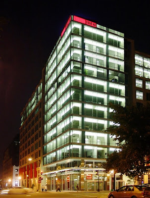
Practically speaking, the L’Enfant Plan, 1910 Height Act, and other local zoning ordinances cause most buildings in Washington to have broad floor plates, shallow floor-to-floor depths, and a single principal facade on the property line facing the street. Mid-block buildings are fully built to the property lines at either side, and corner buildings fill their lots and abut all street frontages. Few buildings are seen in the round, and if they are, their side and rear facades are typically designed to be secondary in nature. Because most developers want to maximize the building volume, very little sculpting is possible. Architects and critics complain that the building forms indigenous to Washington are retrograde, boxy, and uncool. Contemporary architecture provides few tools for designing the flat, horizontally-proportioned street facades of the typical buildings here. It can be difficult to make a building appear to soar when it’s as broad as it is high, and it is challenging to create a plastic, sculptural facade while also striving to achieve the absolute maximum enclosed volume. So many designers rely on traditional styles, or end up with something that looks like half a building from somewhere else. Despite the challenges of designing Washington facades in a contemporary fashion, leaders of the local Sacha Rosen R2L Architects, Washington DC height limits, Herzog de Meuron, Renzo Piano, Gropiusarchitectural community have produced some nice buildings. Shalom Baranes’ 22 West Condominiums is a nice geometrical composition in glass and dark metal; HOK’s International Brotherhood of Electrical Workers (pictured, at left) has the elegance of much taller glass boxes; Phil Esocoff’s curved brick and ornamental cast stone at 400 Mass Ave bring these materials into the 21st century. Although not yet in this city, international (star)chitects such as Herzog de Meuron, Renzo Piano, and Williams + Tsien have embellished other cities with beautiful, contemporary or avant-garde stand-alone facades which could stand as inspiration for future projects here. 

Design Opportunities 
Architects experienced with the Washington context are familiar with a number of design opportunities within the local regulations and traditions. The first is the concept of “spires, towers, domes, minarets, [and] pinnacles”, otherwise known as “rooftop embellishments” which are specifically allowed in the 1910 Height Act as exceptions to the height limits. Originally conceived to permit significant prominent features of governmental and institutional buildings (the Capitol dome and church spires, for example) to rise above the balance of the cityscape, the design community has capitalized on this exception for contemporary commercial buildings as much as civic ones. Unfortunately, some of these look like spiky halos (1980’s), luggage racks (1990’s), or the now-ubiquitous folded metal sunshade (2000’s). The second form-based design opportunity is the concept of “projections into public space,” permitted by the building code, which includes bay windows, balconies, canopies and marquees, cornices, beltcourses, and pilasters. Architects rely on these to add richness and depth to otherwise flat facades. We all love looking into the bay windows when we’re strolling among Capitol Hill’s townhouses; we don’t often notice how important these elements are on large buildings as well. Although these features are often criticized as overly traditional, good designers are able to stretch and reinterpret the rules in the name of plasticity and drama. What people don’t often recognize is that Washington’s zoning parameters and building height requirements also happen to embody a number of design- and form-generating features which are consistent with the fundamental principles of Modernist design, as formulated by Gropius, Le Corbusier and other masters beloved of the Dwell-reading set. Although thSacha Rosen R2L Architects, Washington DC height limits, Herzog de Meuron, Renzo Piano, Gropius, Washington DC commercial propertyese architects made grievous errors in urban planning (including Corbu’s demands to raze most of Paris in favor of a few highrise towers), their work in aesthetics and building design is still relevant and forward-looking. Horizontality, and not verticality, is one of the principal hallmarks of Modern design, in contrast to traditionalist styles. This is clear to anyone who has laid eyes upon the dramatic roof overhangs of Frank Lloyd Wright’s prairie style houses or the crisp geometry of Mies’ design for the iconic Barcelona Pavilion. In downtown Washington, the overall horizontality and coSacha Rosen R2L Architects, Washington DC height limits, Herzog de Meuron, Renzo Piano, Gropius, Washington DC commercial real estatemparatively short building facades are accentuated by the shallowness of the floor-to-floor heights, which results from stuffing a maximum number of floors under the height limit. To reduce the amount of height required for floor structure, almost all buildings tend to be constructed of flat-plate concrete slabs and columns, setting the stage for the realization of several other tenets of Modernism: “free-floating” interior columns unbound by the constraints of load bearing walls and exterior curtain walls free of structural elements. 

Rooftop Opportunities One of the most significant design opportunities seized upon recently by local architects and the development community is the building rooftop. This is not a Washington invention; modernists as early as Gropius regarded the flat roof as a “fifth façade,” a part of the building that would be increasingly visible from ever taller adjacent buildings and passing airplanes (or Google Earth, these days). To Le Corbusier, his urban plans notwithstanding, the roof was the focus of one of his canonical “five points” of modern architecture, and almost prophetically, he called for the roof to be planted as an elevated garden to replace the landscape claimed by the building’s footprint. Today, investment in time and effort required to improve a rooftop is justified by the Sacha Rosen R2L Architects, Washington DC height limits, Herzog de Meuron, Renzo Piano, Gropius, Washington DC commercial property for leaseprovision of additional building amenities, or simply an architectural gesture that will differentiate the building in the marketplace. A number of factors contribute to the design opportunities afforded by Washington rooftops. First, the general building massing determined by the height limits in conjunction with the L’Enfant plan produces relatively large floorplates, with the roof level similar in size to the typical floor. Although building mechanical equipment is typically located on the roof, this equipment is not overly large, since it serves a relatively short building. In fact, the size of the rooftop mechanical enclosure on most buildings is limited to 37% of the total site area, and 1/3 of the total roof area. Such enclosures must be set back from the edges of the building by a distance equal to their heights, and must be of a consistent height and of a material compatible with the main building exterior. Therefore, at least 2/3 of the roof area, and typically the entire perimeter, is open to the sky. This amount of open area presents a veritable creative playground to a design-minded architect. Until several years ago, the zoning regulations required residential buildings to provide a certain amount of residential recreational space, a significant portion of which had to be located outdoors. Because most buildings almost completely cover their lots in the downtown core, this outdoor recreation space was typically located on the roof in buildings. At the same time, the interior space of the mechanical penthouse was specifically prohibited from including any space for “human occupancy.” Recently however, the recreational space requirement has been lifted, coinciding with an easing of the strict rules governing the permitted uses within rooftop structures. First modified to allow uses appurtenant to outdoor recreational facilities (such as showers near outdoor swimming pools), the regulations now permit a wider range of recreational facilities on the roofs of apartment houses and hotels, including fitness centers, bars, and party rooms. To enhance the quality of rooftop spaces, some designers have included plantings and gardens on building roofs for many years. Today, the more stringent requirements for stormwater filtration and retention, as well as requirements and market demands for environmentally sustainable projects induce the industry to provide substantial vegetated roofs on many projects. Buildings with minimal occupant roof access typically have extensive roof plantings (think sedum or turf), while buildings with significant occupied roof terraces are provided with a combination of intensive (think trees and shrubbery) and extensive vegetated areas – the latter also provided on the tops of mechanical penthouses. 

Rooftop Panorama 
Many of the rooftops in the downtown core are within one or two stories of each other in height. They are quite large, and increasingly provide substantial vegetation. A few roofs have significant access for residents, workers, and guests. As a result, there is a potential for beautiful vistas from each rooftop to neighboring buildings, an overall urban amenity created by the prevailing height limit and related planning context. This elevated garden plane is not so high as to be disconnected from the extensive system of street trees in the city, which already helps make Washington one of the greenest cities in the world. In addition to the visual and social aspects of this rooftop garden plane, these green roofs have an increasingly significant impact on the environmental sustainability of the city. Such roofs mitigate heat island effects, manage stormwater runoff, provide building insulation, and present a use for treated grey- and blackwater systems within buildings. The potential for such an extensive system of rooftop plantings suggests that there may be additional opportunities for a true ecological impact, as flora and fauna adapt to this unique elevated landscape. What could be greener or more sustainable than this rooftop panorama? Let’s embrace the opportunities provided by our building height limits, and continue to develop our own unique architectural language and urban design sensibility. No other city has the potential for the reintegration of plants and landscapes into a dense urban environment on such a grand scale. And this sustainable vision is only possible as a result of our building height limits and urban plan.

Sacha Rosen is a Principal of R2L:Architects, a firm specializing in the architectural design of multi-family residential, commercial interiors, and institutional/higher education projects in the Washington DC area. Sacha has ten years experience in architectural design, including eight years of project management experience on multifamily residential, urban mixed-use, commercial office, chancery, hospitality, and campus planning projects. He has a Master of Architecture degree from the University of Oklahoma, where he also taught courses in the history of architecture.

Tuesday, June 01, 2010

Gehry to Brief DC Planners on Eisenhower Memorial

6 comments
"Starchitect" Frank Gehry briefs The National Capital Planning Commission (NCPC) on his design concepts for the Dwight D. Eisenhower Memorial this Thursday at 12:30 PM at 401 9th Street, NW (Suite 500N).

A major player in the 1980s "Deconstructivism" movement in architecture, Gehry is perhaps best-known for designing the Guggenheim Museum in Bilbao, Spain.

Before being selected as designer on the $90-120 million project early last year, Gehry had to duke it out with architects like Moshe Safdie in a multi-stepped, General Services Administration Design Excellence competition.

The Eisenhower Memorial Commission - a 12 member, bipartisan group that includes senators, representatives, former presidential appointees, and President Eisenhower's own grandson - selected their preferred, Gehry-designed memorial just this past March.

But before the Eisenhower Memorial Commission's "tapestries of woven stainless steel mesh supported on the colonnade of limestone" can depict images of Eisenhower’s life and become a four acre reality along Independence Avenue, there must still be many, many meetings with Federal agencies and planners.

According to NCPC Public Affairs Specialist, Stephen Staudigl, Gehry and team will have to present "three design alternatives" including the Eisenhower Memorial Commission's front-runner to the NCPC on Thursday. And while this meeting will just scrape the surface of the three-part, NCPC design review process (read: no concept modifications or rulings to see here yet), the public meeting offers architecture buffs and interested citizens alike the chance to hear how a giant in the world of architecture goes about envisioning a $90+ million presidential memorial. According to the Eisenhower Memorial Commission:
This design not only creates a gathering place for memorial visitors, it also represents Eisenhower’s ability to bring people together to achieve goals on behalf of the citizens he served. From a central location featuring a grove of oak trees, visitors will move to different parts of the memorial, where themes from Eisenhower’s life will be presented. The selected design concept includes columns along the north and south edges of the site, paying homage to the memorial traditions of the Lincoln and Jefferson memorials, while respecting the historic vista along Maryland Avenue.

As for the long-term project forecast, Octavia Saine, Deputy of Public Outreach for the Eisenhower Memorial Commission, tells DCMud that the tentative plans are to have NCPC's final concept design approval by fall 2010, to begin construction by 2013, and to unveil the park for the public on "Memorial Day 2015."

Washington DC Real Estate and Development News

The Limits of DC

23 comments
100 years ago today, Congress passed the Heights of Buildings Act of 1910, a law that has done more than any other to shape the physical environment of Washington DC. The effect has been dramatic - not just on heights - but on architecture, density, land values, even on the city's collective psyche. Much has changed in the intervening century, but the rules have been modified little.

In honor of the June 1st centennial, DCMud will look at the issue of density and DC's height limits, presenting varying opinions on its effects, architecture, and desirability.

A History

No, the height limits are not based on the height of the Capitol dome (at 289 feet high, the 5th tallest structure in the city), a persistent myth. Instead, the 164-foot Cairo Apartment Building (subsequently the Cairo Hotel, now a condo) at 1615 Q Street, NW, aroused the reactionary rules when architect Thomas Franklin Schneider built the Egyptian-inspired building in 1894. Responding to petitions, city Commissioners issued rules limiting building heights, later codified by Congress in the Heights of Buildings Act of 1899, setting maximum height of 110 feet for business and 90 feet for residential projects. The 1910 Act modified the law in several important respects, most notably by permitting heights to rise not past 130 feet, but setting a formula to determine site-specific maximum heights equal to the fronting street width plus 20 feet, judged from the sidewalk, though many sites are sub-zoned for still lower density. An exception still exists for such architectural embellishments as spires and belfries.

Much has changed since 1894 when the Cairo ignited the debate - when Grover Cleveland was President, DC's Commissioners were unelected, and the District didn't even have a vote in Congress (imagine). Few DC denizens are now as shocked by the height of the Cairo as were their 19th-century predecessors. Building construction has progressed dramatically beyond the steel-frame and limestone-brick pile architecture of the Cairo. Firefighting ability, an issue when the Cairo crested above the reach of fire ladders, has likewise adapted to higher structures.

The Plan

Given L'Enfant's sacrosanctity, it should be noted that building height limits at the time the L'Enfant plan was adopted, naturally low due to construction limitations, were never officially part of his creation. Parisian Pierre L'Enfant envisioned the sprawling, low-flung buildings and wide boulevards of his native capital, while President Thomas Jefferson, an extreme Francophile, also dreamed of Paris on the Potomac, providing L'Enfant with inspirational maps of European cities with buildings that hugged the ground (wanting buildings "low & convenient, and the streets light and airy"). Still, formal limits or guidelines were never established.

With the march of technology, the District's earliest architects were without compunction in designing buildings to the upper edge of physical limitations, with no apparent regard for nostalgia. Some of the earliest buildings reached upward unhesitatingly - The Smithsonian Institution Building (begun 1847, 145 feet), Healy Hall of Georgetown (begun 1879, 200 feet), the Old Post Office Building (begun 1891, 315 feet), and of course the U.S. Capitol Building (298 feet).

That Was Then

Proponents of change point to the ever taller buildings creeping up literally on the DC border in Silver Spring, Rosslyn (see Central Place, at right), Alexandria, and Chevy Chase, and with them architecture, development, residents, jobs, and city views denied to DC. Urban planners, preservationists and greenies alike argue for greater density ("if you love the country, live in the city"), a position that also offers a strong economic punch while slowing sprawl. That the law is imposed from without raises the neck fur of DC's voting rights activists who prefer a little more self- determination than that.

Yet it must be admitted that DC is not just another urban environment devoid of national significance. Its existence owes to the founders' desire for an independent district; a national model as a symbol of democracy and showpiece for America's (then) novel experiment. DC is, after all, the only city designated by the U.S. Constitution.

Others prefer DC's uniquely stubbly skyline, greater green canopy, and open, sunny streets. Height limits provide a backstop (if also an upper limit) for property values, limiting developable land and with it competition for developers and landowners. And whatever its initial demerits, DC's low-rise viewscape has become part of its identity as a livable, European-style metropolis.

An Experiment Subject to Change?

If both arguments have some potency, are the two sides condemned to an intractable, Whitehurst-like eternal battle over the issue? Compromise, if there were to be any, would be unlikely to radically change the downtown federal core in an era of accelerating security. Nor are residents of historic neighborhoods like Georgetown or Capitol Hill clamoring for towers in their midst. Others, however, have painted themselves as underserved by the development community, retailers, and entrepreneurs. Marshall Heights and Deanwood - farther from the Capitol building than Rosslyn - have limited claims on the character of DC's downtown skyline. Advocates in both neighborhoods have bemoaned the lack of investment, retail and sit-down restaurants. Taller buildings don't remedy such shortcomings intrinsically but, carefully planned, can increase density to a tipping point that attracts other economic investment.

Raising height limits in select locations could alter the investment dynamic in overlooked neighborhoods, creating entrepreneurial zones, a concept that has worked in numerous struggling cities. Washington DC's "Gateway" avenues present a vexing argument against the status quo: wide, heavily trafficked streets with commercial cores, Metro stations, and less restricted buildings heights one stoplight away. Paris, after all, has Le Defense (at right), a skyscraper-friendly district which only serves to underscore the aesthetics of central Paris and serve as an economic engine for the city of light.

DC has several such zones. East Capitol Street at the PG County border presents a high-speed thoroughfare, Metro station, and yet struggles to find the investment capital to finance its projects. Absent a raison d'etre, Capitol View Park Towers (at left) and Capitol Gateway struggle for existence in a low-density neighborhood, with development on hold.

Georgia Avenue at the Silver Spring border is a dream case study. Farther from the Capitol building than Old Town Alexandria, the two Georgias present a stark contrast - downtown Silver Spring, where painstaking planning has led to a dense and finally vibrant, livable urban core - and its DC root, which lives up to (and then some) its south-of-the-border locale.

Wisconsin Avenue at the city's northwestern terminus presents a different contrast. While the corridor does not want for high-end retail, apartment buildings, office towers, retail, hotels and supermarkets are springing up on the Chevy Chase Maryland side, while on the District's flank development languishes, save an undersized, wood-framed condo, sneaking in by not seeking increased density. Lots above the metro sit vacant or bear empty two-story parking pads, or serve as surface parking for a bus depot. Attempts at development, in spite of zoning approval, are allowed to be vetoed by single-interest groups who protest heights less than half those that exist two blocks north. Density caps on each of the lots render them not quite ripe for development.

Opponents of change need not worry about 50 stories rising in their Palisades backyard or soaring towers blocking off the Mall. The District's zoning authorities would administer appropriate zones for increased height, historic protection, architectural review and case-by-case examination. Modifying the height ban would, in any event, allow the District to make such determinations, making this debate not just an academic one.

Monday, May 31, 2010

Yet More NoMa Residents

1 comments
Noma real estate development Washington DC, GTM architects, ADC BuildersJust a few days after NoMa announced its first new housing in a century, the downtown DC neighborhood will get yet another bump in residents with the opening of The Loree Grand on Tuesday. The Loree Grand at Union Place is the first phase of the Cohen Companies planned Union Place development, which is intended to deliver more than 700 new Noma real estate development Washington DC, commercial real estate brokerapartments, 9,000 s.f. of retail, a daycare center, and central courtyard open to the public. The Loree Grand, named after local resident Loree Murray who fought local gangs and drug-dealers and had her home firebombed as a thank-you, is the only portion of Union Place to begin construction so far. The opening of the apartment building brings 212 new rental units to 250 K St., NE, with 173 parking spaces in two levels below the 10-story frame. The building, designed by GTM Architects and built by ADC Builders, began construction in July 2007. The bulk of the 212 units are variations on 1-bedroom apartments with the remaining 30 units in various 2-bedroom configurations. The first two floors attempt to replicate traditional Washington DC row houseNoma real estate development Washington DC design, with entrances both on the street and from the interior. Cohen did not pursue LEED certification on the building, but the building does support a green roof. Two weeks ago the Loree Grand began taking initial applications from artists for 30 artist-designed apartments, thanks to a partnership with the Cultural Development Corporation. Phase II of Union Place is currently on hold. Cohen also built the Velocity Blake Dickson Real Estate brokerage, Loree Grand, northeast DC, retailcondos in the Capitol Riverfront (ballpark) neighborhood, and is exploring another mixed-use project at 14th and Virginia Avenue, SE. 

Washington, DC real estate development news

Friday, May 28, 2010

NoMa Bulks Up on Student Housing

2 comments
NoMa's population just increased ten-fold. On Wednesday, 317 students moved into The Washington Center's student dorms - no, wait - "residential and academic facility" at 1005 Third Street, NE. Sure, it may be a large group of temporary students, but when your entire neighborhood consists of less than enough people to fill a Metro bus, you tend to count these things.

The residential center, in NoMa's sparser eastern section, is provided by a non-profit that places an international array of students into DC-area internships. The students are NoMa’s first residents in more than a century, according to the Business Improvement District, adding to the 40 or so residents that currently live in townhouses within the BID. The project, designed by Davis Carter Scott, broke ground just last spring.

The population figures may be a bit misleading, as the gerrymandered BID boundaries narrowly miss several large multi-family housing projects such as Senate Square. NoMa BID reps hasten to add that "9300 people live within half a mile of NoMa," and office buildings are going up everywhere, so don't get the wrong idea, the place is hopping. But soon technical geographic distinctions won't matter; Constitution Square - one of NoMa's largest projects - will begin renting its 440 apartments late this summer, and the Loree Grand will also soon open its doors to 212 new residents across the street from The Washington Center.

The $38m project was developed by Paradigm Development Company, and will be sufficient to provide for approximately 80% of the interns drafted by the TWC each year, who are currently housed in apartment buildings throughout the area. In addition to the college-style design elements like shared kitchens, shared rooms, high speed internet and the nostalgia-inspiring common areas, the building will also offer classrooms, offices, a large auditorium space, a computer lab, a fitness and a lounge area.

Washington DC real estate development news

The Family Man

0 comments
He opens the gate, inadvertently flashing a purple cartoon band-aid on a finger of his left hand. David Jameson, architect and family man, self-described "enactor of change" (his definition of an architect), welcomes a visitor to the iconoclastic Jigsaw Residence he shares with wife Nancy and their two young children.

"This is not a big house in the world of Bethesda or D.C.," Jameson says of the soaring, 3,000 s.f. home his firm, David Jameson Architects, originally built for a client from the foundation and exterior walls of a post-war rambler. But in this nondescript Maryland neighborhood, Jigsaw Residence looms larger than life. And for Jameson, who grew up on Maryland’s Eastern Shore eagerly anticipating his local newspaper’s “Associated Press House of the Week” (something he’d always redesign), the home represents a lifetime of invention.

The View from Within

“I actually grew up in a pretty cool house myself,” Jameson recalls. “It was just a simple, single level house, but it was on a fresh water pond and the whole back was glass. Whoever designed that house, though it was very modest, knew that the value or pressures of that site were all about the water,” he continues, “so they made the back of the house tremendously open and porous.”

Sited on a busy suburban corner, and despite its 22-or 24-foot ceilings (Jameson wasn’t sure which), clerestory windows and prolific use of glass, Jigsaw Residence’s “views” include traffic and a series of redundant, characterless, corner-to-corner post-war ramblers and other reasonable facsimiles. With that in mind, Jameson splayed the house around a central courtyard from which, thanks to the glass walls, views of nearly every room are visible, as is the courtyard from the rooms. In this sense, the house embodies the concept of reflectivity.

“You’re both inside and outside and back inside again at once,” Jameson says, speaking to the juxtaposition of wall and glass, solid and void, that create a relatively unobstructed view without being directed outside to the street. “When you look through the etched glass wall of the stair tower, there’s a house 15 feet away, but you don’t feel it. When you’re in the living room, there is tons of glass, but it either looks toward the courtyard or looks toward the sky, above the houses outside,” he adds. As a result of its glass-to-wall ratio, a choreography of light, dark and shadows, which Jameson calls “tenebroso,” permeates and transitions through the house throughout the day, also directing its inhabitants’ interests away from the street.

Are You Experienced?

Inspired largely by his children, Jake, 4, and McKenzie, 7, the latter of whom he says constantly sketches and reinterprets things and can write almost the same story, week after week, “but with a different sort of experience,” Jameson – who closes his office early on Friday afternoons to be with them – defines his work as “experiential.” At the Warp and Weft carpet showroom in the Washington Design Center, its design is the antithesis of the way carpet showrooms are presented throughout the world, Jameson explains, noting that at most, one walks into them only to see massive piles of carpets that must be navigated and peeled back, but not easily removed from their stacks.

At Warp and Weft, Jameson incorporated ripsawn oak flooring, much like clients would have in their own homes, with carpets displayed as compelling “architectonic elements.” The carpets can then be pulled out and spread on the floor, as if in the customer’s own residence, for full effect. The showroom’s entry – a departure from conventional entrances where the prospective customer can actually choose to walk past – is an arch “where the ramp becomes almost a sculptural wave, skateboard ramp, fashion promenade, ledge for various types of chairs,” and which draws the client into the space. “Before you know it,” Jameson says, “you’re half way in to the showroom.”

Likening his brand of experiential architecture to the pre-war 1939 Steinway Model S piano in his home that replaced a less formidable instrument, Jameson calls the piano an art object. “When we pulled the old one out and put the new one in, you just hit the note once – you touched the ivory key – and you heard it. It’s indelibly different – a marking of space and time – a quality-driven experience emblematic of the way I think about architecture,” he said. A set of 1949 Hans Wegner chairs, their style made famous in the 1960 Kennedy-Nixon debates, punctuate the Jigsaw Residence’s dining room, something Jameson also calls “experiential, beautiful, compelling and poetic.

“If you look at the structure of these chairs - the arms in the back and the way they’re crafted, where it curves from the flat to the vertical - they’re at one with one another and they sort of nest together,” he explains. “It’s an experience by a furniture master from Copenhagen.”

Hearts, Souls and Renderings

Defining his practice, Jameson describes it as “somewhere between analog and digital,” and also “non-linear.” With sketching, testing, “recriminating of original thoughts” as much a part of the process as the use of 3D modeling software, Jameson also compares the firm’s work to an EKG. “The work gets a little better, then we learn something about it, and it goes backwards, gets a little better, goes backwards. There are many iterations,” he says, recalling a singular quote from a client who, at the end of a long project, said, “It’s nothing of what I expected, but everything I was expecting.”

Practicing since 1998, Jameson, who traded visions of a career in major league baseball (he went to Virginia Tech on a baseball scholarship) for a profession he calls “not so much a profession but a way of life,” reveals he would love to live in every project his firm designs. “There’s a part of my soul and a part of the client’s soul left in every job,” he says. “Building projects is a journey in life, not a business deal. It’s stressful because it’s about sums of money that are not inconsequential; there’s a lot of importance to almost every decision…Transforming the built environment is time consuming – emotionally-laden with the time, the cost, things that can go wrong. It’s tremendously rewarding, but not for the faint of heart.”
 

DCmud - The Urban Real Estate Digest of Washington DC Copyright © 2008 Black Brown Pop Template by Ipiet's Blogger Template