Monday, March 21, 2011

13th Street Hotel: Signs of Life?

14 comments
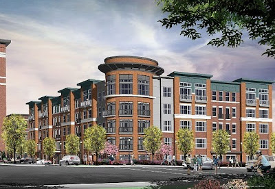
Though early plans, enthusiasm and controversy took off like a shot for 1310 U Street, plans for JBG Companies' Four-Star, U Street Hotel project fizzled with the economic downturn. Despite radio silence since 2009, the project is seeing early signs of resuscitation in the form of renewed design activity.

But surely a Goliath like JBG has access to the funding it needs, right? "JBG, like anyone else, had been affected by the downturn," said Matt Blocher, Senior Vice President of Marketing for JBG. Blocher did not confirm whether the project is now adequately capitalized, but that it's seeing signs of life is prima facie evidence that funding has arrived, and behind it, development.

Plans for the hotel are "actively in the design phase," said Blocher. Under the original plan, the hotel at the site of the Rite Aid on 13th at U Street was proposed as a ten-story LEED-Silver certified luxury hotel with 250 rooms, 23,000 s.f. of retail, and 4500 s.f. of conference space with an art gallery, spa and fitness center, restaurant and stacked parking. To appease community concerns, the planners trimmed it to nine stories when the building was called "a collossus" at an ANC meeting to suss out the plans. The Rite Aid that currently occupies the corner would be moved to the hotel's retail space. David M. Schwarz Architects was selected for the original design.

It will take awhile before the party starts: groundbreaking likely won't occur until the end of 2012. The scope of the project is what will account for the slow roll out, and the site will need to be rezoned, says Blocher.

JBG is also investing just a stone's throw from the proposed hotel, with the 125-unit 14th Street District Condo project for which initial demolition commenced this past January.

Washington, D.C. real estate development news

Saturday, March 19, 2011

Afirmar Argentina!

4 comments
Washington DC interior design journalBy Beth Herman
For Morrison Architects, renovating the baronial Argentinian Embassy wasn't their first rodeo. Located at the corner of 1600 New Hampshire Ave. NW and Q Streets, veteran embassy architect Eric Morrison said that per the original design, the unique angles of the site were manifested Embassy of Argentina, Dupont Circle, Washington DC, Morrison Architectsbeautifully inside the "proud and significant" structure. At the same time, the building was badly in need of a more contemporary office design, updated HVAC and electrical systems, energy efficient lighting, fire safety elements and cutting-edge technology, with the challenge to preserve as much of the original turn-of-the-century grace and patina as possible. "Everyone has visions of Buenos Aires with these old buildings," Morrison said. “The Ministry of Foreign Affairs’ (who is Morrison’s client) own building in Buenos Aires is a fantastic old building with top-of-the-line systems right now, so we wanted to do that. We didn’t mind if the old wood had high heel marks – maybe that was from the tango over the years,” he posited. Even so, Morrison said the structure had not been touched very much since it was built and in many places moldings, trim and cornices were clearly deteriorating. “It needed to be brought back to its original glory,” he affirmed, identifying Monarc Construction as a vital partner in the Embassy’s overall redesign, renovation and restoration.Embassy of Argentina, Washington DC Comenzamos (we begin) Initiated in 2006, a phased renovation of the approximately 40,000 s.f., four-story, 32-room occupied space involved deft relocation choreography of the ambassador, diplomats and support staff from floor to floor during construction. In both the Embassy and the ambassador’s residence, the latter of which the architects are just beginning to renovate, the piano nobile (or main floor) is on the second level. In the Embassy, this space is devoted to the ambassador’s office, his secretary’s office and a few Argentine embassy in Washington DC - design principalsmeeting or ceremonial rooms. The “newer” oval salon, a 1930s addition, is also on the second floor, with diplomats and support staff working one floor above. According to Morrison, when the time came for (now former) Ambassador Hector Timerman to move temporarily upstairs, in the end he’d become so comfortable on the diplomat’s floor with its new lighting, data communications and HVAC system upgrades he was reluctant to leave. Where lighting was concerned, original sconces and some of the older chandeliers were restored. Offices received suspended TA fluorescents by Lightolier that bounce light off the ceiling and also channel it to the bottom. According to Morrison, when the project was conceived, neither CFL’s nor LED’s were mainstream even to the point they are today. With energy efficiency naturally targeted, the building had an old gravity heating system and had not been designed for ducted a/c. The challenge, Morrison said, was to incorporate HVAC changes without ponderous bulkheads. This was achieved by either hiding ducts with built-in shelving on the ground floor to heat and cool it and the second floor, or by utilizing various leftover attic shapes and chases in the original plans, due to oddities from angles created by New Hampshire Ave. and Q Streets, to impact the third and top floors. 

Las Ventanas, colores, espacio y mas (windows, color, space and more) Regarding the Embassy’s century-old windows, HPRB mandated restoration vs. replacement, largely in regard to the wood, which was a big undertaking, Morrison recalled. As such, among other tasks, weather stripping was applied and improved thermal quality (the windows had none) was achieved. Embassy design in Washington DCSixteen marble fireplaces were generally left alone, except for epoxying existing cracks, and where larger rooms and spaces had been chopped up the Embassy was persuaded to open them up again, with the inclusion of more modern work stations. Yet to be installed, anticipated Herman Miller and Knoll furniture systems will accord a little more privacy to staff members who desire it, with the design lighter than traditional, cumbersome Embassy furniture. “Colorations were another big part (of the process),” Morrison said, adding that walls had a faux antique quality as though someone had purposely given them a distressed look. Desiring the same crisp and clean aesthetic as when it was newly built, the Morrison team, which also consisted of Principal Pamela Rodriguez and project architects Miriam Frank and Ryan Sullivan, opted for simplicity instead.Embassy of Argentina, Dupont Circle, Washington DC, Morrison Architects Espiritu de la madera (spirit of the wood) In paneled rooms, Morrison said the original architect had used quartersawn oak, which of course implied old growth in terms of any effort to match it today. Unfortunately, over the years workmen had destroyed some of the paneling during various repair projects, replacing it with rotary oak plywood or Home Depot Embassy of Argentina, Dupont Circle, Washington DC, Morrison Architectsplywood instead of acquiring the right quartersawn, Morrison observed, all of which had to be rectified. “We didn’t want to just sand this wood down and then lose the quality or patina it had gained over 100 years,” he said. Floors and doors were also quartersawn oak, with the latter cleaned and waxed as opposed to staining. The floors were in relatively good condition, though the oval salon’s herringbone pattern had to be replaced (with a similar pattern) because it had settled eight inches at one end. Leveled within the room, molding, trim and wainscoting had to be adjusted accordingly. Original staircases, in good repair, were also quartersawn oak, and a new utilitarian exit stair providing a second egress was added at the rear of the Embassy. 

El teatro y exterior (the theatre and…as it says!) 
As the Embassy’s ground level contains an active, 50-seat movie theatre and entertainment space where D.C.’s Argentine community congregates, updates included a built-in screen and state-of-the-art audio visual system to enhance events such as last year’s World Cup. On the building’s exterior, a rapidly deteriorating cornice – one of the Embassy’s largest features – had been covered with a protective screen for a couple of years, as pieces were falling to the ground. “We had to change the modillions, with Monarc’s craftsmen, and also the florets,” Morrison said of the endeavor, also recalling that in many instances Monarc was charged with the Washington DC retail and commercial property development newspainstaking reproduction of century-old plaster molding inside for continuity purposes. The team also removed nearly all of the roof’s slate tiles and then replaced them again, following repair of the substrate and the addition of a waterproof membrane. “We had just a little bit of new slate where we lost some pieces in the back, where you don’t see it,” Morrison said, adding that the new slate is recovered material. “Overall, it acts like a modern-day embassy – it has everything – it’s a nice, modern office building,” Morrison said, “but we like to think we’ve maintained the quality it had before.” 


Friday, March 18, 2011

Largest Residential Development in Years Breaks Ground in NoMa

24 comments
One of the largest single-phase residential developments in the city's recent history broke ground in NoMa this week. Mill Creek Residential Trust LLC will build NoMa West, three five-story buildings on a 4.3 acre site that will add 603 predominantly market rate apartments to the burgeoning neighborhood. The Preston Partnership LLC is responsible for the design, and R.D. Jones & Associates will do interior work.

Formerly owned by Trammell Crow Residential, which had promised work was "imminent" at several points in the past, the land was transferred by two former principal partners who left Trammell Crow to join the Dallas-based firm. Financing was orchestrated through Berkshire Income Realty and PNC Bank. The site was purchased in 2007, at which point the developers adjusted the 2005 PUD to what amounts to the current plans.

"We are lucky to have weathered the storm that has halted so many development projects in the area and around the country," said Sam Simone, Managing Director of Mill Creek Residential Trust LLC. "We're also lucky to be developing in a city that's been as protected from the economic downturn as Washington, D.C."

Positioned at Eckington Place immediately behind the FedEx shipping center, within the NoMa BID, Q Street will run through the development (see map), allowing for the creation of a pedestrian thoroughfare between the three buildings, which "actually look like six, because we wanted to break up the elevation," said Simone.

Building 100 (for now, until it's renamed) offers warehouse loft designs while Building 200 features more glass and a modern feel. Building 300 is parsed in two parts: one offers traditional rowhouse architecture while the other riffs on the modern design of Building 200. Amenities for the complex include two pools, two club rooms, a media theater room, a small park, and e-lounge, not to mention a paltry 1250 s.f. of retail - downsized from the initial plan for 15,000 s.f. unveiled back in 2006. Simone anticipates the project will span three years to complete.

Development has been a musical chairs game, with owner CSX having selected Fairfield Residential to build the project in 2004, before handing off to Trammell Crow, with each successive developer intending to begin construction in the short term.

Washington, D.C. real estate development news

DC's Ugliest Condo, A Princess No More

9 comments
The Park Princess, which may well be Washington D.C.'s ugliest condo (prove us wrong), has been dethroned. Not by a less appealing condominium (though some developers are trying hard), but by owners, who no longer felt the name suited the association, and have rechristened the building at 13th and N Streets "Logan Park", its original name circa 1981. After several years of wrangling, the condo association has voted internally for the change and navigated city bureaucracy to facilitate the new nomenclature, as if whiting out its inglorious presence with the branding of its now hip neighborhood. The association is also in the midst of a modest renovation of the condo's common areas and elevators, though the exterior will remain, alas, unchanged. The old name "just wasn't appealing" said Jordan Stuart, a real estate agent who lives in the building. "No one knows who the princess was." Stuart doesn't support the building's aesthetic superlative ("there are plenty of Foggy Bottom condos that are uglier"), but isn't heedless of its reputation "we do recognize the curb appeal issue," said Stuart, who adds that the building has positive attributes (from the inside). "You have to appreciate the roofdeck." As Parisians say of the Eiffel Tower, it offers the best views in the city, principally because its the only place in Paris where you can't see the tower. 

Washington D.C. real estate news

Thursday, March 17, 2011

St. Patrick's Day Special: Kelsey Gardens for Sale

5 comments
Kelsey Gardens is for sale. Well, still. Okay, erstwhile developers of the 280 unit apartment building in Shaw's burgeoning development strip put the property on the market exactly one year ago, but now are rebranding - just a bit - their city-sanctioned project next to the (possibly, someday) O Street Market.

Metropolitan Development had enlisted the help of Ideal Realty Group in March of 2010 to market the fully entitled project, which had been rebranded from Kelsey Gardens of low-income, crime plagued housing project fame, into Addison Square, a new mixed-income project embodying more modern concepts of lower income housing. Metropolitan sought a joint venture partner, financier, or outright sale of the property. But one year in, Metropolitan has dropped Ideal Realty in favor of MAC Realty Advisors, and dropped Addison as a marketing name.
Kelsey Gardens adjoins the O Street Market along 7th Street as would be projects looking for a suitor but - also along the 7th Street corridor - the new Shaw Library, Progression Place (underway), Howard Theater, and 2 potential housing projects at 7th and Rhode Island (1, 2)

Metropolitan paid $7m for the property in 2004, and has secured from the city $18 million in tax abatement, as well as a zoning change to allow the density in the form of a Planned Unit Development - with the catch that 54 of the 280 units be set aside for tenants making 60% of AMI. A sale of the property would require a purchaser to follow the plans, or be required to start the zoning process anew. Bruce Levin of MAC says his brokerage has compiled a substantial portfolio of apartments since its inception just a year ago, including View14 which is also on the market, but pulls no punches about his predecessor's inability to sell the plans, calling the past year "the low point" for marketing such projects. "But the market is very robust right now," says Levin. "We're crushing it" he says of the firm's portfolio.

It wasn't supposed to take this long. Neat signs still announce the project "Coming in 2010", and Metropolitan Construction Manager Jim Wurzel said in January of 2010 that he was "hoping we can start construction this summer." But ANC Commissioner and Shaw Main Streets founder, Alexander Padro was more sanguine at the time."We're probably talking 2011 or 2012 before anything is even torn down."

Lessard Architectural Group designed the project, which will (theoretically) include 14,700 s.f. of retail space along 7th. For the sake of Shaw, let's hope MAC crushes it here, and quickly.

Washington D.C. real estate development news

Neighborhood Report: Capitol Riverfront Southeast

9 comments
"Our neighborhood is no longer emerging," said Michael Stephens, Executive Director of the the Capitol Riverfront Business Improvement District. "It has blossomed." Stephens cites 35,000 people who commute to work in the area every day and the rising number of residents to buttress the growing retail imprint just north of the Anacostia River.
Retail, restaurants and office space leases are filling in at a more rapid rate than counterpoint emerging neighborhood NoMa, where the snap-up of square footage has been dominated by office leases. Sexier retail - even indie tenants such as as Pound Coffee have defected to Capitol Hill, while Capitol Waterfront is a hot commodity for retailers.
It helps that temporary projects draw the young and artsy to the water - Trapeze School Washington, Sensorium Dining and Art at the Yards generate buzz. Then there's the developing Canal Park that's scheduled to open in May 2012, Yards Park which opened last year, and Diamond Teague Park that was completed in 2009. In the meantime, enter the bridge to connect the two parks. And of course there's the ball park.

Many completed office buildings have lassoed tenants. Monument Realty's 55 M Street S.E. is 86% leased, with tenants such as the FAA and DDOT. Several D.C. government offices plan to move to the neighborhood in the second quarter, and this month Booz Allen Hamilton moved into 20 M Street, bumping the building to 97% leased. And 1015 Half Street, the former Opus East LLC and Prudential Real Estate Investors partnership that was resuscitated by Skanska this past May, is slated to open in July.

Both
Lumber Shed at The Yards Park Pavilion and The Yards Boilermaker Shops are among the most anticipated retail projects. Both buildings - the Lumber Shed at 100 Water Street and Boilermaker Shops at 200 Tingey Street - are part of the National Register of Historic Places, with Forest City Washington as developer and Gensler shepherding construction and design. Among other tenants, Neighborhood Restaurant Group has signed a lease for a restaurant that's expected to become a brewpub. According to Ramsey Meiser, Senior Vice President of Development at Forest City, 50% of the Lumber Shed and 70% of the Boilermaker Shops leases are tied down. Estimated opening date is early 2013.

Over at 400 Tingey Street S.E., Michael Stevens confirms that "a major health club" is signing a lease for 30,000 s.f. of this Forest City cite; sources tell DCMud that said major health club is VIDA Fitness, and that the lease is a done deal.

Also destined for the block at 401 M Street is a 50,000 s.f. Harris Teeter, above which will rise two residential towers with 220 units, with 20% affordable housing, also by Forest City. Environmental remediation will continue through the year with construction is expected to begin in the spring of 2012.

The big news as far as grocery stores in the area has been the potential for a Whole Foods at 800 New Jersey Avenue, S.E., however, the developer William C. Smith + Co. and the grocer are looking for tax abatement to the tune of $8 million over ten years. The groups have apparently been discussing a store for the site since 2002. With a city handing out tax breaks to far less game-changing endeavors - but now strapped for funds - the plan is still given better than even odds.

Among residential options, of Capitol Quarter's EYA development of 113 homes, phase I has sold out, and the 130 homes of Phase II are on the market now, with a move-in date of June 1. Construction had started in 2008, with Phase I construction completed in May of last year.

Other apartments include the off-then-on Foundry Lofts project at 201 Tingey Street S.E. which will offer 10,000 s.f. of retail and 170 market rate units. Forest City was able to resume building in September of 2010 as a result of President Obama's New Issue Bond Program (NIBP) that allowed for the D.C. Housing and Finance Agency (DCHFA) to fund the project and kick it forward. Leasing will begin this summer, with move-in likely in October.

In a holding pattern are several other projects awaiting financing. They include Factory 202, the SK&I-designed building that had been home to Federal Protective Services which was to have become a condo building. Forest City is still entertaining other plans for the site, but as of now it is considered a building for a later phase of development.

Though Monument Realty's 55 M Street is filling up, there is no start date for the hotel or residential buildings at Half Street since funding has not been secured since Lehman Brothers' exit. The grand plans for this property tanked with the fall of the economy, leaving a crater sized hole in 2008.

Akridge's Half Street mixed use office, residential and retail tower is also on hold, as developers are in the process of securing an office tenant. "We've just picked things up again in regard to design," said Kathy McDaniel, Project Administrator for Akridge. "Three months from now, we will have more progress to report."

Still on the boards is the CSX plan to widen its rail lines that run under Virginia Avenue, which is not marketed as loudly, partly because it will be some time before the location will be affected. A $98 million TIGER grant will raise the clearance in 38 locations in three states; 23 more need to be funded and amended before the bigger clearance allows for taller trains. The Virginia Avenue tunnel is among the largest and the most expensive pieces of the project.

Washington, D.C. real estate development news

Wednesday, March 16, 2011

8021 Georgia Ave. to House Apartments by Priderock Capital Partners and DLJ Real Estate

13 comments
Last week, Priderock Capital Partners LLC and DLJ Real Estate Capital Partners officially broke ground on apartments at 8021 Georgia Avenue in Silver Spring, a nine-story complex that will offer 210 units and two levels of underground parking. The complex will be comprised of two older buildings already on the property and a new one that broke ground on the 1.88 acre site last week.

Building will unfold in two phases: new construction, followed by building rehabilitation of the remaining structures. During the first phase of building, as the new structures are built, the older buildings will be cleaned of asbestos and brought up to code. BEK Construction Management Group has been awarded construction for the project and The Preston Partnership will helm design.

"This complex will be a place where middle class, working people can live without having to own," said George Banks, co-founder of Priderock. "That's the only difference between these apartments and condos." The complex will offer a gym with simulated golf, massage area, concierge, swimming pool, and secured parking. 13% of the units are slated as affordable housing, in compliance with city code, said Banks.

"We're trying to put quality housing stock back into the city by offering a nice place to live," he said. "We want to get these buildings back on the tax roll for the city." Banks expects for a grand opening date of October or November of 2012.

Priderock and DLJ Real Estate Capital Partners have contracts to buy at least three other properties on which to develop housing around the city. Banks has asked to withhold revealing the exact locations until after the close.

Washington, D.C. Real Estate

Monday, March 14, 2011

From Candidates to Color Tiles

1 comments
By Beth Herman

It’s a long way from Warsaw to Washington, and for former foreign correspondent Izabela Eisemann, owner of Eisemann Design,the journey from the rigors of reporting to the drama of design put her precisely where she needed to be.

Arriving in the U.S. in 1999, via a stint in Brussels, to work for a Polish division of BBC radio and later for Polish Radio ESKA, Eisemann’s professional interests ran the gamut from politics to social issues, art and culture, which she dubiously studied and reported to international audiences. “When you live in a new country, you’re curious about everything, so I was basically soaking (everything up), like a sponge,” she recalled of her early days in D.C.

Tiring of life in a media pressure cooker and mining a creative vein she admitted she’d always had, Eisemann, who loves color, sought ways to express herself artistically in Washington, taking art classes at a local college. “That led me into design classes,” she explained, adding she’d moved so often abroad for her work, creating a new home for herself each time and also extending ideas to friends, becoming a design professional was a natural evolution of her talents. “I went back to school and got a degree in design,” she said, eventually forming Eisemann Design. “I wanted to learn more and be more professional about it.”

Cellar Color

In 2005, while still navigating the end of design school (and still working in news), and clearly before Eisemann had hung her own shingle, she participated in a National Symphony Orchestra-sponsored design house. As the gods would have it, a phone call followed from a couple who’d seen the design house project. “They wanted me to work on a Silver Spring area basement,” Eisemann said, “a very cluttered, disorganized space.” (In a stroke of validation that Eisemann had indeed chosen the right course for the next phase of her life, ASID later gave her a chapter award in a student category for the Silver Spring basement project, as she’d begun the work while barely out of school.)

At 930 s.f. of undivided space, the size of a small home, the designer was tasked with creating a TV/game viewing area, a section for a pool table, a collectibles display area and a bar/beverage space. Confronting challenges in the way of pipes, protruding columns, soffits and other irregularities, which many would instantly camouflage, Eisemann realized the true expression of color when she elected instead to use them to her advantage - storing speakers inside a column, for example - punctuating them with rich maroons, antique golds and more saturated colors. In fact, with the husband of Indian ancestry, the Silver Spring homeowners had requested an Indian theme for their basement recreation area which Eisenmann achieved using the aforementioned traditional colors of India. A Taj Mahal theme ensued, with arc’d window treatments made of MDF’s (medium density fiberboards), pendant billiard lighting and wall sconces, from Pottery Barn, the latter of which were born as floor lamps.

“Color is the first thing I suggest to my clients when I see walls that are just beige or no color at all,” Eisemann said of her overall design philosophy, basement or otherwise. “I think designers use it more and more often, especially in this economy when people don’t always have thousands of dollars to renovate a space. Irregularities like soffits or columns, a nook or obstructions that hide chimneys - I like to emphasize these using different colors,” she affirmed.

Color Causality

At a turn-of-the-century townhouse in Adams Morgan, Eisemann’s proclivity for color transformed a home-based 1,300 s.f. law office from nondescript white walls that disappeared into the space to a rich, robust environment. Sited on the second and third floors of the three-story structure and comprised of an office for the attorney, a conference room, secretarial space and small kitchen, the designer replaced white walls with a pigeon blue, a color she called “atmospheric,” with chocolate brown and deep orange used in accent areas such as a staircase wall. Also applying deep orange to a bump out wall that concealed the chimney, Eisemann said when these items are painted differently, “…they don’t look like accidental elements; they look like they were designed to be that way.”

Utilizing an original cherry colored desk and file cabinet, and incorporating office furniture from West Elm and IKEA (the designer endorses some, though not all, IKEA lines, like office furniture which she said is well-constructed), a definitive dark brown was a recurring theme. For the floor, Eisemann chose FLOR carpet tiles, which are rated for heavier or lighter use and come in a variety of colors and patterns. “That’s another way I introduce color into the area,” she said, adding she used them in the center of the room, to absorb office traffic, leaving a hardwood floor border. Irregularities in the space, like a nook, were filled with two built-in shelving pieces that accommodate an office fridge, with a granite countertop for a coffee maker and tray with mugs. This precludes ascending to the third floor kitchen and back when clients are present.

Consequential Color

When Georgetown’s Jelleff Boys and Girls Club came calling, Eisemann used a primary (red; blue; yellow) color scheme to transform a tired, institutional-looking space with a repetitive dark coffee-and-milk color scheme into a bright, vigorous environment. A succession of doors, each one painted red, blue or yellow by the designer in a continuing pattern, created a vivid corridor; light floor tiles with accent colors also in red, blue and yellow replicated the theme. In fact, children have been known to use the tile squares interactively for games. Conversely, an upstairs gym painted a monochromatic navy blue that wouldn’t reflect light, natural or otherwise, was lightened, with the end result preserving energy. “The head of the Boys and Girls Club came back and said he saved on the lighting bill because he no longer needed the lights on in the gym, at all times, the way he had in the past,” Eisemann said.

“Color is such an easy fix,” the designer said, acknowledging that except for benches and a few other items, little was changed at the club except the color scheme. “It is a major factor in design.”

Monument Pays $7.3m for its Downtown Development

4 comments
Sources say that Monument Realty shelled out $7.3m for its purchase of 627-631 H Street at an Alex Cooper auction, one of the last opportunities for buildable development in downtown Washington D.C.

In its place, Monument will build Gallery Tower, an 80,000 s.f. office tower that will feature either one or two floors of retail space.

Monument tapped Cunningham+Quill for design but has yet to choose a contractor. Though the company is actively looking for a pre-lease tenant, the company acknowledges it may build on spec. "We believe in the vibrancy of this location in downtown Washington," a source told DCMud. "We don't believe we'll have a problem securing a tenant."

The parcel Monument purchased is near 675 H Street, N.W., which McCaffery Interests Inc. and Douglas Development bought from the same auctioneer within the same week. The property had been owned by Yeni Wong of Riverdale International, who had defaulted on the note several times which had led to foreclosure.

The property had been the site of China Doll Gourmet which had closed in 2006 and has since been razed. Monument anticipates breaking ground by the year's end.

Washington, D.C. real estate news

Saturday, March 12, 2011

Tewkesbury Condos - Newly Renovated Homes on Rock Creek Park

2 comments
Sponsored Post
In a leafy corridor of Washington’s Northwest 14th Street lay Tewkesbury Condominiums. This singularly attractive & modern light-filled building, composed of 26 units on four floors, has just finished a complete renovation, and almost every aspect of the building has been replaced with brand new components. This includes all windows, elevator, complete HVAC system, hard wood and ceramic floors, stainless appliances, granite countertops, a modernized lighting system, and washer and dryer as well as a ceiling sound system in every unit.

The parts of the building that were kept intact are the concrete floors and walls that separate the units, making for a very quiet abode, as well as the covered individual parking garages. Blocks from Rock Creek Park golf course in the quiet neighborhood of Brightwood, the building has 1 and 2 bedroom condos priced from the upper $100,000's to the upper $200,000's - an amazing value (see website for pictures and floor plans). Open Sundays from 1 to 3. For more information and appointments please call Gwen at 202-251-5260.
Tewkesbury Condos
6425 14th Street, NW
Washington DC
Open Sundays 1-3pm

Your Next Place

2 comments
By Franklin Schneider

The first thing you notice when you enter this fantastic Gothic-ish mansion at 1st and V St., NW, is the oblong custom-made three panel stained glass window that stretches up to the living room's vaulted ceiling, a height of nearly two stories. All country club-style woodwork and exposed brick, this majestic area opens onto a massive kitchen; from there you go through a pair of oversize sliding doors leading out to a spacious patio. Come spring, it'd be a perfect place to have breakfast, read the paper, and ask random passersby if they have two-story stained-glass windows in their living rooms. (“You don't? I do.”)

Up to the second floor; there's a beautiful sitting room and a sun- filled southfacing nook. There's also a waist-high overlook, from which you can survey the ground floor; in a unique touch, the top is planted with ornamental cacti. It looks stylish, and it's a clever way to remind guests not to put their empties there. I noticed that on each floor, there seemed to be an identically-shaped closet in the very same spot; it turns out that there used to be an elevator shaft running through the middle of the house, which was converted into closets. If it had been up to me, I would've kept the elevator, and just thrown all my shoes and underwear in there. But then I'm an exceptionally classy person

The third floor is the master bedroom suite, a mini-Xanadu with a heated jacuzzi, gas fireplace, and enclosed patio, perfect for nude sunbathing. Along another side of the house is a long, open deck overlooking the street; on a clear day you can see the Washington Monument. All in all, there are five fireplaces, 3.5 baths, and two-car attached garage. There's also a one-bedroom english basement rental unit, so you could probably get some recent college grad to heavily subsidize your mortgage payment. Ah, America!

2100 1st St., NW
Washington, DC

3 Bdrm, 3.5 Baths
Parking

OPEN SUN 1-4
 

DCmud - The Urban Real Estate Digest of Washington DC Copyright © 2008 Black Brown Pop Template by Ipiet's Blogger Template