Sunday, September 25, 2011

Your Next Place

0 comments
By Franklin Schneider

City life can be cool, but it can also become really tedious. The traffic, the car alarms at 5am, packing onto the metro like cattle, crackheads lighting up directly under your bedroom window (can you get a contact crack high?). I once got so sick of it all that I took a couple months off and retreated to my parents' country house, but that was just as bad, in totally different way. The nearest bar was a 25 minute drive away, the well water tasted like DDT, and the television seemed to only receive broadcasts from thirty years ago. I was so bored that I think time actually stopped, and not in a good way.


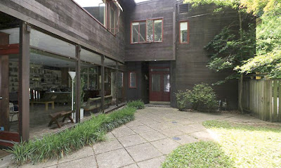
Is there no happy medium? Well yeah, but it's going to cost you. First time on the market for this place, and it's easy to see why. It's a country house in the middle of the city, a palatial Forties-style house on a double lot in the Palisades, completely surrounded by a dense ring of greenery. Total privacy. Howard Hughes himself would approve of this place

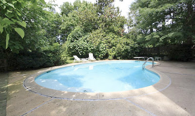
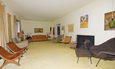
There's also an in-ground pool (for skinny dipping) and a huge outdoor patio area. Inside, the house is roomy, with lots of windows (loved the sunroom), and quaint woodwork and tiling. It's in the Palisades, so you can zip over to Georgetown in just a few minutes. And then, after you get elbowed off the sidewalk by Jersey Shore-types in popped collars talking on their iPhones and a stampede of office girls going for free cupcakes, you can zip right back to your country house and pretend none of it ever happened. Those of us without urban country houses will have to continue to resort to heavy drinking.

4863 Potomac Ave. NW
$1,799,000
5 Bedrooms, 3.5 Baths


Friday, September 23, 2011

Tweaking Science: NAS Goes Under the Knife

0 comments
By Beth Herman

Its marble headquarters at 2101 Constitution Avenue NW was built in 1924 by celebrated architect Bertram Grosvenor Goodhue, who died four days prior to its dedication. Though it continues to serve as an epicenter of the elite in times of war and peace, the National Academy of Sciences building’s programmatic mission had changed dramatically in recent years, according to Quinn Evans Architects Principal Larry Barr.

Undergoing three more building campaigns and sequential additions of a west wing in 1962, an east wing in 1965 and a 700-seat auditorium in 1970, the 182,000 s.f. space had been compromised in recent years by an insufficient infrastructure that resulted in burgeoning maintenance fees. Tantamount to that, the organization’s modus operandi had changed to include substantial public engagement at hearings and presentations, its conference rooms and public spaces markedly unequal to the task.

“As recently as 10, 15, 20 years ago, an awful lot of NAS’ work was behind closed doors,” Barr said. “It was time to bring the facility into the 21st Century,” a project begun in 2007 and slated for completion in April, 2012.

Citing elements and more that were part of a 2006 master plan, including relocating and/or expanding conference rooms, reinterpreting public access, evolved wayfinding and circulation, and improved ADA-compliancy (some of the Academy's nearly 2,200 esteemed members and 400 foreign associates, if visiting, had to enter indirectly on C Street through the back), Barr said encroaching on the building’s historic fabric was certainly at issue. “It was turning the first floor into a public floor that was the driver,” he added, noting additional space needed to be captured without expanding beyond perimeter walls.

To that end, utilizing east and west courtyards that accrued to related wings, the architects infilled each space with a roof and skylights so they became suitable, informal public gathering spaces for hearing breaks or cocktail parties. Three new conference rooms have been established on the main floor, two accommodating up to 150 people each, with a smaller space seating 50. The renovation also reintroduces two historic gallery spaces to showcase art.

According to Quinn Evans Project Manager Tom Jester, a considerable number of half-levels needed to be addressed to make the building handicap-accessible. Accordingly, elevators and ramps are being installed, with front-of-the-building access achieved by the removal of an existing window, and wall beneath the window, down to the ground. A bronze door will be added to match other historic bronze doors throughout the structure, facilitating access to an entry vestibule and elevator that goes to the main floor lobby.

Preserve and protect

With the 1924 portion of the building most historically significant, including the Great Hall which contains the behemoth rotunda, integrating elements like fire protection, updated electrical systems and data systems into historic spaces where there isn’t a great deal of cavity space, or access behind walls, was a significant design challenge. Identifying “creativity” as a key component in a successful restoration/renovation of this nature, Jester said specific variances had to be obtained to preserve the work of original architect Goodhue and his team, which included bronze sculptor Lee Lawrie—who created the building’s bronze spandrel panels, window mullions and mammoth pocket doors—and muralist Hildreth Meiere. Goodhue favored these artists and had collaborated with them on other projects.

Akoustolith, a widely used porous ceramic material employed in the early 20th Century to moderate noise, was used in the building's Great Hall and contains decorative painting and gilding. With the team in the process of conserving and restoring those surfaces, Jester said they will be brought much closer to their original appearance. Untouched since original construction, the material had fallen victim to cigarette smoke and other environmental abrasives—emblematic of its age.

Under the sun

In regard to NAS’ exterior, Barr said the building was generally in good condition, with repointing underway and a major concern expressed by the team that over time mortar had been replaced with an inappropriate sealant. Subsequently sealant has been removed from joints which are again filled with mortar compatible with the original masonry.

Restoring the building’s original steel windows while preserving the 1924 building’s historic character was also important— the decision made to retain them but apply a low-emission glaze. Windows were replaced with insulated glass units in the 1962, ’65 and ’70 additions. Skylights over the east and west courtyards contain integrated photovoltaics—part of the glass’ assembly—which is different from a typical roof solar array. The architects believe the process, while widespread in Europe, is still cutting edge in the U.S.

Historic lighting fixtures are being retrofitted to incorporate LED’s, where possible, on the path to LEED Silver certification—a requirement for the $45 million NAS project as it is financed with city bonds. The restoration/renovation is the District’s first project to be reviewed under the lens of the D.C. Green Building Act.

Citing the efficiency and cooperative spirit of an extensive team with an aggressive schedule, which includes The Gilbane Building Company and The Christman Company, Barr has summarized the NAS project as “a very challenging intellectual exercise” in its complexity, allowing for 21st Century activity without compromising historic integrity. “In the end it’s going to be a great building for the client,” he said.

Demolition Making Way For Madison Apartment in Alexandria

6 comments
Alexandria Virginia development SK&I architect Equity Residential retail map
Demolition has begun at 800 N. Henry Street in Old Town Alexandria, the site claimed by the Madison, a two-building apartment complex developed by Equity Residential. According to Dirk Geratz, principal planner for the City of Alexandria, construction is to begin in November.  Equity Residential took over sole responsibility of the project last year and can be credited for its revival. The development had been idle after Alexandria City Council approval came three years ago; idle "due in part to the economy over the last several years," according to the City. New construction costs, estimated to be around $37 million, will be spread across two 5- and 7-story buildings containing 360 apartment units, nearly 9,700 s.f. of ground-floor retail and 45,280 s.f. of "open space" - public plaza, courtyard and rooftop pool - designed by SK&I, which was brought on as the architect in 2010, replacing Cooper Carry

The Madison apartment building in Alexandria, designed by SK&I), developed by Equity Residential
In February, the plan was both bumped up and scaled back from what was approved in 2008 - whereas the number of apartment units increased, from 344 to 360, retail space was cut, from 23,000 s.f. to 9,672 s.f., and the number of parking spaces trimmed by nearly 100 spots (from 561 to 464). Retail space will be located on the corner of North Henry and Madison Streets. Varied styles and materials will be incorporated throughout the property in an effort to make the whole development appear as several distinct entities. A new private access street will connect North Fayette to North Henry Street. The development, initially meant to be underway in 2009, is located two blocks from the Braddock Metro stop in West Old Town; the project awaited approval in 2007 due to the incoming Braddock Metro Small Area Plan, which was adopted by Council in March of 2008. 

Article amendment: SK&I was brought on as the project architect (replacing Cooper Carry) in 2010, when Equity Residential took over sole responsibility of the project; Trammell Crow Co. was a development partner in 2008, when the project was first approved. This article has been updated to reflect these facts.

Alexandria Virginia retail and real estate development news

Thursday, September 22, 2011

Your Next Place

0 comments
By Franklin Schneider

The bungalow is like the little black dress of houses; simple, timeless, and sort of impossible to improve on. (I’m wearing one right now!) And this expanded bungalow in AU Park is a perfect example of what I’m talking about. Beautifully compact and deceptively large, it’s a model of sublime design. If Apple made an “iHouse” it would look very much like this.

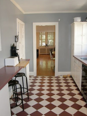
A wide, welcoming front porch leads to a bright, airy living area with hardwood floors and a fireplace. This leads naturally to a dining room and then to a large kitchen with table space and adorable checkerboard tiling. There’s also a library and/or den on the first floor – all in all, the open, simple floor plan makes for an extremely naturalistic and pleasant living space. Upstairs are three bedrooms and two bathrooms; it doesn’t seem possible, thinking back to how the house looked from outside, that there’s enough room for all these rooms inside. But there is. (So there.) The basement is fully finished, and has a little kitchenette. There’s also a fenced-in backyard for your dog (or kids) to run around in, and a detached garage.


The more houses I see, the more I find myself gravitating towards these sorts of places. A huge house is impressive initially, but once you consider the practical side of having a huge house, it starts to seem a little ridiculous. I read this story recently about Will Smith, who lives in what’s reputed to be the finest house in all of California, a palatial mansion of unprecedented luxury. For some reason, he has a replica of the small kitchen from the 70s sitcom “Good Times” in his house, and it turns out that that’s where his family spends most of the their time. I’m not saying we should all live in the kitchen from “Good Times,” but you get my point. It’s like, I have fifty pairs of shoes, but I only wear maybe four of them. What’s the point of the excess? This house is like your four favorite pairs of shoes.

4527 49th Street NW
$839,000
3 Bedrooms, 4 Baths


Solar-Powered Homes Compete in 10-day Solar Decathlon

2 comments
In West Potomac Park (see map), 20 collegiate teams, from as far as New Zealand and as near as Maryland, are readying their solar-powered residential creations - two years in the making - to compete in the 5th biennial U.S. Department of Energy Solar Decathlon. The teams have each designed and built a solar-powered house that they will live in, and monitor the operational efficiencies of, over 10 days. All homes have a footprint less than 1,000 s.f. (not including exterior decking) and should have cost $250,000, or less, to build - teams will lose points for going over. The winner will be whichever team scores the most out of a maximum 1,000 points; there are 100 points attainable across 10 categories. Six categories will be judged by a jury: architecture, market appeal, engineering, communications, affordability, and home entertainment (livability). The rest will be "measured" results of how the house performs: comfort zone (i.e. temperature, humidity), hot water, efficacy of appliances, and energy balance. In order to determine something like "home entertainment" value, each team is required to throw a dinner party. The Solar Village opens to the public this Friday, the 23rd, and will run until Sunday, October 2nd.  A big turn out is expected - in 2009, the event brought in 307,502 visitors. Below is a look at what is in store for visitors, and, as an architecture student with New Zealand's team said, "It's interesting how differently people approach the same problem." 

 Tennessee, Living Light: The University of Tennessee's design is a nod to a traditional cantilever barn found in southern Appalachia, with seasonal venting capabilities. Nearly all of the structure is wrapped in double glass; the amount of light coming into the house is controlled with wrap-around shades. The team is the only one using solar cylinder tubes.Team New York, Roofpod: The City College of New York's design was inspired by "high population, and low space" - the house is designed to be plopped on top of a New York high rise; the team calls it "a penthouse with a purpose" due to a green roof, storm-water management system, and surplus energy all benefiting its host building. For assembly, deconstructed parts of the house "fit in an elevator" and the rest can be hoisted up without a crane.

Images have been removed from the original story

Team New Jersey, ENJOY House: Rutgers and New Jersey Institute of Technology's design was done with "a retired, elderly couple living on the Jersey Shore" in mind. The design makes good use of concrete and an "inverted-hip shape roof" to increase rainwater collection, as well as optimize solar energy captured. The team was still working today...

Team Massachusetts, 4D Home: The University of Massachusetts at Lowell and Massachusetts college of Art and Design's house has a "Northeast vernacular," says team member Chelsie Kelly; it includes a gable roof, I-joists to reduce thermal bridging, and 15-inch-thick walls.

Team Florida, FLeX House: Four Florida Universities - South Florida, Florida State, Central Floria, and the U of Florida - worked together to create a modular house that features sectional "cubes" that can be repositioned (i.e. slid on tracks). Inside the home, a liquid desiccating waterfall pulls humidity out of the air during hot summer months.Team China, Y Container: Tongji University's house is made up of six recycled shipping containers; two laid side-by-side branch off in three directions (in a "Y" shape) from the house's core. Cost conscientious containers were used partly "to offset the high cost of [utilized] photovoltaic technology." The "Y" shape was also done to increase "a flow of space" and, inside, triangle-shaped furniture can be reconfigured into many seating/lying/what-not options.

Team Belgium, E-Cube: Ghent University's design was done to achieve affordability and rapid assembly, as well as simplicity. Team member Charlotte Vyncke said, "It's affordable but very spacious" and "It's a do it yourself building kit... no special tools or heavy machinery are needed."

SCI-Arc/Caltech, CHIP: The Southern California Institute of Architecture and California Institute of Technology created a visually distinctive home, most noticeable for its exterior "puffy jacket" like appearance. The design arcs upward, through a series of platforms, to a loft bedroom. The durable ground-floor is designed for So. Cal socializing, with surfboards and skateboards welcomed in.Purdue, INhome: Purdue University's all-American design features a wraparound porch, and what else but a garage (the only one in the competition). Team member McKenna Regan said, "Hopefully [our home] shows it can be an easy transition into solar living." Inside, near the kitchen, a biowall helps filter the air.

Parsons NS Stevens, Empowerhouse: Parsons the New School for Design and Stevens Institute of Technology constructed a home that will be headed to the Deanwood neighborhood after the competition ends. Together with Habitat for Humanity and The D.C. Dept of Housing and Community Development, the team selected a housing recipient, and then designed the creation to fit "a narrow lot in an urban community."

Ohio State, enCORE: Ohio State University built its home with a family in mind, and onion-like inspriration; a team member stated, "The house works in layers... unveiling itself until you get down to the core."

New Zealand, First Light: Victoria University of Wellington traveled 8,750 miles to bear its creation, named for New Zealand's unique geographic location which allows its inhabitants "to see the light before anyone else does," said a team member. Wrapped in western red cedar and insulated with recycled sheep's wool, the house was designed with a traditional NZ vacation home, the "Kiwi bach," in mind.

Middlebury College, Self-Reliance: Middlebury College's house was designed for "a young Northeastern family of four” and inspired by the "simplicity and durability of a traditional Northeastern farmstead." The house upholds a "seed-to-plate" philosophy by incorporating edible gardens, both inside and out. Materials include locally sourced slate and maple wood.

Maryland, WaterShed: The University of Maryland's house is designed with water conservation in mind, and inspired by the Chesapeake Bay ecosystem. The team created a house, and a wetland, which runs through the house's core; the wetland helps filter and recycle grey water (i.e. water used in the shower, sink, washer).

Illinois, Re_Home: The University of Illinois at Urbana-Champaign created a home that serves as "immediate response rehousing" for people left homeless at the hands of a natural disaster; the home can be assembled in only 12 hours and is comprised of two units that fit onto one semi truck.

Florida Int'l, perFORM [D]ance House: Florida International University went it alone and created a house that "dances" (in a way), with solar panels that adjust to optimize sun capture according to geographic location. Massive shade panels, durable enough to offer hurricane protection, can be raised and lowered.

Canada, TRTL (Technological Residence, Traditional Living): The University of Calgary built a home for a family within the Treaty 7 Native Peoples in Southern Alberta. The shape of the house was done to resemble a teepee, and a team member said the goal is for the house to "increase the health, safety, quality of life and native identity" of its recipient.

Tidewater Virginia, Unit 6 Unplugged: Old Dominion and Hampton University teamed up to build a six-unit modular building. The home was designed to "fit into a historic center-city neighborhood" and has a central porch area that when closed off in winter still feels semi outdoors.

Appalachian State, Solar Homestead: Appalachian State University created a "Great Porch" around its home, which was inspired by "the traditional homestead" of early settlers in the Appalachian Mountains of North Carolina.Washington D.C. real estate development news

Tuesday, September 20, 2011

14th & Wallach Residential Project Going for 2nd Try

5 comments
14th Street development, Washington DC, retail space

Architect Eric Colbert will take his revised design for L2 Development's residential and retail project at 1905-1917 14th Street NW back to HPRB this week, two months after the rejection of his initial design.

This time around, the U Street Neighborhood Association made a motion, on August 11th, to "provide a letter of support [for the project]."

In early August, Wallach Place residents - many of whom opposed the project at the HPRB meeting in July - were also largely in favor. Craig Brownstein of U Street Dirt said, "Almost uniformly, the Wallach folks found the new iteration of the design a marked improvement. It was a huge step forward."

Eric Colbert architect Wallach 14th opposition

On August 15th, the Design Review Committee of ANC1B supported (6-1) a motion to recommend that the ANC give its full support of the revised design at its meeting on September 1st, which it did. However, as noted in the Design Review report, committee member Joel Heisey felt that the "Georgetown red brick is out of place on 14th Street" and requested that there be a consideration of "something more in keeping with the limestone and beige appearance of most of 14th Street’s structures."

Steve Callcott, HPO staff reviewer for the project, has recommended the HPRB approve the revised conceptual design, but continue to work with Colbert on "the storefront design, development of window specifications, and detailing of the masonry and metal cladding."  Callcott also praised the revised design: "Both in massing and design, the compatibility of the project has been significantly improved. With slight reductions in the building mass and the use of different architectural vocabularies, the weight of the building is broken down into smaller scaled elements that will coexist much more compatibly with the surrounding smaller historic buildings."

Although the building's height (7 stories) and 16,000 s.f. footprint remains unchanged, an approximate reduction in mass of 4,000 s.f., due to more significant step-downs, has taken the number of residential units from 154 to 144 units.

Washington D.C. real estate development news

Monday, September 19, 2011

New Plan for Oldest Apartment in DC

3 comments
In the past five years, the 123-year-old Harrison Flats at 704 3rd St, NW - the eldest conventional apartment building in the District - has changed ownership three times; a change that has brought three different plans for restoration and reuse of the historic landmark to the Historic Preservation Review Board.

The latest plan, by current owner the Zuckerman Brothers Inc., is for a 12-story hotel with ground-floor restaurant and/or bar (rendering from ANC 6C meeting posted in June) designed by R2L:Architects.

In June of 2010, the Zuckerman Brothers purchased the property for $8.5 million. The plan will be reviewed by the HPRB this Thursday, the 22nd. ANC 6C approved the project in June, when presented by Goulston and Storrs' Andi Adams, R2L's Sacha Rosen, and owner Stuart Zuckerberg.

Two previous plans, both approved by the HPRB, were submitted in 2006 and 2008 (11-story office addition). Tim Dennee of the HPO, said that the three proposals in the last five years have been for "additions of roughly the same size, but the amount of demolition proposed has increased each time." In large part, this is due to significant deterioration of the building within the last seven years; resulting in much of the property having been deemed structurally unsound by an engineer. Dennee wrote in his report, "The condition of the building has declined dramatically in the years since the staff first toured it (about 2004)."

Tim Dennee's staff report states that although the Harrison was designed as apartments, the federal government leased the building in 1889 to use as an executive office for the Census Bureau, a move which resulted in the north addition "structured for office loading and to be 'fire proof,' with a system of steel columns and beams supporting brick and concrete floor arches, [whereas] the original, south section had been conventionally framed with wood."

Designed by John C. Johnson and Charles E. Gibbs, in 1888, the 5-story building (with basement level that served as a cafe around the turn of the 20th century) is an example of Romanesque Revival architecture. As use of the Harrison Flats has evolved over the past century, some may know the building as the "Astoria" (as it was renamed in 1899) or the "Canterbury" (in 1941).

Now boarded-up, and vacant for the past eight years, the property is currently being used by a small contingent of the District's homeless population.

Update: Renderings from the ANC meeting in June show the design before slight changes, requested by the ANC, were made to the project by the development-and-design team and re-presented to the ANC in September.

Washington D.C. real estate development news

Your Next Place

2 comments
By Franklin Schneider
This fantastic house is perfect for a family; bright, expansive spaces, a massive deck and fenced-in yard, and it backs right up to Archibald-Glover Park. Totally close to everything, but feels like a country house. If it was any more perfect it would be Emma Watson.

Inside, there are acres of gleaming hardwood floors, and oversized windows. The open floor plan gives the house a real sense of flow; no matter where you are in the house, you could quickly and easily find a family member to annoy. (“Hey Dad, do you ever wish you dated more before you got married?” I actually asked my father this question one time; he didn't even answer, he just stared straight ahead like a POW being tortured.) This house is huge, inside and out. Five bedrooms and 3.5 baths in, and a backyard that seems as big as a football field. Beyond the fence is the lush greenery of the park, bisected by a burbling little creek. The previous owner actually used stone recovered from the creekbed to build a fireplace mantle in the house. Where else in DC are you going to be able to do something like this? When I first moved to Shaw, years ago, my uber-artsy girlfriend at the time built a mobile out of crack vials from the alley behind our rowhouse. Yeah, not quite the same.

There's also a crap ton of parking, and a rear gate that leads to a dog park, tennis courts, a playground, and some other stuff that I couldn't see because my vision had suddenly clouded over with a bright green fog of pure envy.

3310 Idaho Avenue NW
$1,193,310
5 Bedrooms, 3.5 Baths


Sunday, September 18, 2011

Resurrection: Coming Home to Two Hundred Years of Military History

0 comments
By
Beth Herman
En route from France on the USS Olympia, the body of World War I’s Unknown Soldier passed through the history-imbued Washington Navy Yard on its way to the Capitol Rotunda, and ultimately Arlington National Cemetery. Created to build and maintain ships more than 200 years ago, and becoming the world’s largest naval ordnance plant by World War II, the Navy Yard—and especially its 221,500 s.f. foundry building — were home to the design and construction of weapons used in every war from 1883 until the 1960s, when the Yard became the ceremonial and administrative hub for the U.S. Navy.
"We focused on that history—so much history,” said Sabine Roy, owner and principal of SR/A Interior Design LLC, when the firm was commissioned by developer Forest City Washington, with SK&I Architectural Design Group, to turn the brunt of the landmark building into a singular residential property: Foundry Lofts, 301 Tingey Street SE. “We based our design on research with the naval archives, the Library of Congress, historical photographs, antique documentation–whatever we could do,” she affirmed.

Informed by 200 years of military lore, Roy said the structure’s context allowed the firm to be more “modern and urban” in its interior design concept, noting a combination of new construction (which this facility was not) and modern may result in an environment that is too cold. “But with an historic building, you already have this warm, worn look,” she explained, adding it’s been “humanized.”
That said, attracting active professionals to its 170 units and amenities was a programmatic priority, high on the list of design determinants. Boasting elements such as a sunken conversation area in the concrete lobby and a courtyard—where war ships were once fashioned—reincarnated into a sleek social club, the addition of an outdoor fireplace, cinema, and rooftop garden terrace with seating and art make Foundry Lofts a rare residential experience.

Anchors away
Fraught with pendulous columns that supported an industrial floor plan, the building was also higher than the street and not meant to be entered from the sidewalk, but rather the water, so ships could be launched, Roy explained. Consequently the concrete lobby floor had to be elevated a few feet to street level, though a designated seating area, replete with new fireplace and modern art, was left below grade for a sunken effect.

According to Roy, the foundry had been constructed as a “rectangular donut with enormous courtyard in the middle for ships.” With SK&I Architectural Design Group creating 170 residences—33 of them newly-constructed two-level penthouses on the 5th and 6th floors, all are designed to discharge on one side into a windowed corridor that directs residents’ attention to the 4,400 s.f. social courtyard below.
An indoor courtyard-adjacent space, designated as a party room, was extended further into the courtyard, with a modern outdoor fireplace—glowing winter and summer— visible from inside as well. Atop the party room, a rooftop terrace with metal sculptures and Asian-style grasses create a Zen garden effect, according to Roy, with soft, strategic lighting limited to showcasing the art. From a large stair, residents can descend into the courtyard to play bocce or relax in hammocks, or on colossal square ottomans that seat up to five, and which are lit from the center. Old movie nights at the courtyard’s outdoor cinema will be a lot of fun, Roy suggested, envisioning classic black-and-white movies and martini parties for residents and their guests.

Columns, canons and carpeting
“When we entered the building,” Roy said of the team’s initial foray in early 2010, there was nothing new though it had been cleaned up. You just saw the structural columns and old heating systems and exterior walls.” All in all, she said, it was “an emotional experience when you think about the consequences of what was built here—what it did to the rest of the nation.”
In an effort to retain much of the historical fabric, a legion of pendulous structural columns was left alone including one “smack in the middle of the lobby,” Roy said. A challenge due to their size and girth, the designer said the lobby column, specifically, became a focal point, with a dressing added to accommodate adornments such as flowers. A Civil War-era canon unearthed during renovation that had later seen action aboard the USS Raritan was installed in the lobby, and will help distract from the behemoth column. The juxtaposition of the historical lobby with contemporary fabrics, furniture and modern art in the space is a further manifestation of Foundry Lofts’ aesthetic.
With dislodged historical components like the repurposed canon integral to the building’s design and sustainability, the latter is achieved on many levels. Roy said all elements—carpeting; furniture; paint; backings—are recycled content or post-consumer recycled material. The party room is bamboo, and courtyard flooring is earth-friendly Trex.

According to Forest City Washington’s Senior Vice President of Development Ramsey Meiser, Foundry Lofts’ mixed-use component includes three retail spaces, two of which have been leased to Pot Belly’s and Kruba Thai and Sushi, which will be open in the first quarter of 2012.
“This building is so unique in its adaptive reuse of an existing building,” Meiser said, noting he is buoyed by marketplace reaction and the results of preleasing efforts for residences which will be available at the end of October or beginning of November of the current year.
 

DCmud - The Urban Real Estate Digest of Washington DC Copyright © 2008 Black Brown Pop Template by Ipiet's Blogger Template