Wednesday, November 28, 2012
10 Questions with Deborah Ratner Salzberg
10 Questions is a weekly feature in which we interview some of the leading District figures in real estate, architecture, development, and planning. This week's subject ... Deborah Ratner Salzberg, President of Forest City Washington, Inc.
For Deborah Ratner Salzberg, real estate runs in the family. As President of Forest City Washington, Inc., Salzberg oversees the local branch of billion-dollar development giant Forest City Enterprises Inc., the company her family founded in 1920. A former attorney at the U.S. Department of Justice, Ms. Salzberg also holds leadership positions with many community, arts, and philanthropic organizations, including The Jewish Federation of Greater Washington, the Washington Ballet, and Arts for the Aging.
1. What's a typical day for you?
Wake up and head to the gym. Go into the office. Check emails. Spend the day balancing Forest City Washington work with community/nonprofit activites. Check emails. I generally have a lunch meeting and after work often head to a fundraiser or nonprofit event. Head home and check emails. Get an advance start on tomorrow’s headlines on my iPad. Go to sleep and start again.
2. What or who is your biggest influence?
My biggest influences are my relatives. I work with my relatives, and they influenced my decision to join Forest City. I was surrounded by strong independent women growing up. My mother, paternal grandmother and three aunts all worked outside of the home. My father has always been my advisor, biggest fan and supporter. To this day I've never given a speech without running by him first. Although, I didn’t run these answers by him!
3. What neighborhood do you live in?
The Edgemoor area of Bethesda.
4. What is your biggest DC pet peeve?
We can’t see stars at night due to the bright lights. It’s time to convert to directional street light fixtures.
5. What is the #1 most played song on your iPod?
Born to Run….I play it when I’m working out.
6. Favorite DC haunt?
Sterling. My gym.
7. What's your favorite thing to do on a Sunday afternoon?
Yoga
8. If you could live anywhere in the world, where would it be?
Here, but I wouldn’t mind a second home in NY, SF, Paris or Tel Aviv.
9. If you couldn't be a developer, what would you be?
An international flight attendant. I love to travel.
10. Name one thing most people don't know about you.
I took a semester off from college my sophomore year and moved to Hawaii where I ended up working in security for McInerny Department Store.
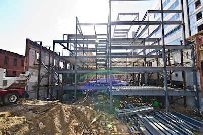
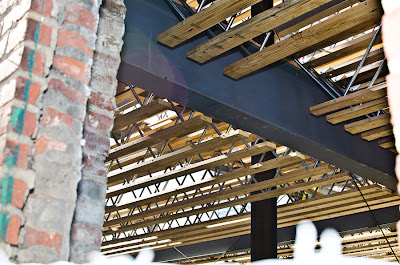
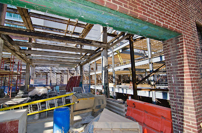
Today in Pictures - Wonder Bread Building
12
comments
Posted by
Ken on 11/28/2012 09:48:00 AM
Labels: Douglas Development, R2L Architects, Shaw
One of the few true industrial buildings in DC, the Wonder Bread building in Shaw has long captured would-be architects' and developers' interest. After the attractive but decrepit building sat vacant for years, Douglas Development put the structure through a nomination to be included in the D.C. Inventory of Historic Sites in August of last year.
With that out of the way, work began on the refurbishing the building in June, and work crews have now gutted the interior, lowering the floor, and making way for more than 50,000 s.f. of space, with 24,000 of retail on 2 levels. Designed by R2L:Architects, the building's revival is part of Shaw's commercial rebirth, ironically just as the building's namesake declares bankruptcy. Despite the raw look of the shell, Douglas expects to turn the building over to the first tenant in January.
Washington D.C. real estate development news
NoMa's Trilogy Apartments Open Thursday
7
comments
Posted by
Ken on 11/28/2012 07:05:00 AM
Labels: Mill Creek Residential Trust, NoMa, Preston Partnership
NoMa's newest apartments open Thursday as developers and city officials gather for a photo op to inaugurate one of Washington DC's largest apartment buildings. "Trilogy" - 3 buildings designed by the Preston Partnership and formerly known as NoMa West - will add 603 rental units to the border between NoMa and Eckington at 151 Q Street, NE.
The first of the three buildings - Cirq, Linq, and Esqe - is now open, with the other two opening within the next few months. Designed by developer Mill Creek Residential Trust to appeal to nearly any taste and architectural preference, each of the three buildings sports several motifs, a "highly differentiated architectural style," say its developers, that will span the centuries, architecturally speaking, with "traditional and contemporary" in Cirq, "warehouse, contemporary and art deco" in Linq, and finishing with the "highly contemporary" Esqe when it completes in March.
The project broke ground in March of 2011, but has been in the works far longer, at least since the team of CSX (as owner) and Fairfield Residential (as developer) plotted a 2006 groundbreaking for the residences. The torch then passed to Trammell Crow Residential, and finally to the current team, who can finally spike the ball at tomorrow's ceremony. Mill Creek is also working on an even larger project at the Dunn Loring Metro station.
Washington D.C. real estate development news
Tuesday, November 27, 2012
District Releases RFEI for St. Elizabeths
Today, the District government released a Request for Expressions of Interest (RFEI) in a bid to get development going at St. Elizabeths. The Phase I development puts 4 parcels, totaling almost 7 acres, up for development bidding. The proposal is the first of what will be a long, multi-phased development by the DC government for the East Campus of St. Elizabeths, following on the heels of development on the West Campus by the federal government that is now well underway.
The District had previously issued general guidelines for what the site could look like, with office, residential and commercial taking the place of the hospital now on site, with the hospital moving to the back of the current site. The RFEI notes that the land is "especially ripe for complementary residential and retail development," and that the area presents an opportunity for "underserved" retail and "the next office submarket," and that historic preservation will also be a key element of consideration. The District intends to make final selection of the development team by next summer.
Washington D.C. real estate development news
Envisioning the Visio and Murano
Q and A with Suman Sorg
by Beth Herman
Seeking to venerate but modernize Washington D.C.'s classic row house archetype, and drawing from the surrounding urban U Street corridor neighborhood, Suman Sorg of Sorg Architects created the 19-unit Visio and Murano, 2109 10th Street NW. Studying historic preservation at Cornell University, though a modernist at heart, Sorg's work is often a confluence of the two, with compatibility a word she uses to define her efforts in the contextual realm. The Visio and Murano has won six awards, including two AIA awards for Architectural Excellence and one for Washington Residential Design. DCMud spoke with Sorg about the project.
DCMud: What was the design impetus behind the Visio and Murano?
Sorg: The idea was to build so-called stick buildings that are not steel or concrete but wood, and to redefine the concept of infill row housing. When we built the Visio, we used mezzanines -- or internal stairs -- in each apartment so you could get extra space and still build a building out of wood frame, though the exterior is brick and glass.We had really tall ceilings -- 11 to 18 feet high -- each one has a double-height living room. We used English basements to create extra square footage at street level.
DCMud: How did the neighborhood's vernacular manifest in the design?
Sorg: We wanted to make these buildings compatible with the adjacent church. There's an alley between the church and Visio and Murano, but they almost form a street line. My idea was to look at what's important in the church, which is a turret, and how to add that kind of verticality to the facade of Visio. I wanted to work with the church's material which is red brick -- traditional Washington. We used that but in a modern application. I was also thinking about the industrial character of the area. You look at the Visio's front stair through bent steel - almost sculpture, and then the windows have steel mullions. The brick is sharply cut; it's not antiqued at all. These are some industrial features in the design.
DCMud: In what ways does the design emulate more doctrinal area architecture?
Sorg: In D.C. we have what's called the traditional bay house which allows you to project into public space by four feet. I was interested in incorporating that concept, but in a modern way. I wanted a modern vocabulary -- one that's Washington's own vocabulary rather than an imported one -- as well as taking advantage of what zoning allowed so we could have maximum square footage inside.
DCMud: Can you elaborate on the concept of imported, or as some have called it borrowed, architecture?
Sorg: I believe we've been importing architecture from Europe since the very beginning, and lately importing architects themselves. Washington's own architecture can develop in its neighborhoods rather than downtown where there's more commission scrutiny. We should look at what's traditional to D.C. and then reinterpret it.
DCMud: There is a prodigious use of glass in these buildings, and they are not towers, so with that how was privacy executed in the Visio and Murano?
Sorg: There's a general trend right now -- a shift from post modern to modern. Because the shift was so quick, people went back to early modernism -- the 20s and 30s. In residential architecture, however, people don't want to live in a glass box. They do want a sense of privacy and warmth.
When there are large amounts of glass in residential architecture, proportion is important. Again people don't want to live in glass boxes, so we broke it into smaller panes. We used zero sightline windows so the ones that do open don't look different from the rest of the glass. We also set the glass back behind balconies for shade. Hardwoods were used in the interior, including wood stairs. We followed LEED Silver requirements and used some natural materials, low-E windows and Energy Star appliances, though did not pursue certification.
DCMud: You work extensively internationally, as well as in D.C. Does the Visio and Murano reflect anything you have done before?
Sorg: I did a similar housing project in Kuwait in 2005. Following the war, the U.S. was given a piece of property by the king on which to build a new embassy. We did the housing in the embassy compound. It's somewhat the same in its proportion and materials, including glass and shading.
I've also been working in historic neighborhoods for a long time. The Visio and Murano are the evolution of townhouses that we did in Georgetown and particularly in Ledroit Park, south of Howard University, where we built 14 brand new infill townhouses. While you couldn't tell them apart from other historic townhouses in the neighborhood, it taught me about proportion and management of materials in these historic buildings. It became a foundation for the Visio and Murano's modern interpretation.
DCMud: Speaking of interpretation, is there a place in the District that calls to you?
Sorg: I like buildings that are unassuming -- beautiful, quiet buildings or spaces where, when you walk or bike around the city, they do not scream for your attention. One of these is the Decatur Terrace Steps and Fountain (sometimes referred to as D.C.'s Spanish Steps) between 22nd Street and Decatur Place. The large trees that surround it make for a perpetually shaded resting spot to listen to the bubbling fountain and enjoy a respite from the busy city.
Arlington Publishes Major Plan for its Bikeshare
Arlington County has just released a six-year blueprint for growth in its share of the Capital Bikeshare system, and planners say the blueprint - with recommendations for growth and funding - could be the first bikeshare Transportation Development Plan (TDP) in the country.
Arlington County is part of the Capital Bikeshare system, one of
four operators in a group that also includes Washington, DC, Montgomery
County and the City of Alexandria. In total, the system has 1,670 bikes
and 175 stations. As of September, Arlington County's share included
44 stations and 306 bicycles.
Over the past year, the county's BikeArlington staff solicited public feedback both online and in person, surveyed local stakeholders including agencies, businesses, and users, and based on the results laid out scenarios for growth for the system over the next six years.
"Capital Bikeshare is an integrated part of the transportation fabric in the Washington D.C. region, and it should be treated as such," Chris Eatough, program manager for the county's BikeArlington program, which oversaw the plan, wrote in a column published by Mobility Lab, Arlington's transportation innovation branch.
Findings
According to the report, system data shows almost 50 percent of Arlington's bikeshare users were either coming from or going to Washington DC. Most bikeshare trips were less than 1.5 miles in length. Users who bring in the most cash for the system are "casual users" who take trips lasting over 30 minutes (those trips cost more), although those users made up less than 20 percent of riders in 2011. Commute trips constituted a third of all trips with Arlington's bikeshare.
Funded Growth
In one growth scenario, the report outlines what Arlington can do with existing funding to grow and maintain the system.
According to the report, with existing funding, Arlington would grow most in 2013, adding 40 stations, three through "external sponsorships" and the rest with transportation grants and other funding. New stations will "build out" the system in Shirlington and South Arlington, along Columbia Pike east of the Washington and Old Dominion trail.
Pending approval by the National Park Service (NPS) and the Department Defense, stations will also pop up at Arlington National Cemetery and the Pentagon. More stations will go into neighborhoods to create connections between the Rosslyn-Ballston corridor and Columbia Pike, as well as between Crystal City and Shirlington.
Beyond Existing Funding: Big Demand for Lots of New Stations
Beyond the existing funding for 40 new stations, the TDP estimates a total demand for between 57 and 115 additional Arlington bikeshare stations. The report calls locations in North Arlington at East Falls Church and Lee Highway the "logical next steps" for bikeshare expansion, and notes that more bicycles in Crystal City, Rosslyn and Court House Square will also be needed.
Funding
Currently, bikeshare gets operating revenue from fares and from station sponsorships. However, the report estimates continuing operating deficits, and suggests opening up bikeshare station panels to advertising sales, but Arlington County would first have to change its policy against on-street advertising.
According to the report, the system gets $200,000 in capital revenue from Arlington County vehicle decal fees. In the past and for 2013, the system has gotten funding from a federal program called Congestion Mitigation and Air Quality (CMAQ), though the continuity of that program is uncertain beyond 2013.
What Comes Next
Next, according to Eatough, the plan goes to the State of Virginia to be considered for transportation funding.
In the meantime, the plan lays out 15 ambitious performance measures that Arlington will monitor to keep an eye on how well things are going with its plan for growing its bikeshare, as well as other more abstract things like sustainability, safety, health, and bicycle culture. Those performance measures include the ratio of Alrington's bikeshare miles traveled to total vehicle miles traveled, helmet use, crash rates, even average calories burned per trip.
The county is also still accepting public suggestions for future stations with its crowdsourcing map.
Bikeshare trips to and from Arlington. Image: BikeArlington |
Over the past year, the county's BikeArlington staff solicited public feedback both online and in person, surveyed local stakeholders including agencies, businesses, and users, and based on the results laid out scenarios for growth for the system over the next six years.
"Capital Bikeshare is an integrated part of the transportation fabric in the Washington D.C. region, and it should be treated as such," Chris Eatough, program manager for the county's BikeArlington program, which oversaw the plan, wrote in a column published by Mobility Lab, Arlington's transportation innovation branch.
Findings
Existing Arlington bikeshare stations. Image: BikeArlington |
Funded Growth
In one growth scenario, the report outlines what Arlington can do with existing funding to grow and maintain the system.
According to the report, with existing funding, Arlington would grow most in 2013, adding 40 stations, three through "external sponsorships" and the rest with transportation grants and other funding. New stations will "build out" the system in Shirlington and South Arlington, along Columbia Pike east of the Washington and Old Dominion trail.
Pending approval by the National Park Service (NPS) and the Department Defense, stations will also pop up at Arlington National Cemetery and the Pentagon. More stations will go into neighborhoods to create connections between the Rosslyn-Ballston corridor and Columbia Pike, as well as between Crystal City and Shirlington.
Beyond Existing Funding: Big Demand for Lots of New Stations
Funded Arlington bikeshare growth. Image: BikeArlington |
Funding
Currently, bikeshare gets operating revenue from fares and from station sponsorships. However, the report estimates continuing operating deficits, and suggests opening up bikeshare station panels to advertising sales, but Arlington County would first have to change its policy against on-street advertising.
According to the report, the system gets $200,000 in capital revenue from Arlington County vehicle decal fees. In the past and for 2013, the system has gotten funding from a federal program called Congestion Mitigation and Air Quality (CMAQ), though the continuity of that program is uncertain beyond 2013.
What Comes Next
Next, according to Eatough, the plan goes to the State of Virginia to be considered for transportation funding.
In the meantime, the plan lays out 15 ambitious performance measures that Arlington will monitor to keep an eye on how well things are going with its plan for growing its bikeshare, as well as other more abstract things like sustainability, safety, health, and bicycle culture. Those performance measures include the ratio of Alrington's bikeshare miles traveled to total vehicle miles traveled, helmet use, crash rates, even average calories burned per trip.
The county is also still accepting public suggestions for future stations with its crowdsourcing map.
Monday, November 26, 2012
Your Next Place
The brainchild of bleeding-edge designer Chryssa Wolfe, this beautiful, sprawling house is both luxurious and morally upright, thanks to the cutting-edge green technology used in its construction. It's like a Lambourghini that runs on fair trade coffee, or a pair of cashmere Toms.
Seriously though, this house is light years ahead of anything else on the market right now. With a geothermal heat pump system, a rigid insulation envelope, high-performance insulated windows and doors, and energy recovery ventilators, this house is as energy-efficient a house as present-day technology could produce, aside from some sort of hermetically-sealed fart-warmed life capsule. This is what all new construction should be like, but isn't, because ... because I don't know why. It really made me step back and marvel at how inefficient the typical turn-of-the-century DC rowhouse is, with gas-fired furnaces pumping hot steam up through metal coils scattered throughout a swiss-cheese-like brick-and-mortar shell. It's no wonder that it costs $250 a month to keep my apartment at 62 degrees in the winter.
But this house isn't just environmentally-efficient - it's also beautiful. With gleaming (responsibly harvested) hardwood floors and an open floor plan, the house is full of light, and spacious. The coffered ceiling of the family room and cutting-edge color palette of the formal dining room and kitchen belie a design aesthetic as up-to-the-minute as the construction. There's a huge screened-in porch with panoramic views, and out back is a fantastic in-ground pool, next to which is a wide flagstone-lined lounge area that features an outdoor stone fireplace, where you can recline in sunglasses and surreptitiously judge everyone else's swimsuit bodies.
And since it's a green house (not to be confused with a "greenhouse," which is where our parents grow their glaucoma medicine), the buyer will receive a $35,000 geothermal tax credit, which is almost as much as I get for my made-up family of dependents, Pablo, Marian, and the triplets. (Hey, as far as I'm concerned, if Mitt Romney pays 14% taxes, all bets are off.)
5420 Galena Place NW
6 Bedrooms, 6 Baths
$2,785,000
Demolition and Preservation at Former Chinese Embassy
1 comments
Posted by
Amanda Abrams on 11/26/2012 09:28:00 AM
Labels: Embassies, Esocoff and Associates, Kalorama, Sheridan-Kalorama Historic District
Drive by the former embassy of the People’s Republic of
China on Connecticut Avenue and you’ll see an interesting sight: a building façade propped up by an elaborate set of braces, next to another building undergoing wholesale demolition.
Much demolition has already
occurred. But the facade is being preserved as part of the Sheridan-Kalorama Historic District, and will be incorporated into a new building on the site that’s been
designed by Esocoff and Associates.
While the embassy proper decamped for Van Ness Street in
2009, the new Connecticut Avenue building will serve as the embassy’s residential
and consular building, containing 136 mostly two-bedroom apartments for
diplomatic staff, and some office space.
The original embassy was actually composed of two distinct
but connected buildings. The more historic structure at 2310 Connecticut Avenue
was built in the 1920s, and its façade is the one that’s being salvaged. The
other structure, at 2300 Connecticut, was the hulking, largely unadorned
building that most observers remember as the Chinese Embassy. It started out in
the late 1940's as a hotel, but was turned into an embassy after Nixon’s visit
to China in 1972.
Now, most of the latter building is being reduced to rubble.
“I think one of the reasons we had unanimous community support was that
removing a building that unappealing was a mitzvah—a good deed,” explained Philip
Esocoff, adding that demolition of the newer building should be complete by the
end of 2012.
But the older building has a different, more delicate story. Braces have been utilized to preserve the two outside walls and
strengthen them against wind while the building’s interior is removed. “We
will cut away at the wall behind it, but we’ll have to do it carefully, by hand,”
said Esocoff. “That’s a particular kind of process, saving a front wall: you
don’t want to rip the building down inside because it might pull something
off.”
Esocoff rendering of the new building's facade |
“I think it’ll be a very well-constructed building, a little
higher quality than we might do on a standard apartment house because they plan
on being there forever. It’ll be institutional grade,” said Escoff. “And this
will really improve the vista as you come down from the bridge.”
Groundbreaking will occur after the first of the year, with
the first step being an excavation of the property’s lower levels to include a
parking garage.
Washington, D.C. real estate development news
Friday, November 23, 2012
Design for an Abled Life
by Beth Herman
Contracting polio as a child, Idaclaire Kerwin learned to make the most of every moment.
Commissioning interior designer JoAnn Zwally, ASID, of Ashton Design Group, who'd worked with Kerwin and husband Tom on previous residences, and Jonas Carnemark of Carnemark Design + Build (also a Kerwin design veteran), along with Carnemark Principal Michael Stehlick, the couple sought a residence that facilitated life with physical limitations but in which the accruing design was neither stark, ordinary nor clinical, and in fact was driven and enhanced by the challenge.
With a drive and determination reflected in her favorite color, a potent cinnabar, the almost life-long force in the League of Women Voters (now treasurer for the Arlington, Virginia chapter) was guided by Zwally to infuse a new apartment at Arlington's senior residential community, The Jefferson, with a strong color palette featuring cinnabar. The spicy hue both affirmed Idaclaire's bold spirit and served as a unifying element. And because of her disability, issues of flow and "purpose" were tantamount to aesthetics.
"It was actually two apartments that had been made into one some years ago," Zwally said of the 2,036 s.f. space, "but it was really appalling the way it was - so much waste that needed reconfiguration." The idea was for the homeowner to able to traverse the space unimpeded, accordingly doorways were widened, site lines created and design logic was employed, so to speak, where she could move to and through a reimagined foyer, master bath, hallway, kitchen, master bedroom, home office and more.
Life design
Speaking to principles of handicap accessible design, Carnemark said while his goal was to create a user-friendly space, other components factored in as well.
"For me, as a designer, there is universal design, but it's nice to design for the the life of the home and for whomever is going to use it: grandparents and grandkids. We look at design as purposeful. And one objective was to open up the space and make it feel bigger," he said.
As the homeowners wanted something minimal without sacrificing coveted storage space, Carnemark included elements such as a pop-up counter and wall-mounted fold down cutting board next to the refrigerator where they could chop vegetables - geared for wheelchair use. Instead of cabinets, drawers contained dishes.
Designed as height-specific to accommodate Idaclaire, counters were lowered - the sink side is 33 inches and the cooktop area is 30 inches as opposed to a normal 36, and Siematic cabinetry, which adapts well to unconventional spaces, was employed.The refrigerator has a bottom freezer for easy access, and the cooktop has a halogen top which makes it easy to clean and maintain. A speed oven - combination oven and microwave - sits below it at a comfortable height for the homeowner.
"In addition to accessibility issues in the kitchen, we wanted to create a real contemporary look with a pop of color in the back," Carnemark said. To that end, Zwally selected a custom-painted piece of glass in cinnabar that was used as a substantial backsplash behind the cooktop, the color teased throughout the entire residence in furnishings, textiles, wall color, art and more.
In the curatorial-type dining room, a series of gritty, industrial photographs by Historical American Engineering Record photographer John T. "Jet" Lowe flank a Dakota Jackson dining table. Vintage fire-retardant chairs from the S.S. United States, a luxury passenger liner built at Newport News, Virginia in 1952, and described as the first sea-going vessel built in compliance with US Navy fireproofing guidelines."We had to cut down the legs of the table for it all to work, but it looks great," Zwally said.
A locomotive runs through it
A former senior railroad executive with the Norfolk Southern Railway, husband Tom desired a study/library that was borne of a bedroom on the other side of the dining room, replete with cherished items such as a piece of stained glass art replicating a train and an extensive collection of books. The study can double as a guestroom in the two-bedroom apartment. For his wife, a home office design, though smaller, with height-adjusted built-in console with wraparound counter that runs from patio to desk provides ample workspace for League of Women Voters business.
In the quest for enlarged, open space, Carnemark and Zwally eliminated an existing bath. While the clients were reluctant at first for resale purposes, they decided to focus more on their own comfort and joy, Carnemark recalled, adding he counsels clients to "do the things that really make them happy" for the best value in the long run. Accordingly the bathroom was removed and walls on both sides opened, creating a glass-shelved display area for the homeowners' many collections including pottery from Native American artists Joy Cain, Bob Lansing and Robert Silas. Storage spaces were conceived at this juncture to hold games and other items for visiting grandchildren.
In the existing foyer, walls were "offset and funky," according to Carnemark, who ended up aligning them to clearly define the space and help expand the kitchen.
"We weren't able to get rid of an entire wall, as we had to move some piping and in these buildings certain risers go from floor to ceiling that you cannot move, but we expanded as much as we could," he said, adding that a foyer niche with focal point for a vase was created when an adjacent pantry with sliding door was eliminated.
Creative controls
In reconfiguring the master bath, which went from 46 to 97 s.f. and is often a major issue for a disabled homeowner, thresholds were eliminated. To get the shower drain to work properly, the surrounding porcelain and glass mosaic tile floor was built up slowly, according to Carnemark. "There's a little bit of a ramp that rises up a level so we could back it down to the drain." A deep shower bench was calculated for a specific height, where the homeowner can sit and control the main and hand showers separately. Controls are deftly embedded in a knee wall next to the drawer base. The toilet was situated on a pedestal at a desirable height for the homeowner, who is not without some mobility. And when the homeowner exits the master bath toward the cinnabar-hued bedroom, a closet was relocated to the other side creating a long, open hallway for ease of movement.
Where lighting was concerned, Carnemark said one of the focuses was to provide a high level of contrast in task areas. Noting the process becomes a challenge in buildings like the Kerwins' because of concrete ceilings and floors, the designer said all too often the ceiling must be built down to hide recessed lighting or ductwork for exhaust fans. In the homeowner's dining room, in lieu of customary wire mold, the lighting track was extended farther along so that it met the wall. "This cleaned up the ceiling lines for flow," Carnemark said.
Citing his methodology for projects like the Kerwins', Carnemark noted he prefers to do things so that everything has a purpose. "If you drive the design that way, you can make it more beautiful on top, always considering how the flow (and function) works first and then filling in color, texture and light."
Said Zwally,"Jonas and I did everything together. In the beginning we came up with a lot of the same ideas, and others complemented each other. It was a real partnership."
Photos courtesy of Geoffrey Hodgdon and courtesy of CARNEMARK.
Contracting polio as a child, Idaclaire Kerwin learned to make the most of every moment.
Commissioning interior designer JoAnn Zwally, ASID, of Ashton Design Group, who'd worked with Kerwin and husband Tom on previous residences, and Jonas Carnemark of Carnemark Design + Build (also a Kerwin design veteran), along with Carnemark Principal Michael Stehlick, the couple sought a residence that facilitated life with physical limitations but in which the accruing design was neither stark, ordinary nor clinical, and in fact was driven and enhanced by the challenge.
With a drive and determination reflected in her favorite color, a potent cinnabar, the almost life-long force in the League of Women Voters (now treasurer for the Arlington, Virginia chapter) was guided by Zwally to infuse a new apartment at Arlington's senior residential community, The Jefferson, with a strong color palette featuring cinnabar. The spicy hue both affirmed Idaclaire's bold spirit and served as a unifying element. And because of her disability, issues of flow and "purpose" were tantamount to aesthetics.
"It was actually two apartments that had been made into one some years ago," Zwally said of the 2,036 s.f. space, "but it was really appalling the way it was - so much waste that needed reconfiguration." The idea was for the homeowner to able to traverse the space unimpeded, accordingly doorways were widened, site lines created and design logic was employed, so to speak, where she could move to and through a reimagined foyer, master bath, hallway, kitchen, master bedroom, home office and more.
Life design
Speaking to principles of handicap accessible design, Carnemark said while his goal was to create a user-friendly space, other components factored in as well.
"For me, as a designer, there is universal design, but it's nice to design for the the life of the home and for whomever is going to use it: grandparents and grandkids. We look at design as purposeful. And one objective was to open up the space and make it feel bigger," he said.
As the homeowners wanted something minimal without sacrificing coveted storage space, Carnemark included elements such as a pop-up counter and wall-mounted fold down cutting board next to the refrigerator where they could chop vegetables - geared for wheelchair use. Instead of cabinets, drawers contained dishes.
Designed as height-specific to accommodate Idaclaire, counters were lowered - the sink side is 33 inches and the cooktop area is 30 inches as opposed to a normal 36, and Siematic cabinetry, which adapts well to unconventional spaces, was employed.The refrigerator has a bottom freezer for easy access, and the cooktop has a halogen top which makes it easy to clean and maintain. A speed oven - combination oven and microwave - sits below it at a comfortable height for the homeowner.
"In addition to accessibility issues in the kitchen, we wanted to create a real contemporary look with a pop of color in the back," Carnemark said. To that end, Zwally selected a custom-painted piece of glass in cinnabar that was used as a substantial backsplash behind the cooktop, the color teased throughout the entire residence in furnishings, textiles, wall color, art and more.
In the curatorial-type dining room, a series of gritty, industrial photographs by Historical American Engineering Record photographer John T. "Jet" Lowe flank a Dakota Jackson dining table. Vintage fire-retardant chairs from the S.S. United States, a luxury passenger liner built at Newport News, Virginia in 1952, and described as the first sea-going vessel built in compliance with US Navy fireproofing guidelines."We had to cut down the legs of the table for it all to work, but it looks great," Zwally said.
A locomotive runs through it
A former senior railroad executive with the Norfolk Southern Railway, husband Tom desired a study/library that was borne of a bedroom on the other side of the dining room, replete with cherished items such as a piece of stained glass art replicating a train and an extensive collection of books. The study can double as a guestroom in the two-bedroom apartment. For his wife, a home office design, though smaller, with height-adjusted built-in console with wraparound counter that runs from patio to desk provides ample workspace for League of Women Voters business.
In the quest for enlarged, open space, Carnemark and Zwally eliminated an existing bath. While the clients were reluctant at first for resale purposes, they decided to focus more on their own comfort and joy, Carnemark recalled, adding he counsels clients to "do the things that really make them happy" for the best value in the long run. Accordingly the bathroom was removed and walls on both sides opened, creating a glass-shelved display area for the homeowners' many collections including pottery from Native American artists Joy Cain, Bob Lansing and Robert Silas. Storage spaces were conceived at this juncture to hold games and other items for visiting grandchildren.
In the existing foyer, walls were "offset and funky," according to Carnemark, who ended up aligning them to clearly define the space and help expand the kitchen.
"We weren't able to get rid of an entire wall, as we had to move some piping and in these buildings certain risers go from floor to ceiling that you cannot move, but we expanded as much as we could," he said, adding that a foyer niche with focal point for a vase was created when an adjacent pantry with sliding door was eliminated.
Creative controls
In reconfiguring the master bath, which went from 46 to 97 s.f. and is often a major issue for a disabled homeowner, thresholds were eliminated. To get the shower drain to work properly, the surrounding porcelain and glass mosaic tile floor was built up slowly, according to Carnemark. "There's a little bit of a ramp that rises up a level so we could back it down to the drain." A deep shower bench was calculated for a specific height, where the homeowner can sit and control the main and hand showers separately. Controls are deftly embedded in a knee wall next to the drawer base. The toilet was situated on a pedestal at a desirable height for the homeowner, who is not without some mobility. And when the homeowner exits the master bath toward the cinnabar-hued bedroom, a closet was relocated to the other side creating a long, open hallway for ease of movement.
Where lighting was concerned, Carnemark said one of the focuses was to provide a high level of contrast in task areas. Noting the process becomes a challenge in buildings like the Kerwins' because of concrete ceilings and floors, the designer said all too often the ceiling must be built down to hide recessed lighting or ductwork for exhaust fans. In the homeowner's dining room, in lieu of customary wire mold, the lighting track was extended farther along so that it met the wall. "This cleaned up the ceiling lines for flow," Carnemark said.
Citing his methodology for projects like the Kerwins', Carnemark noted he prefers to do things so that everything has a purpose. "If you drive the design that way, you can make it more beautiful on top, always considering how the flow (and function) works first and then filling in color, texture and light."
Said Zwally,"Jonas and I did everything together. In the beginning we came up with a lot of the same ideas, and others complemented each other. It was a real partnership."
Subscribe to:
Posts (Atom)