Tuesday, July 12, 2011

Editors Building Downtown Turning to Hospitality

2 comments

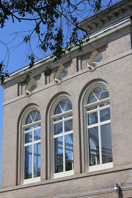
LinkThe "Editors Building," located one block from the White House at 1729 H St., NW in the Golden Triangle, has been owned and occupied by Kiplinger Washington Editors Inc. from the time it was completed in 1950. But after six decades, the family-owned finance publisher is selling its 10-story, 77,000 s.f. neo-classical building to a hotel developer.

The buyer currently under contract, OTO Development Company LLC, has put down a firm deposit, giving Dek Potts, a senior managing director with Holliday Fenoglio Fowler, L.P. (HFF), "reasonable confidence" that the sale is a sure thing.

Settlement is scheduled for October in order to allow Kiplinger time to relocate. HFF has been marketing the property since the summer of 2010. OTO Development LLC is a South Carolina-based hospitality development company with properties nationwide, and in April delivered its first project in D.C., the Hilton Garden Inn at Constitution Square in NoMa.

Located in the downtown core, the new Golden-Triangle property being acquired is C-4 zoned, allowing office, retail, housing, and mixed-use development (up to 110' and 8.5 F.A.R.) by way of right.

Designed by Washington architect Leon Chatelain Jr. in 1948, construction of the building in the subsequent two years was completed under the guidance of John McShain, celebrated general contractor-builder, who has been dubbed "The man who built Washington." McShain and his company worked on over 100 buildings in the thirty-odd years spanning the 1930s to '60s, including the National Airport, the Kennedy Center, the Jefferson Memorial, the Pentagon, the Library of Congress annex, and, the same year as the Editors Building, a revamp of the White House.
The Editors Building is not designated as a historic/landmark structure, allowing the buyer one less fee-trip in the path to redevelopment. A façade of limestone surrounds a red-granite-and-bronze entrance with matching red-granite window accents. Inside, the continuation of neo-classical elements includes an all-marble lobby with 12-to-16' ceilings.

Washington D.C. real estate development news

Monday, July 11, 2011

Your Next Place...

0 comments
By Franklin Schneider

When I was fifteen, I spent a summer living with wealthy relatives in Germany, near the Black Forest. They lived in a very fine house that on the inside looked a lot like this one. When I think back on that summer, I think of the Old World elegance of their house; the hardwood floors, stone fireplaces, the simple but timeless elegance. That, and the fact that there was no drinking age, and that it was perfectly acceptable for a 15-yr old to stay the night at his girlfriend's house, in her bed. My parents really had no idea what sort of education I was getting.

But back to the Old World elegance. This place has it in spades, with wood and stone wherever you look; from the six fireplaces to the fantastic woodwork to the luxury dining room with a fully-functioning antique dumbwaiter (you don't see many of those anymore). There's a spacious library, with built-in shelves and a bay window/reading nook, a den/office, and a massive kitchen that opens onto a private enclosed patio for al fresco dining. Five bedrooms with two full baths and two half baths; the master bathroom is exceptional, long and white like a luxury traincar, with twin basins and a huge glass-enclosed shower with twin showerheads.


Located at 17th and P, it's close enough to the Dupont Circle metro and everything else (Whole Foods, Safeway, CVS, tons of shops, restaurants and bars) that you really don't need a car. At this point let me direct your attention to the one letter's difference in the phrases “carefree” and “car-free.” Coincidence? Well, yes. But it makes for good copy. Okay, decent copy.

1704 P Street NW
Washington, DC 20036
5 Bdrms, 3 Baths
$1,395,000

Saturday, July 09, 2011

What Jill Spaeth Sayeth

0 comments
ByAmerican Chemistry Council, Washington DC Beth Washington DC commercial design - Jill Speath, Fox ArchitectsHerman


Inside the American Chemistry Council in northeast Washington D.C., a long wall of custom, internally LED-illuminated panels illustrates some of the District's great landmarks in a formidable photo mosaic. At first glance, the Capitol dome and the Washington Monument appear boldly enough, but further investigation reveals the images are made up of distinct letter forms from the periodic table of the elements.

"According to the ACC, chemistry is in everything, said Jill Spaeth, founder of Fairfax, Va.-based graphic design studio Citizen Creative. “So we subtly put that in there.”
American Chemistry Council, Washington DC
Moving upon graduation in 2004 from New York to D.C. for a position with the then nascent FOX Architects, Spaeth and her communications department colleagues were responsible for the firm’s maverick marketing collateral. This included a mass mailing of socks with text that said, “FOX Architects will knock your socks off, so here’s another pair,” and a Christmas gaggle of blue icicles exhorting recipients to “lighten up: it’s the holidays.”

“We kept doing this and eventually it got out there so well that people wanted to know the creative team behind these projects,” Spaeth said, noting the team began to get some of its own clients separate from father FOX. While they often came in as a byproduct of an architectural project, Spaeth recalled creating an identity for a law firm in a FOX redesign, focusing on letterhead and business cards.

On other occasions, referrals came in that established a graphic design client base for the creatives, independent of architectural projects, with clients seeking critical space identity, wayfinding signage and communication design. In forging its own identity to bid jobs as a separate entity, and with FOX’s imprimatur, the tiny ‘graphics department that could’ became Citizen Creative, with Spaeth then encouraged to strike out on her own in early 2010.

True north and pepperoni

When the nearly 200-year-old Virginia Theological Seminary with its sprawling Alexandria campus came calling, wayfinding was at the top of its dance card, according to Spaeth. “It was a great project because you’re creating design solutions that enable people to do something bigger—enable them to function by getting to their destinations more efficiently, or faster, or more cohesively,” she said, noting the new dean at the time had confided students couldn’t even get a pizza delivered.Jill Speath design, Fox Architects, Washington DC commercial design
Tasked with a comprehensive signage program, the firm strategized primary signs that direct people to the alumni center or the library, for example, and secondary signs that provide names for each building. A tertiary level of signage put numbers on each structure for easier identification and access, but there was much more to the project than simple clarification.

“It’s the oldest theological seminary in the country,” Spaeth said, “with gorgeous brick buildings to which we wanted to pay homage.” Affirming she also wanted to integrate the campus’ newer building design into its signage, the resultWashington DC commercial property for saleing product is a marriage of a brick masonry base with the top Virginia Theological Seminary, design by Jill Speathconsisting of aluminum to withstand the weather. “We painted the new identity in these bold colors on the top that really brings the two pieces together,” Spaeth said.

What lies beneath

When meeting with clients to ascertain their needs, and referencing ACC in particular where FOX Architects had retained Citizen Creative as a consultant in 2010, Spaeth said she probes deeply by asking targeted questions such as what they represent, why they are here, and why what they does really matters. “This tells me more about the client than they realize,” she said, adding that because the ACC is largely about educating lawmakers on Capitol Hill about the role chemistry plays in developing new ideas and solutions, the graphic-paneled Washington wall with its embedded periodic table of the elements was created to trumpet the message.
Washington DC commercial property for sale
At IBS Millwork in Manassas, the celebrated custom millwork fabricator sought to expand its reach and skew the aggressive D.C. architecture and design market, but fell short in its materials presentation, according to Spaeth. Collateral colors like “undecided grey” (a paean to the owner’s cherished Ohio State Buckeyes) failed to make a powerful statement, and a portfolio that included long shots or lobby-wide images made prospective clients “do all the work” about what work, exactly, IBS had done in the space. Creating everything from a bold-hued brochure Washington DC architecture and design firmsto a qualification package and more, and even hiring a photographer to reshoot elements of spaces that accentuated the FSC-certified client’s achievements, Spaeth said “crisp and current” materials and project-specific images are critical to successfully navigating the saturated D.C. market.

Recently concluding a two-year term as president of the 900-member DC chapter of AIGA, the professional association for design (Spaeth was the youngest chapter president in the organization’s history), she is also newly certified as a SWMOB (Small, Women and Minority-Owned Business) in Va., which she explained may garner a higher proposal ranking for clients bidding on government projects.

“We are truly citizens of design,” Spaeth said of the firm’s unconventional name. “We have an allegiance to providing clients with gorgeous, thoughtful design ideas that really showcase who they are and what their message is.”

ACC photos courtesy of Ron Blunt

Friday, July 08, 2011

U-Turn for Residential Building on 14th Street

26 comments
Three residential projects will rise up 7 stories along the 14th Street Corridor between R and U Streets NW in the next two years, but Level 2 Development's project sited for Wallach Place and 14th (1905-1917 14th Street) won't be one of them - at least not yet. The project's architect, Eric Colbert & Associates, went up against the Historic Preservation Review Board (HPRB) - and up against two handfuls of Wallach Place residents - last week at the HPRB's monthly meeting, only to be unanimously denied design approval.

As first reported by U Street Dirt, the HPRB was openly critical of the design and urged Colbert to rethink the building's rhythm, scale and greater context in the U Street Historic District.

The Colbert design presented was a 7-story apartment building, with an approximately 16,000 s.f. site footprint (150' wide x 106' deep). Although materials alternated between brick and metal "to break the building down into smaller pieces" with for 5-story projecting bays along 14th Street, the Board verbalized dissatisfaction with the look and feel, saying it wasn't 14th Street appropriate and ultimately didn't have "that Colbert magic" (apparently preferring the Floridian.)

It seems inevitable that the one-story "bunker" - officially "The Edna Frazier Cromwell Shopping Center" - currently lying low at the site, will not escape demolition. Built in 1986, the center was the first privately financed real estate development on 14th Street after the destruction of the 1968 riots. However, the structure has widely been regarded by the immediate community as an "eyesore." Previously on site was a 5-story brick building (demolished in 1970).

Washington D.C. real estate development news

Thursday, July 07, 2011

Winner of President's Park South Design Competition

5 comments
National Mall:  President's Park design, Rogers Marvel Architecture

Rogers Marvel Architects, a New York-based firm, was announced as the winner of the President's Park South design competition at the National Capital Planning Commission (NCPC) meeting held today.  Rogers Marvel was selected amongst five semi-finalists out of a field of 25 entrants. In a statement, NCPC described the Rogers Marvel design as "adding a seating wall with integrated pedestrian lighting, while subtly raising the grade of the Ellipse. This establishes a security feature, reinforces the Ellipse as an event space, and minimizes the visual appearance of adjacent parking." The design adds a new E Street terrace that joins the modified Ellipse with the White House South Lawn, a design that "could also accommodate re-opening E Street, NW without requiring significant changes," according to NCPC. The next, and more formidable, portion of the project will be to wrangle the money necessary to build out the winning design.

Washington D.C. real estate development news

Partial Preservation Prevails Over Parking

4 comments
The request submitted to the Historic Preservation Review Board (HPRB) for partial preservation of three historic rowhouses at 1232-1236 New Jersey Avenue NW, was unanimously approved by the HPRB Board on June 30th. The applicant, The Third Street Church of God, had petitioned for a full raze of the properties to make way for 5-7 parking spaces.

The partial raze compromise was reached in the "11th hour," as HPO Staff Reviewer Brendan Meyer stated during his testimony; HPRB Chair Catherine Buell explained that the role of the HPRB is to preserve "contributing structures in a historic district." With that said, Buell then acknowledged that the Church could revisit the Board with a new (full raze) request, or petition the "Mayor's agent" using the plea of economic burden.

Washington D.C. real estate development news

Plans Submitted for Southwest Wharf Waterfront

6 comments
Visions of a "world class" waterfront destination along the Washington Channel in Southwest had been dancing in developers' heads for years before a contract was awarded by the District in 2008. On June 28th the winning team's vision became more clear when PN Hoffman and Madison Marquette filed a preliminary report with the D.C. Zoning Commission, clarifying its plans for the 52 acres (including build out on the water) that will be radically revamped as "The Wharf" to be constructed in three phases over the next 10 years.

Phase one of the project - encapsulated for approval as the "Stage 1 PUD" - will be reviewed by the Commission on July 18th. In addition to reviewing Stage 1, the Commission will rule on the request to rezone the area from R-3 to C-3-C on land, and from unzoned to W-1 in the water.

If approved, the initial stage will be valid for 18 months, allowing developers that long to submit the final Master Plan to the office of the Deputy Mayor's for Planning and Economic Development (DMPED) for approval. Construction of the first phase is projected to begin in late 2012, and is expected to last until 2016. In those four years, phase two will undergo the review and approval process.

Phase 1 will begin in the middle section, roughly from 7th Street to 9th Street, in between the entertainment-heavy section closest to I-395, which focuses on water-transit-oriented piers and redevelopment of the Municipal Fish Market (phase two), and the residential area at the southern end (phase three). Redevelopment of the Municipal Fish Market will take place in phase 2.

Phase one includes the restructuring of portions of 7th, 9th, N St and M Place; a new Capital Yacht Club; two new piers - "City Pier" off of 9th and "7th Street Pier" - and a major infrastructure overhaul of Water Street. The grand scheme is to turn Water Street into a promenade with 60' of width shared between pedestrians, streetcars, bikes and outdoor diners.

The parcels in phase one (2,3,4 and 5) will be developed as office, retail, residential and hotel space. Parcels 3 through 5 could potentially be 130' high, as is permitted in a C-3-C zone. The plan shows that parcels 3 and 4 will have ground floor retail and office and/or residential towers, parcel 5 will hold two hotels, and parcel 2 is slated to become a concert/entertainment venue with seating for 4,000 to 6,000.

Parcel 3, at the corner of Maine Avenue and 9th Street, has been claimed in part by the Graduate School USA, which will take up 190,000 s.f. of space and operate 18 hours a day. A temporary Kastles Stadium, now located near parcel at 9th and Maine Street and intended to be temporary, is now being considered for parcel 2.

Holland & Knight, legal counsel for PN Hoffman and Madison Marquette, submitted the project's prehearing statement to the Commission in May, and the more recent "20 day [in advance of hearing] submission" on June 28th. Significant changes in both prehearing documents that will affect phase one include a decreased F.A.R. (floor area ratio), the removal of residential use at parcel 5, reduced parking spaces and increased bike docking areas. Most encouraging is the reduction of subsidized housing required by the District from 30% to 20% of total housing.

A community workshop was given by the developers on June 7, where several issues were raised, most of them surrounding the riparian development, including the depth of the channel, and the extended length of several piers, which cuts the width of the channel from 400' to 200' wide.

Subsequent development will include a revamped Banneker Park and the Southwest Ecodistrict of 10th Street (not controlled by Team Wharf), which will ideally provide a link from the waterfront to the Mall.

Other elements of the overall development (all three phases) include a combined 3.2 million s.f. gross floor area (3.87 F.A.R.), 8 to 12 acres of park/open space with "programmed public activities" catering to year-round use, 625 hotel rooms, 1,200 "mixed-income" residential units, and 400 to 500 Marina Slips

The entire project is estimated to need $2 billion; the District pledged $200 million in 2008 in tax increment financing. The redevelopment, say developers, has the potential to bring in $40 million in tax revenue annually.

ANC 6D will hold a meeting, in advance of the Zoning Commission hearing, at the Dept. of Consumer and Regulatory Affairs (DCRA) at 7pm, next Monday, July 11th.

Washington D.C. real estate development news

Wednesday, July 06, 2011

Safety First: Dissecting the Mexican Cultural Institute

3 comments
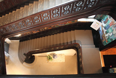
By Mexican Cultural Institute Washington DC, John Bellingham, Monarc ConstructionBeth Mexican Cultural Institute Washington DC, John Bellingham, Monarc ConstructionHerman Its array of explosive Latin American murals propels one through history, geography, space and time. Standing before the dramatic interior walls of the Mexican Cultural Institute, tilling the fields or tickling the gods are well within reach. For Monarc Construction Principal John Bellingham, upgrading the Institute’s labyrinth of safety and security systems, and addressing handicap accessibility issues, without disturbing its signature murals and coterie of antiques, gilded objects, cut crystal, tile and ornate grille work was not your grandmother’s construction challenge. "It is magnificent inside," Bellingham said of the series of galleries that define the 40,000 s.f. space, and his commission to expand them. “It’s a four-story (Italianate) structure with 20-ft. ceilings that had been neglected badly.”Mexican Cultural Institute Washington DC, John Bellingham, Monarc ConstructionMexican Cultural Institute Washington DC, John Bellingham, Monarc Construction Built as a residence at 2829 16th Street NW for President Taft’s secretary of the treasury in 1910-11, the building was sold to the Mexican Embassy in 1921 and then designated as a cultural center in 1990 by President Carlos Salinas de Gortari of Mexico (the embassy had moved to another venue the previous year). While adroitly circumventing artist Roberto Cueva del Rio’s masterful murals was indeed part of the challenge, major concerns included inadequate 30-inch-tall handrailsMexican Cultural Institute Washington DC, John Bellingham, Monarc Construction, property for lease in the building’s sprawling three-story stairwell, often utilized as space during receptions, as well as antiquated electrical, plumbing, fire and other safety systems, and also interior environmental issues. In fact when the Institute’s executive director, under whom the work began, was replaced by current Executive Director Alejandra de la Paz, elements such as an exterior envelope upgrade and restoration were added to the already comprehensive task list, with an emphasis on windows. Mexican Cultural Institute Washington DC, John Bellingham, Monarc Construction, architecture

Of wind and mortar “I remember standing there in the winter and the curtains were just blowing in the breeze because the air was coming in so much,” Bellingham said, adding for sustainability and preservation purposes the goal was not to replace but restore them, some 16 feet tall. Brick work was cleaned – the limestone repointed, and Bellingham noted because the bricks are German (thin and long), repairs had to come from cutting other bricks when nothing comparable could be found. In what was once a greenhouse in the back of the building but is currently a public space for presentations and the like, exquisite Calavera tile was restored with tremendous effort. When a match could not be obtained from its manufacturer in Puebla, Mexico, Richmond, Va. celebrated artisan and sculptor Charlie Ponticello was commissioned to replicate the tile.Mexican Cultural Institute Washington DC, John Bellingham, Monarc Construction, Beth Herman writer Scalpel, please “In buildings of this age, typically there are a lot of vertical chases as they were heated with hot water radiators,” Bellingham explained, adding the question of how to cut the art-laced walls for equipment upgrades was a painstaking issue. “It’s a matter of finding the chases again, opening them up, taking out abandoned piping in some cases and replacing it, and forming new chases,” he said. In the third floor library, with its polished walnut ceiling, years of incursions for construction or mechanical purposes had damaged it considerably, and Monarc also had to install components of its safety systems. Bellingham said by the end of the process, there was no way to determine where any work had been done, resulting in a great enhancement of the space. With the original wood balustrade just 30 inches high, safety concerns abounded for those gathered on stairways, especially during parties and receptions. “You could be pushed or literally fall backwards,” Bellingham said, “with the handrail coming up only to the back of your legs – not your waist.” Seeking not to impinge on the beauty of the balustrade or disturb it any way, a glass handrail was fabricated to stand in front of it.Mexican Cultural Institute Washington DC, John Bellingham, Monarc Construction And among the project’s more prickly challenges was the method in which to “sprinkle the stairs,” Bellingham recounted. “It’s a four-story lobby with an atrium that goes all the way from the ground floor to the roof,” bathed in murals and more. A decision to enhance the original cornice – which ran up under the stairs – and hide new pipes between the old and new cornice work camouflaged necessary pipes, Bellingham explained. Located on 15th Street in back of the structure, a 1,500-s.f. carriage house with collapsed roof was also restored, transformed into a new housing unit for visiting dignitaries and other personnel. “The whole building is a solid masonry structure,” Bellingham said of the Institute. “There was a lot of exploratory work, and we took down parts of the ceiling, went through walls, cut passageways and took down moldings to hide pipes and wiring, not to mention working around an old organ. We had to protect these great artifacts.” 

Washington DC commercial design

Tuesday, July 05, 2011

No Mo' for East NoMa This Year?

13 comments
Washington DC commercial property for lease - Wilkes Company develops Noma
Charles "Sandy" Wilkes
founded The Wilkes Company over three decades ago and began investing in NoMa - North of Massachusetts Ave - shortly thereafter, acquiring property as early as 1985, when Reagan was in office, Mandela wasn't free, and Back to the Future was the highest grossing film in the U.S.  That investment may soon pay dividends, as Wilkes plots a course to finally develop the block of property at 3rd and M Streets, NE, in Noma's long underdeveloped eastern branch. While signs of construction have been evident at the site for several months, Wilkes is holding back on development until the moment is right. That moment may well depend on Douglas Development and its development of Uline Arena; restoration of the historic 60-year-old Uline/Washington Coliseum, according to Douglas, depends on finding a marquee tenant, which they are actively seeking. Despite other real estate projects in the Northeast area rolling forward - Valor Development's 49-unit condo at 3rd and L, slated to begin in spring of 2012; the AvalonBay's 215-unit apartment project at 3rd and I; and Guy Steuart's Giant project at 3rd and H - Wilkes seems to be keeping an eye on what may be the city's most unique entertainment venue just across the street. 

 In addition to the combined Uline and Ice House project by Douglas and 300 M St NE, there are two other substantial planned projects on the boards for East NoMa proper: Union Place II, a 500-unit apartment with 30,000 s.f. of retail by The Cohen Companies, now in the design phase and looking to break ground in first quarter 2012, according to TCC's executive vice president, Eric Siegel; and the long-way-off Burnham Place project, a massive, billion-dollar build by Akridge.Link
Douglas Development's Uline Arena in Noma, Washington DC

300 M Street has long been idle and is being used for parking in the interim; the reason for the long wait time, according to Wilkes, is that he is "taking the time to determine the right mix of uses [at the site] and determine the right timing." The market is a big factor, specifically the uncertainty of the market for office space in the immediate area, and the unknown effect of substantial commercial density being added to west NoMa. Wilkes is familiar with the market, as well as the ongoing changes in NoMa: along with being an owner of substantial property for over 25 years, he invested in the construction of the New York Avenue Metro stop, and serves as vice chairman of the NoMa BID (a map with the boundaries of NoMa is found below). 

Although the specifics may change given Wilkes' earlier statement, an original design for 300 M, conceptualized by D.C.-and-New York-based Beyer Blinder Belle , incorporated retail, loft-style residences, and office space catering to a large organization: a non-profit HQ, government agency or trade association. One thing is clear about the future use of the site,"It will require zoning relief," explains Wilkes. The Ward 6 location is zoned C-M-1, low bulk commercial and light manufacturing uses, with a maximum height of 3 stories or 40'. Wilkes asserts that the zoning process will take some time, and that ground breaking at the site is not imminent. Wilkes also claims that east NoMa will eventually develop as more of a nod to New York's SoHo and Tribeca than anywhere else in DC, and "patience" is required, but that patience is wearing thin for some. For now, it seems Wilkes' project will sit on the sideline for the rest of the year, as west NoMa continues to witness the highest concentration of construction in Washington D.C. With over $3 billion of private investment shuttled into the whole of NoMa since 2005, 15.7 million s.f. of the neighborhood has been developed, and with 16.8 million more square feet to go, more patience may be a necessary asset. 

Washington D.C. real estate development news

Saturday, July 02, 2011

A Penthouse Defined by Color and Comfort

3 comments
By Beth Herman


Chromophobia... fear of color.

You won't find it anywhere in interior designer Camille Saum's Washington oeuvre, and certainly not in the Edgemoor condominium she created for renowned D.C. area real estate broker Sherry Davis.

Known as much for her personal style as prodigious use of color (think: sun-yellow floors and skin-pink ceilings), in more than three decades Saum has yet to acquiesce to the beiges, blacks, browns and greys of convention –unless absolutely pressed!

"You do have to listen to the client—that’s what success is all about," Saum affirmed, conceding that she has worked very hard over the years to be able to strike a balance between clients' desires and her own evolved design ideas.

Transitioning Davis from a sprawling 4,500 s.f. Bethesda home to a 2,500 s.f. penthouse in the same neighborhood, Saum said in addition to the use of color for depth and drama, economy of space was paramount. By the same token, the client’s priorities clearly needed to define the space.

"The instructions that I had at first were that she’s got to live in this room,” Saum said of the living/dining room space, because unlike the expansive home Davis was leaving, there were no other areas to which to escape except for a bedroom and guest bedroom. Desiring a comfortable, largely contemporary environment, accommodating a cherished, aging schnauzer with accruing health problems named Max was also high on Davis’ dance card and factored heavily into fabric and flooring. A durable “nubby” fabric was subsequently chosen for the couch and loveseat, and a wool rug that could be easily cleaned was added.

Because size mattered, Saum had furniture custom-made which allowed more flexibility in scale. “You have to be creative,” she said, reaffirming the smaller room mandate. Recalling an issue at The Westchester, where she resides, Saum said she’d once witnessed a failed attempt to load a magnificent antique sofa through a doorway. “Every piece of furniture I order for every space—I measure doorways and everything else,” she said, whether custom-made or otherwise. “You can take the feet off and do other things, but I prefer not to do that.” In fact, in the client’s aptly named Panache Penthouse, Saum made the sofa backs shorter, for easier entry, so the cushion sits up three inches above it and looks beautiful.

With small grandchildren, space in a concentrated area for them to spread out for reading, games or art projects, or to be able to participate in holiday meals, was achieved with two built-in pedestals that double as seating, with colorful cushions on top, or as low table surfaces.

Saum chose a favorite in her signature color palette for the space’s tray ceiling—the resulting shade of “plantain” redolent of the sun. Reflected in accessories such as pillows, lamp shades and especially a wall-sized acrylic canvas by artist Linda Cafritz, the plantain hue transforms the room into a bright, shining environment. “I always try and make a space happy, because when you walk through a door, you want to love to be there,” Saum said.

Enlightening space and client

Not enamored of recessed lighting, Saum said her client had to be convinced to try it and when she did so, never looked back. “She thanked and thanked me, as we had to think about what we were going to do in the living room when a floor lamp wouldn’t be enough,” Saum said. An antique chandelier from Dominion Electric Supply added sparkle to the living/dining space, and table lamps “float,” according to Saum, with holes drilled in glass-top tables and skirts to conceal cords.

In the master bedroom, a custom 72-inch leather headboard in a deep camel with green cording complements neutral walls and soft, moss-green furniture. Twin Donghia lamps were painted to accent the room, and a camel-colored area rug with 3-inch banding and mitered corners completed the space. The penthouse’s guestroom utilizes an iron bed from Davis’ former home, along with a crisp mustard-and-white-striped chair in Donghia fabric. A simple Pottery Barn bedspread, cuddle pillow with a solid flange, and toile quilt and sheets - also in a Donghia fabric - reflect a serene and gracious environment, with chili-red lampshades providing a dollop of drama.

Of her designing life and proclivity for color, Saum maintains she was “born with it in her blood.” A bona fide daughter of Georgetown, among Saum’s earliest memories is a move from one home to another where she recalls the placement of every piece of furniture, along with the color and texture of the wallpaper, when she was just 4 years old.

“It’s intuition, and all the school in the world cannot change that if it’s not there,” the designer affirmed. “Color is inside of me.”


photos courtesy of Gordon Beall Photography


Friday, July 01, 2011

Takoma Park Progresses on Twin Developments

13 comments
SGA Companies and Level 2 Development are finally watching construction progress at their joint residential-and-retail project at 235 Carroll Street NW in Takoma Park, a long dormant site that Bethesda-based SGA Companies, founded by Sassan (Sas) Gharai, purchased in 2004. Three years later, site prep was undertaken, including extensive environmental remediation and the removal of rusted-out oil drums left over from the former gas station and truck rental facility on site. Still, four years went by before construction began, last month.

Of the changes at 235 Carroll Street in the Takoma Park Historic District, Sara Green, Commissioner of ANC 4B 01, has no complaints. It's the site next door, at 231 Carroll St, also being developed by SGA and Level 2, that is giving her some grief.

The developers' plans for the adjacent site (231 Carroll) were approved, with suggested refinements, yesterday, June 30th, by the Historic Preservation Review Board (HPRB), and now await final approval by the Historic Preservation Office (HPO).

Although Green submitted in her testimony to HPRB yesterday, "Everyone I have talked to is excited about seeing a vacant and ugly lot on our 'main street' developed, and this design has several very appealing and creative features," her concerns lie with the back of the building at 231, not the appearance from the front.

Along the new "main street," the two buildings will be distinctly different, thanks to community feedback and HPO recommendations, as the HPRB Staff Report by Anne Brockett details, "The design for [231] has changed dramatically in its exterior appearance since submission. Initially it was proposed to match the design of 235 Carroll."

In the interest of visual diversity, the newest plan for 231 Carroll St is a 5-story complex with 60 residential units, 35 underground parking spaces, and a retail component, designed with a "warehouse-inspired aesthetic" using predominantly red brick. In contrast, 235 Carroll St is a longer but shorter building, with 4 stories, 84 residential units, 70 underground parking spots, and 6,500 s.f. of ground-floor retail, featuring "yellow brick with panelized bays."

The two residential-and-retail complexes will be connected by a glass "hypen" of sorts that at once connects and separates the two buildings, which Commissioner Green appreciates, as does much of the community, according to her.

Of 231, the staff report explains that "large, street level openings have brick arches and are covered by a corner canopy suspended from metal rods. The upper story windows are 6-over-6 hoppers with steel lintels and sills. The side elevation along Cedar Street continues the warehouse materials and detailing of the main block and then at a setback and lower wing changes to a mix of stucco bays and hardiplank-sided recessed balconies. Along this elevation, the northernmost corner loses its top floor for a terrace, thus stepping down toward the adjacent historic home on Cedar."

It's the "step down" plan, on the corner of Carroll Street and Cedar Street, where Green's concerns are focused.

In her testimony to the HPRB yesterday, Green stated, "The Takoma Central District Plan specifically addresses height. It states that 'new commercial and residential buildings should be no more than 2-4 stories in height to match existing residential scale' and to preserve Takoma’s 'small/town village character'."

She continued by saying that, "The Takoma Overlay District permits heights of up to 55 feet, but as I also understand it, you have the ability to reduce the height, as needed, on case-by-case basis."

Yet, overall, the project has been well received by both ANC4B and a majority of the immediate Takoma Park community. Green also asserts that Sas Gharai of SGA, and Jeff Blum of Level 2, have worked diligently with concerned parties, and have revised the design at 231 Carroll into something commendable. Still, she believes, it could be better, and specifically, shorter.

Meanwhile, the complex already underway at 235, dubbed Ecco Park early on, had planned for condos but turned rental in the spring of 2008. The project was also once in the hands of Ellisdale Construction, in the summer of 2010, but is currently being built by Hamel Builders; Hamel Builders could not be reached this morning, and Ellisdale would not disclose any information on the change.

Washington D.C. real estate development news
 

DCmud - The Urban Real Estate Digest of Washington DC Copyright © 2008 Black Brown Pop Template by Ipiet's Blogger Template