Thursday, March 08, 2012

MoCo Approves North Bethesda Market II

8 comments


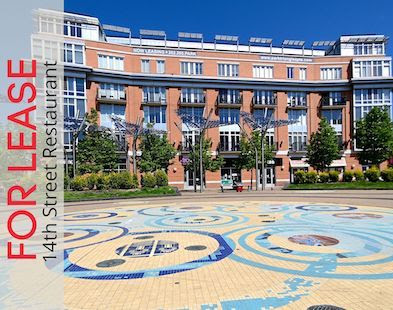
The Montgomery County Planning Board approved plans for the JBG Companies and MacFarlane Partners' North Bethesda Market II last week, continuing the area's stunning streak of approved megadevelopments.
While the name "North Bethesda Market II" may conjure visions of one of those upscale bodegas that has prosciutto and a surprisingly good wine aisle, that is not the case here. North Bethesda Market II will consist of four separate structures offering as many as 414 residential units and 368,000 square feet of retail. The roster of tenants is stacked with heavyweights; Whole Foods, L.A. Fitness, Arhaus, Seasons 52, and Brio, with others to come. The centrally-located 4.4 acre site is a block from the White Flint metro station, across from White Flint Mall, and just west of Rockville Pike. Of course, it's also right next door toNorth Bethesda Market I (which features the tallest building in Montgomery County).

"NBM1 has been very successful," said Charlie Maier, spokesman for JBG, when asked about the follow-up project. "The site used to be a one-level motel and now it's a model for development in the Wisconsin Avenue corridor." Maier also said JBG is looking to 4Q 2012 for groundbreaking.

The centerpiece of NBMII is a 26-story, nearly 300 foot tall residential tower that will eclipse its sibling development's tower as the tallest structure in MoCo. The Stu
dios Architecture-designed monolith features a stepped facade and balconies that will look out onto a European-influenced interior plaza designed by landscape architects Olin. The eye-catching building is sloped slightly backwards to catch the maximum amount of sunlight and, like the other three buildings, will feature a green roof. Architectural journals have gushed over the design, and the Washington Post likened it to "a Mayan Temple whose glass bricks have been shaken earthquake-like out of position." Units are planned as rentals, though developers have kept the condominium option open. Elsewhere in the development, developers also plan a movie theater with 175,000 square feet of office space above.

The development continues the recent(ish) trend of transitioning sprawling 50s-style car-centric low-slung areas into dense, vertical, mixed-use, pedestrian-friendly urban-style areas, leading to the question of, five years from now, will there be anything left for me to make snarky remarks about at dinner parties? Revitalization in White Flint was catalyzed (much as it was in adjacent Wheaton), when Montgomery County planners approved an updated White Flint Sector Master Plan in early 2010, and shows no signs of slowing down. Aside from the North Bethesda Markets, the Pike and Rose gained approval in February, and the Falkland Chase whole-block development was approved in January.

Montgomery County real estate development news

Monday, March 05, 2012

Rebel with a Reciprocating Saw: Creating El Centro

1 comments

By Beth Herman
There are more than 18 restaurants, including Washington's acclaimed Masa 14, in his epicurean empire, at far-flung locations from D.C. to Denver to Dubai. So what could powerhouse chef/owner Richard Sandoval have in common with a Rhode Island School of Design graduate and her garage full of power tools?
For Brie Husted of Brie Husted Architecture, who created Sandoval's latest D.C. digs—the eclectic El Centro D.F. (stands for Distrito Federal), at 1819 14th Street NW, the tools are her unconventional calling card. In fact with a knack for fabrication that rivals her creative prowess, Husted’s so-called guilty pleasures would seem to run more toward nail guns than nail color.
“One of the things I really should credit is my RISD education,” the architect said of her views on building and design. “The architecture school there is very hands on: Your first project begins with making something—then you ask questions.”
It’s all in the joist
In creating El Centro, “materiality” and “rhythm” were a key part of the creative process, as they are in all of Husted’s work. Her fusion of raw and recycled materials— rope, scrap metal, newsprint, lighting fixtures composed of metal sprinkler heads, reclaimed/repurposed old pine joists and broken Talavera tiles—resulted in a hospitality space that piques the pulse as much as the palate. “Art and architecture just feed off of one another,” she explained, citing a behemoth, textured mural of old newspapers and recycled wood in the restaurant’s main dining space, something she and her trusty battery pack nail gun fabricated in about five days. At 13-by-13-feet, its imposing, variegated cross design was actually subconscious, the architect revealed, as were the Talavera tile crosses she created in the restroom, though they’re emblematic of Mexico’s deeply religious culture.
On two levels and at 4,600 s.f., with an additional rooftop deck gilded by a single street-facing wall to absorb noise in deference to neighborhood below, three distinct dining spaces for 150 patrons facilitate El Centro’s alimentary experience. An open kitchen with distressed metal panels suggests a classic taco truck and separates the taqueria in front from the cafĂ© in back. A cavernous, carved-out, below grade space, called the “tequileria,” implies the old time speakeasy atmosphere that appeals to Sandoval: He, Husted and Sandoval’s managing partner Ivan Iricanin began to conceptualize El Centro at an aptly-named Mexican speakeasy affair in NYC.
Helmed by project architect George Wabuge, whom Husted credits with keeping their mission “authentic,” general contractor and master carpenter William Camden was also part of the team. Brandishing his own set of power tools, including a chainsaw to fashion such elements as a light fixture from an old carriage house wooden beam, Camden also crafted a log trough sink in the restroom from a tree on his property. Millwork benches and more were built from reclaimed timbers—actually salvaged pine joists from deconstructed Adams Morgan and Mount Pleasant homes— by furniture maker Joe Mills. “We designed and made all of the furniture,” Husted affirmed of the artful collaboration.
Texture and tradition
For inspiration, rather than acquiescing to the “shtick” she said defines many Mexican restaurants, Husted spent time researching what is characteristic and enduring about the country. “Everything’s textured, and everything’s recycled in Mexico—nothing is put in the trash can,” she said. To that end, coarse masonry block walls—ubiquitous in Mexico— were used in the restroom, and the decision to recycle was manifested in items like the space’s decades-old steel sprinkler heads. The former Georgetown Refinishing warehouse had 13- or 14-foot ceilings, wherein fire sprinklers had been lowered by pipes to about 8 feet, which worked out perfectly for the team who figured out a way to transform them into rustic light fixtures. Much of El Centro’s wood, including the mural’s infill, is reclaimed wood lath, which traditionally backs plaster in pre-1920s residences. And 200 feet of rope—a natural material used in vertical fashion as a guardrail—embellishes the restaurant stairs, reinforced by turnbuckles for durability.

Of culture and carpentry
Eschewing what can be the anonymous cog-in-wheel nature of architectural firm work, as a young architect, Husted eventually focused on general contracting and carpentry work for personal projects she created (a home she bought; another renovation with a friend). She also worked as a construction administrator and carpenter before hanging out her own architecture shingle in 2000.
At her first formal meeting with Sandoval and Iricanin, the native Washingtonian presented a 12-by-24 piece of wood and some scrap metal, along with a few newspapers, declaring these were what she was considering for the design. “They said it was curious, but OK – they’d go with it,” Husted said. “One thing they say in school about professional practice is that you can’t have a good project without a good client. Ivan (Iricanin) really got this and encouraged it.”

In the cellar, or tequileria, the space was actually dug out and left raw, with a poured concrete bar, floors and walls. Because steel beams spaced on 5-foot centers supported a concrete floor on the level above it (not a lot of owners are willing to venture that far, according to Husted, who credits Sandoval and Iricanin with their sense of adventure), wood vaults with 10-foot arches could be inserted between the beams to give it a real cellar feel but with additional height and drama. Drawing on the cultural research she’d done in the beginning, Husted carved multiple niches tableside, in the walls, in which to display Mexican art.
“I went to Mexico and found something OK, but then Richard and Ivan went and searched all over,” Husted recalled. At the end of one day, they walked into a little gallery shop, (the now defunct) La Azteca, and found these masks, each based on a Mexican myth, and bought 20 of them for the tequileria’s niches.

As the brunt of design elements at El Centro were conceived onsite, Husted revealed the materiality and temporal nature of the project—four months from permit drawings to Cinco de Mayo grand opening—made creating many things ahead of time impossible.
“In my work, half of my ideas come from just looking at a material and imagining what it could be,” she said.


photo credit: Rey Lopez

Saturday, March 03, 2012

Your Next Place

0 comments
By Franklin Schneider

This Logan Circle Victorian was renovated by a professional designer, and it shows. Where most "renovations" just mean tearing out the carpeting and painting over everything, this one legitimately
transformed the place. Boasting clean lines and tons of light (check out that bay window), there's also a ridiculously cool fireplace, some of the most impressive hardwood floors I've seen, and skylights galore. The master bedroom suite is huge, with a fantastic bathroom that features a spa-style tub and twin basins. (That way you can be married AND still have your stubble-hair-and-toothpaste-encrusted sink).

The kitchen is huge and has a "smart" island, which means that it's extra long and has a sink in it. This is brilliant and a potential game-changer. Why isn't this standard? If I had one of these I might even wash my dishes occasionally instead of letting them fester in the sink and then moving them out to the deck for a few months before shoveling them into a trash bag. (P.S. I'm thirty-three years old. Hee!)


Out back is a nice cozy garden and the lower level is a self-contained one bedroom apartment. It's also in Logan, so it's close to everything you could possibly want to go to, as well as Logan Circle, which is a seriously underrated public greenspace and one of the best places to sit in the summer and pretend to read while eyeing attractive passersby. I spent a good forty-five minutes there one day last summer before realizing I was holding my book upside down.

1817 15th Street NW
3 Bedrooms, 3.5 Baths
$999,500


Friday, March 02, 2012

Silver Spring "Adele" Site Fails to Sell at Auction

4 comments

The half-acre parcel at 900 Thayer Avenue in Silver Spring, formerly touted as the prospective site of the 96-unit Adele, failed to sell at auction last month.

According to Bill Hudson of Atlantic Auctions, there were several interested parties at the auction, and bids were made, but ultimately American Bank, present owner of the property, put in a token high bid and retained ownership. (Identities of the bidders and the amounts of their respective bids are confidential.)

American Bank is the holder of the property's note, which dates from November 2006, in the original principal amount of $5.15 million. American acquired the property after original developers Fenton Street Development LLC - a partnership between the Freeman Group and Bloom Builders - presumably defaulted. Fenton Street had gained approval in 2008 for an SK&I-designed mixed-use project, christened "the Adele," that featured 15,000 square feet of ground floor retail, 18,200 feet of second-floor office space, and 96 residential units, as well as a green roof and a public plaza. But when the recession hit, the project stalled (probably the most-typed phrase in real estate blogging), and eventually the property changed hands.

The 28,500-square-foot corner lot, located in downtown Silver Spring at the intersection of Thayer Avenue and Fenton Street,
seems like it would still be a viable location for the right project, and was already approved by the county. Zoning (3.0 FAR for mixed-use) and a location in the Fenton Village Overlay Zone (which confers certain building height exceptions) seem conducive to high-rise construction. The most recent listings for the property (which are over a year old) peg it at just over $7 million. Take note, prospective future bidders. (And don't forget to bring your $100,000 deposit to the next auction.)

Silver Spring, MD real estate development news

Thursday, March 01, 2012

JBG's Woodley Park Residential Tower Reborn as 2700 Woodley

15 comments
JBG plans residential building designed by David M Schwarz Architects in Woodley Park
Construction on The JBG Companies' long-planned DC Real Estate: JBG plans residential building designed by David M Schwarz Architects in Woodley Parkresidential tower in Woodley Park, just east of the Marriott Wardman Park, is well underway with excavation nearly complete, and the project - formerly known as Wardman West - has been rebranded as 2700 Woodley.
Upon completion (delivery is anticipated in Q1 2014), the upscale David M. Schwarz Architects-designed tower will offer 211 rental residences. Ongoing speculation has centered on whether the project would be condos or apartments, and it turns out that developers have decided to go the "premier apartment community" route, a savvy decision considering the almost complete absence of new high-end rentals in the immediate area. Matthew R. Blocher, Senior Vice President at JBG, said a full-scale marketing campaign will launch in the fall. (Possibly from New York-based SeventhArt?)

DC retail and construction news: JBG plans residential building designed by David M Schwarz Architects in Woodley ParkA new rendering acquired by DCMud (top) shows a building structurally similar to the Esocoff-designed concept depicted in the earlier renderings (below, right), but with a vastly different, and more attractive facade. Whereas the previous design verged on minimalistic (if not outright post-Soviet Eastern Bloc), the new facade is more texturally interesting, and much more in keeping with the character of the nearby hotel.
While the 2700 Woodley tower will likely be successful, the building also represents something of a defeat for JBG. After buying the nearby Wardman Park hotel and its 16-acre parcel for $300 million in 2005, JBG and partner CIM planned to convert the hotel into residences, in addition 2700 Woodley planned apartment building by JBG in Washington DCto building the new tower. Marriott objected, the project stalled, and then the recession hit. The project lay dormant for some years before resurfacing in seemingly unrelated litigation between JBG and Marriott over a new Marriott hotel at the Washington Convention Center. After a JBG-affiliated entity filed suit to block construction at the Convention Center, a Marriott countersuit claimed JBG's suit was a mere tactic to force them to renegotiate regarding the Wardman Park hotel. JBG denied this, and eventually all suits were dropped.

Regardless of what it was really all about, the Marriott Wardman Park, the city's largest hotel, and onetime home to three former U.S. presidents (I'll buy you a drink if you can name all three without looking on Wikipedia), continues to operate, even as construction kicks into high gear just to the west.

Washington D.C. real estate development news

Wednesday, February 29, 2012

Alexandria, Private Developers Tout Ambitious Beauregard Corridor Revitalization Plans

1 comments


Alexandria city officials and their private-sector partners have spent February on a virtual barnstorming tour, touting their plan to revitalize the Beauregard Corridor in Alexandria. The thirty-year plan calls for the 440-acre, seven-neighborhood area to undergo a dramatic increase in density (from 5.5 to 12.5 million square feet, including 703 new dwellings) while preserving and enhancing its unique topographical and green features. The remaking of the corridor is a joint venture between the city and the Beauregard Corridor Developer Stakeholders, a group whose membership includes local developer The JBG Companies, Duke Realty, Hekemian & Co., Home Properties and Southern Towers.

Big picture, the Beauregard Small Area Plan seeks to do what nearly all present-day redevelopment does - reverse the missteps of the past. Surface parking becomes public green spaces, sprawl becomes density, and auto-centric planning gives way to pedestrians, bikes, and mass transit. Planners envision the area transforming into a “garden city,” citing Roland Park in Baltimore as a model, with curving streets, courtyards, front yards, and greenways, all of it roughly bisected by the newly landscaped North Beauregard Street.

Planners also recommend the strict definition of seven distinct neighborhoods – Greenway, Garden District, Town Center, Southern Towers, Adams, Upland Park, Seminary Overlook – each with a central park. Developers have already claimed their neighborhoods; JBG (whose parcel looks to be at least as large as the other four parcels put together) has staked out almost the entire western half of the corridor (Greenway, Garden District, and Town Center. Hey, at least they didn't go with “JBGTown.”) Directly adjacent to the east is the oblong Duke Realty parcel (Adams), and along the east side, from top to bottom, are the more moderately-sized parcels of Hekemian (Upland) , Southern Towers, (Southern Towers) and Home Properties (Seminary Overlook), respectively. The logic behind the demarcation of the neighborhoods - which at present range from low to medium density - isn't entirely clear. The developers do own property within the borders of their designated neighborhoods - JBG, for example, already owns the Shops at Mark Center, as well as various apartment buildings along North Beauregard, and Home Properties owns apartments in Seminary Hill - but it's unclear how the apportioning was done (and by whom?), how binding it is, and how many of the purchases predated the mapping process.


It's still early for details about specific businesses, and representatives at recent meetings were vague or simply had nothing to report. However, planners have included three retail nodes in their plans – one in the west, in Town Center, and two in the east, in Upland and Southern Towers. These will be coveted locations for businesses – though Landmark Mall is close by, slightly to the southeast.

In exchange for access to development opportunities in the Corridor, the conglomerate has agreed to contribute just under $150 million towards a new fire station, road improvements, green public spaces, and affordable housing. The public reaction has not, however, been unanimously positive. On the public comment page the city set up, many citizens pointed out that the "townhome" style housing options would price out many of the current tenants. Others questioned the urgency behind the rollout, and wondered if it was a veiled effort by the city to raise density in the area to make up for lost tax revenues from the massive DOD facility at the Mark Center. Some questioned whether the proposed degree of density could be supported without a Metro stop (which isn't forthcoming), while still others objected on aesthetic grounds, calling it a "stepford wives" community.

The city replied by citing the surrounding areas and their projected development figures – Landmark/Van Dorn to the south plans 12 million square feet(!), Bailey's Crossroads to the north will get 5.5 million square feet - which, they say, will drastically alter
transportation and development patterns in the area, isolating and undermining Beauregard if it doesn't follow suit. Whether this is a real worry or the municipal equivalent to “keeping up with the neighbors” remains to be seen. That being said, the plan as it stands does look to be a clear improvement on the present state of the area.
If you have an opinion you'd like to share with the city or with developers, the next community meeting is on March 6. You can also weigh in online, on the citizen comment board.


Tuesday, February 28, 2012

Mid-Pike Plaza Warmly Received By MoCo Planning Board

10 comments

The Montgomery County Planning Board gave initial approval last week to the preliminary site plans for Pike & Rose, the replacement for Mid-Pike Plaza, an ambitious vision that would dramatically transform a 24-acre parcel in White Flint, at the intersection of Rockville Pike and Old Georgetown Road.

The preliminary plan, from Rockville-based REIT Federal Realty Investment Trust, proposes to convert the existing surface-parking-and-strip-mall into mixed-use pedestrian- and bike-friendly mega-development with interspersed public green spaces. The final buildout, which was designed by WDG Architecture and Baltimore-based Design Collective, would come in at just under 3.5 million square feet, with approximately half of that total being residential. A list of tenants for the finished development includes AT&T, Bank of America, and CVS, among many others, including - notably - an 8-screen, reserved-seating iPic theater.

Though the project represents a massive facelift for the area, planners have surprisingly received no complaints regarding the project from adjacent property owners or other members of the public, and the planning board was largely receptive to the plans at last week's meeting. Of course, final approval is contingent on developers meeting a long list of conditions, including providing recreation facilities, street improvements, bike parking, vegetated rooftops, and a per-residential-unit payment of just over 1800 dollars to Montgomery County schools.

In accordance with the latest trends in urban planning, plans for Mid-Pike Plaza place heavy emphasis on pedestrian-friendly access, traffic reduction, public spaces, and green solutions. The project, for example, includes a "road diet" that would sharply reduce traffic in the area, largely by reducing Old Georgetown Road to four lanes from six, and a "dramatic" reduction in parking. Phase One also includes generous apportioning of public green spaces; included in the site plan are two pedestrian plazas and a public green that would altogether account for 1.3 acres (of a total 6.7 Phase One acres). Planners have also required Federal Realty to include vegetated roofs on most of the buildings. Smaller pockets parks are splashed throughout the development, and most of the public spaces will be linked by a "recreation loop" of bike lanes and walking paths.

Construction is slated to commence in three phases, proceeding roughly from the southwest corner of the property and proceeding roughly northeast. Phase One, tentatively scheduled to break ground this August, will start with Building 10, located in the very southwesterly corner, a 200-foot-tall, 319-unit residential building with 13,300 square feet of commercial space, Building 11 (directly to the east of Building 10), a 100-foot-tall 251,000 square foot u-shaped office tower with ground floor commercial space, and Building 12, a 70-foot building which will front Old Georgetown Road, and consist of 174 residential units and just over 50,000 square feet of commercial space. Per an agreement with the county, the two residential buildings in Phase One would offer 12.5% moderately priced dwelling units (MPDUs). Phase Two would represent the approximate center of the trapezoidal parcel, and Phase Three would complete the north end of the development as well as fill in spaces on the west and southeast margins.

North Bethesda real estate development news

Friday, February 24, 2012

Your Next Place

4 comments
By Franklin Schneider

Located in a Victorian red-brick townhome, this very fine vertically-arranged living space will get you one step closer to everyone's childhood dream of living in a lighthouse. Put in a fireman's pole and I promise I'll drop by unannounced at least four times a week. (Which is probably the best reason not to put one in.)

You ascend through the place via a beautiful floating stairwell painted sky blue, from the living room up to the kitchen (granite countertops, Kitchen Aid Professional appliances) and then up to the two bedrooms and the luxury baths (Travertine tile, etc.). Four levels in all. I'm a huuuuuge fan of this place - a friend of mine lives in a vertical-type place and there's something really novel and appealing about the setup. Not to mention the peripheral fitness benefits of the stairs; if you really want to beat the obesity epidemic, all you have to do is mandate that all new houses have to be built on the Y axis. My hammies were on fire after just a brief open houser – I bet after a month of living here you'd have the lower body of a young Jean-Claude Van Damme.


The place also boasts some beautiful interior design and furnishings - from the pendant lighting to the turquoise bathroom basins – which you could maybe convince your friends and family you picked out yourself, depending on how good a liar you are. In back is a small patio perfect for grilling out or a getting a little sun with your morning coffee, and the unit also comes with assigned parking. I once lived in a place where I had an assigned parking space, but I didn't have a car, so I rented it on Craigslist. The guy who rented it conveniently omitted the fact that he was going to be living in the car he'd be parking there. I felt bad for him so I let him stay for a month, and at night sometimes when he'd shift in his sleep his feet would accidentally hit the brakes, and his brakelights would flash and reflect onto the wall of my bedroom, where I'd be up late reading. If you can come up with a more depressing image than that, I'll give you a hundred dollars. (Not really.)

1328 Maryland Ave NE #4
Washington, D.C.

2 Bedrooms, 2 Baths
$539,900


Wednesday, February 22, 2012

From Chiang Kai-Shek with Love

3 comments

By Beth Herman

It was the year flailing New York crowds first welcomed The Beatles to "The Ed Sullivan Show." And though its own brand of fanfare was less about screams and more about shoji screens, a traditional 1960s 416-unit high-rise in Rockville, Md., with a decidedly Asian interior, went up to public acclaim at about the same time.

Renovated only once since then, in the 1980s, the quietly dignified Grosvenor Park III, 10401 Grosvenor Place, cautiously courted a more modern facelift, its loyal residents desiring to preserve as much of the building’s Far East legacy as possible. Manifested in such elements as jade-colored marble base molding, Japanese shoji screens, finely etched glass panels—a gift from Chinese General Chiang Kai-Shek—mounted in floor-to-ceiling teak, and both Chinese and Japanese artwork, time had nevertheless eroded and faded fabrics, furnishings and flooring. Glass panels had essentially become jaundiced with age. With the dĂ©cor a mix of Chinese and Japanese, where the former is traditionally ornate and the latter very clean and spare, bringing the building’s 3,000-s.f. main lobby, elevator lobby, mail room, and reception and entry areas into the 21st Century without sacrificing their heritage was a feat not easily undertaken.

“It didn’t look terrible, but there were elements that included (outdated) draperies all over the windows, and a terrazzo floor had cracked,” said owner/ principal JoAnn Zwally of Ashton Design Group, responsible for the redesign. “The reception counter was very old and had not even been changed in the last renovation. It was just not functional—dark wood and a design that really needed to be updated.”

The best of East and WestLink

Embracing Shanghai and the luxe Peace Hotel (now the Fairmont Peace Hotel), to which she’d traveled, Zwally recalled singular Chinese art deco elements, including mosaics, deciding to base Grosvenor Park III’s redesign on the same. Working in tandem with building resident and design team head Alice Scherr, Zwally set about transforming the vast, dated lobby spaces and corridors of all 17 floors into modern quarters, the older incarnation’s blue and green hues manifested in a more contemporary and vibrant teal.

Culling obsolete wires and dormant cables from the reception area, and eliminating cluttered and confusing signage (only one sign currently exists), the designer replaced older materials with teak panels in an effort to mirror the treasured teak on the other side. “Today’s teak is not what it was the 1960s,” she said, “but we matched it as closely as we could.” The addition of a sleek, bi-level black granite and glass countertop with aluminum stanchions provides for staff privacy with a nod to modernity. A new soffit contains the lighting, and a newly-created wall conceals security monitoring equipment.

In the lobby, a Murano glass chandelier illuminates a curvilinear table, made from Bubinga—an exotic wood found largely around equatorial Africa—something Zwally designed herself from an antique she saw online. Art deco-style furnishings, including durable round-arm chairs by David Edwards, continue the theme, and computerized shades manipulate light and heat for energy conservation.

In a modern take on bread crumbs, Zwally integrated two large four-foot black diamond inserts and a few smaller ones into the floor of an elongated passageway, ushering residents to the elevator, and redolent of the rich black hue in the lobby space’s Chinese art deco rug. Dark-toned antique Asian doors at the end visually foreshorten the long trek.

Upstairs, Zwally swathed 17 floors in carpeting with a horizontal design strategy. Created to help proportionalize corridors 200 feet long but only five feet wide, “interlocking ovoids in different scales were used,” the designer said, larger in the more rectangular spaces where one exits the elevator and smaller where the hallways narrow. “We hand-measured every doorway because there were places where things were not exactly the same,” Zwally explained of the process, adding the carpet had to break strategically in between.

Shoji screens on every floor with a quiet, organic quality were obtained when the structure was built, though painted green in the prior renovation. This was something the Japanese culture would never do, according to Zwally, though residents were still quite partial to the screens. Accordingly, they were remade to look clean and contemporary, and reflect their natural origins.

With the addition of increased, though energy-efficient lighting fixtures, especially around the elevators, Zwally brightened the building’s public spaces considerably, ensuring residents and guests are able to savor the fruits of the redesign at any time of the day or night.

“Everything in this renovation is very durable,” Zwally said, speaking to the anticipated longevity of a large, public space. Chiang Kai-Shek, who lived nearly 88 years, would undoubtedly approve.

Photos courtesy of Geoffrey Hodgdon


DCmud - The Urban Real Estate Digest of Washington DC Copyright © 2008 Black Brown Pop Template by Ipiet's Blogger Template