by Beth Herman

DCMud: What elements about this building struck you?
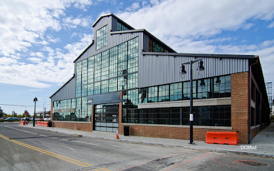
Roy: The building was this magnificent long solid brick structure with amazing 5- or 6-inch solid maple flooring. It was in bad condition; the roof was caving in. We fell in love with it when we saw it!
DCMud: How did it come to its new life?
Roy: It found itself in the middle of a development of new residential buildings, originally by K. Hovnanian Homes and slated for a condominium venture, and then sold to Home Properties as apartments. It was put in a drawer for a couple of years due to the economy but taken out again with all of its possibilities.
DCMud: Old structures often come with challenges and caveats. How did you decide what to keep and what to jettison?
Roy: We wanted to keep as much of the building's history as possible. We kept the solid brick walls and I fought to keep the flooring. You don’t see 5- or 6-inch solid maple anymore. Another battle was to save the ceiling as it was made of cedar and had no insulation. Because of its (historical fabric), we had the insulation and all the re-roofing done from the exterior to save the cedar. Usually these things are sandblasted, or high-power washed, or blasted with an equally abrasive material, but walnut shell is among the softest and used in restoration—it doesn’t attack the wood; just the coating. Once it was cleaned this way it was absolutely splendid.
DCMud: What was the thinking behind the redesign, which appears to be a real juxtaposition of history and today.
Roy: There was so much history in the building conserving the brick, the flooring, ceiling and trusses that we could go the other way and bring in modern techniques, materials, furniture and finishes to the design. The contrast between the historical building and new materials is an interesting, warm, comfortable treatment. I’m French and it’s something you see a lot in Paris, where you have all these old buildings and units with crowns and trims and pretty parquets. The best way to showcase an antique is to put something modern in it. It was the same thinking behind what we did at Foundry Lofts.
DCMud: How did you arrive at the color palette you chose, which in many ways emulates nature.
Roy: The building already had a lot of red because of the brick, so we didn’t want to do anything too urban so we went a little more traditional with warm greens, pale yellows and golds—as in the ceiling. Instead of red we did a deep purple. The colors were simple and ‘forest-y’ in keeping with the Fredericksburg environment. We had the thick maple flooring to warm it up.
DCMud: What about ambient and/or task lighting in such a vast space?
Roy: We used uplights on the 30-foot ceilings and on the trusses so you could see the height of the ceiling—the volume of the room and the beauty of the existing materials. We dropped some LED’s from the height of the trusses in the common areas. In the fitness center we dropped the lights. It was a matter of pinpoint lighting. There’s a fireplace. Even though the light is not awfully strong or bright in the club room, you really feel the space. Adding floor lamps and table lamps and partial LED’s here and there, you have enough lighting so you can see what you’re doing or where you’re walking but you are not aware of the light. It’s just a warm space.
DCMud: Speaking of warm spaces, if
you could choose one area of the District that felt like home to you, what
would it be?
Roy: I really
like Southeast Waterfront. The park they’ve built is wonderful, and it’s where
Foundry Lofts is located. But if I had to move (from Maryland), it would be to
the upper part of Georgetown. It’s the European in me: I like those little
houses and being able to walk to places. The old world in me is still alive.


