Sunday, August 14, 2011

Your Next Place

2 comments
By Franklin Schneider

Duplex condo! "The condo that feels like a house." Because let's be
honest, sometimes a regular apartment or condo can feel a bit too much like a little cement box surrounded by dozens of other little cement boxes. When my mom, who's lived in huge freestanding Midwestern
houses her whole life, visited me here and saw my apartment, she asked, “So when the person downstairs takes a number two, can you smell it in here?” “No, mother,” I said. She looked at me and then nodded slowly. Clearly, she didn't believe me.

But now this place – this place a mother could love. Two sleek levels in a beautiful building, a ton of natural light, gourmet kitchen with stainless steel appliances, granite countertops, and maple cabinets. A winding staircase takes you up to an airy loftlike space on the second floor, where the spacious family room flows into the generously-proportioned kitchen. Two bedrooms, two recently-renovated and very fine baths.


Washer/dryer on-site, so you can watch whatever you want while you do your laundry instead of being at the mercy of that remote-wielding attendant at the laundromat who wears an Andy Warhol-style toupee and has the most annoying habit of watching commercials and then flipping away when the actual program comes back. Why does he do that? I asked him once and he just said, “9/11.” True story!

Best of all, the place is in Logan Circle, so you're extremely close to whatever you might want to do (restaurants, nightlife) but far enough away that people won't be shrieking into their cellphones and vomiting Alabama Slammas under your window. Trust me, I lived right in the heart of Adams Morgan for a year and you have no idea how quickly the sound of laughter can become an object of pure hatred.

1437 Rhode Island Ave Nw #107
Washington, DC 20005
2 Bedrooms, 2 Baths
$524,900


Washington D.C. real estate news

Saturday, August 13, 2011

A Lobby for All Seasons

0 comments
Alexandria Virginia commercial real estate By Carlyle Towers Design, Camille Saum designer, Old Town AlexandriaBeth Herman

From 20 stories up at the top of the Carlyle Towers, 2151 Jamieson Avenue, the city of Alexandria spreads out in a mélange of shapes and colors. In autumn, the season’s golds, purples, reds and yellows are a palette of particular appeal. But not so for the same theme in the condominium’s current South Tower lobby.

For interior designer Camille Saum and associate designer Nicole Hansen, transforming what is essentially “a harlequin lobby” into an “elegant and durable space” brought the two on a trio of exploratory missions to the property, long before they were tapped for the job.Carlyle Towers Design, Camille Saum designer, Old Town Alexandria

“We wanted to have the answers,” said Hansen of the time they and nine other firms were first approached for ideas to renovate the south building. For them, the answers included using color continuity to turn a disjointed array of the building’s public spaces into true residential luxury, but with an eye to sustainability and cost-effective measures as well.

Built in phased construction in 1996, 1998 and 2000, the Carlyle’s three towers undergo a kind of roving renovation, according to Hansen, who explained work on the South Tower, built in ’98, is set to begin in the fall. On the redesign agenda are the approximately 1,500 s.f. lobby and mailroom, the Carlyle room which is used for special events that include parties, weekly yoga classes and bridge games, hallways for floors 13 through 20, a conference room and part of the facility’s kitchen.

“The colors that we found in the lobby are predominantly bright red, purple, and then rugs of a sort of rainbow hue in red, blue, yellow and purple,” Hansen said, adding the sofas are a kind of “retro purple mohair.” Two 2 ½-ft.-in-diameter two-story central columns that anchor the space are a red-and-purple harlequin pattern from floor to ceiling. There is no continuity of this particular color experience outside the lobby, so it does not agree with the rest of the property, Hansen explained.

In sharp contrast, the floors are a subdued cognac, bone and light brown marble –a dignified, neutral palette the designers are seeking to replicate in furniture, rug and fabric choices.

Look homewardCarlyle Towers Lobby Design, Camille Saum designer, Old Town Alexandria

According to Hansen, the lobby bifurcates into left and right living room-type spaces, which she and Saum call “the vignettes.” The area below the left and right space’s mirrored mullions is painted white and magenta, though will become a neutral tone with “punches of color.” Durable draperies will complement the two vignettes for a homey look, and Xorel fabric in a shiny beige-and-gold tone will be used on specific walls and columns as it is compatible with the marble flooring. Recycled porcelain flooring will also be added.

Opting for modern but transitional furniture in a warm space that honors the past though embraces the future, Karges and Caron sofas in soft hues are slated for the lobby, with Saum’s signature pop of color (Spring Dust by Benjamin Moore) on the tray ceiling.

In the Carlyle room, used for activities and adjacent to the pool area, neutral tones will be offset by chartreuse accents in 100 percent wool carpeting, for sustainability, and ceiling. “Right now it’s a kind of foil,” Hansen said of the ceiling, adding that a grid of 4-by-4-ft. beams traverses it. The foil is tarnished, so the ceiling will be painted a flat chartreuse color instead. The space’s soon-to-be custom carpeting in taupe and chartreuse will also be replicated in upstairs hallways. “We wanted it all to have a feeling of movement, but with a warm, residential feel as well,” Hansen said, because the building with its public spaces is very much people’s home as opposed to an office building.Carlyle Towers Design, Camille Saum designer, Old Town Alexandria commercial real estate

The Carlyle room’s expansive dance floor will be refinished in a taupe stain to blend with the carpeting. Prevailing sound issues during lively events will be mitigated by the use of Novawall, a sound absorption material that will be used on the ceiling and one wall, camouflaged by more Xorel fabric.

Where lighting is concerned, the designer said illuminating the lobby’s and hallways’ many dark spaces with an eye towards energy savings were paramount, as well as updating the current look. To that end, LED lights will be interspersed with sustainable recessed lighting, and for aesthetics four contemporary wood and iron chandeliers from Dominion Electric Supply will replace a group of nondescript chandeliers currently in use.

With the four-month project slated to begin in September, Hansen said they are looking forward to the challenge, their objective to make Carlyle Towers’ public spaces as warm, durable and welcoming as the residents’ own homes.

Alexandria Virginia commercial real estate design

Friday, August 12, 2011

Redevelopment of Former Italian Embassy Past the HPRB

4 comments
Potomac Construction is one step closer (but only one) to breaking ground on the redevelopment of the former Italian Embassy, due to project architect Trout Design Studio and Valor Development moving past the Historic Preservation Review Board for good.

At the end of July, the HPRB unanimously (5-0) approved the revised plans for the redevelopment. According to the Historic Preservation Office, "The Board found the design refinements and materials submitted to be consistent with the concept design and compatible with the character of the landmark."

Yet "the Board directed the applicants to restudy the entrances on Fuller Street and Mozart Place to see if changes to the design, size, and/or scale might improve their compatibility."

Next up is a visit to the Zoning Commission for consolidated PUD and map amendment approval, on September 8th.

Washington D.C. real estate development news

Thursday, August 11, 2011

Shaw Giant to Close September 8th to Make Way for CityMarket at O

20 comments
The Shaw Giant will close September 8th in order to make way for CityMarket at O, Roadside Development's $260 million dollar project that will rebuild 2 full blocks in Shaw with 87,000 square feet of retail (including the Giant), 629 residential units, and 500 parking spaces. The project had received demolition permits early this year and a HUD financing commitment in April, leaving just the final administrative hurdles to clear before beginning work on the long awaited project.

Under the terms of the agreement with Giant, Roadside Development was required to give Giant officials a 60-day notice to vacate, which it planned to do once the funding was secure and in place. While Roadside officials offered a "no comment" on the notice, Giant Store Manager Patrick Aryee tells DCMud that Giant corporate officials informed him yesterday that the store would close September 8th. Once Giant closes, Roadside has 2 years to complete the project to let Giant back in the space. Roadside Principal Armand Spikell told DCMud this spring that Roadside would likely issue the 60 day notice by July.

The closure is therefore sure to be followed quickly by frenetic construction and add vigor to revitalization in Shaw that has already gained steam with such projects as the Marriott Marquis, Progression Place, and a new pair of Marriotts. The new Giant Foods will be one of the larger nearby supermarkets at 55,000 s.f., with 13,000 s.f. underground, burying such items as the loading dock which now mars 9th street.


The buildings are being designed by Shalom Baranes Architects and built by Clark Construction.

Washington DC real estate development news

Heritage Foundation to Raze Church on Capitol Hill

5 comments

The Heritage Foundation has been given the green light to raze the former Unity Baptist Church at 426 3rd Street, NE near Union Station on Capitol Hill. The church, located directly behind The Heritage Foundation, was sold in 2004 for $1.3 million. According to a representative, The Foundation does intend to build on the site, however plans are nascent and not available for public disclosure at this time.

Though the church was constructed in 1919, additions were added in the 1960s and '70s which overtook the original façade; due to this, the Historic Preservation Review Board ruled unanimously to support the raze, as the building "no longer contributes to the Capitol Hill Historic District."

Washington D.C. real estate development news

Your Next Place

5 comments
By Franklin Schneider
Located in a fully-renovated Dupont mansion, this unit boasts fantastically eclectic spaces with elegant finishes. From the high ceilings and staggered planes of the spacious, bright living room (with white marble fireplace), to the hedged-in, vaguely Stonehenge-ish patio, this place had no end of little surprises. The master bedroom is truly palatial, with a luxurious master bath (loved the twin basins) and walk-in closets so big you could plausibly rent them out as separate apartments.

But if I had to pick a highlight, it would be the streamlined custom-designed gourmet kitchen, with Miele & Bosch appliances and teardrop-shaped light fixtures suspended over the largest island I've ever seen, a fifteen foot long slab of marble that makes most kitchen islands look like a postage stamp. Don't ever underestimate the importance of a kitchen; in most houses, it's where the real interaction occurs. You know what I mean; at parties, the living room is all small talk, but the real talk is in the kitchen. Maybe it's the proximity to food, it triggers some sort of visceral instinct. In my life, almost all the major “life-changing conversations” I've had have taken place in the kitchen, from the one that ended with my girlfriend at the time throwing a platter of steaming hot chinese food in my face, to the one that ended when yet another girlfriend kicked her wooden clog off her foot, across the room, and into my groin.


The entire unit is wired for sound, and there's an iPod dock so everyone else in the house can snicker and roll their eyes at your musical tastes. It's in Dupont, so you're close to and roughly equidistant from Logan, Adams Morgan, U Street, and anywhere else you might want to go. Plus, you get to park in a huge circular driveway out front, just like Tony Montana. And look how well things turned out for him!

1841 16th Street, NW #1
Washington D.C. 20009

3 Bedrooms, 2.5 Baths
$1,299,000


Washington, D.C. real estate news

Wednesday, August 10, 2011

Hilton Garden Inn Aiming for Next Summer at One Hotel Site

8 comments
The West End has been waiting on 1 Hotel for several years. In a way, the wait is over, according to Robert Cohen, President of Perseus Realty LLC, half of the site's development team along with the Starwood Group, who said, "There is no more 1 Hotel [for this site]." Instead, there will be a 238-room Hilton Garden Inn with a 5,000 s.f. restaurant, and construction is expected to begin in June of 2012.

New design, Hilton Garden Inn:
Previous design, 1 Hotel:
Perseus Realty is currently applying for an amended PUD with the Zoning Commission, using the above (first rendering) working design by local architecture firm Shalom Baranes. "It's a first class design," explained Cohen. "It'll be the nicest Hilton Garden Inn in the country." Shalom Baranes principal Patrick Burkhart is in charge of the new Hilton Garden design, the 1 Hotel design was done by Chad Oppenheim of Oppenheim.

"Due to the climate in the last two or three years, we felt that a Hilton Garden Inn is a better use for the site. Nothing more than that," said Neil Jacobs, president of SH Group, Starwood's luxury hotel brand management company, formed in 2009. "With a 1 Hotel we were limited in the number of rooms we could get onto the site. We didn't want to compromise the brand, and commercially [the Hilton] is a better choice."

The 1 Hotel brand is alive and well, confirms Jacobs, who notes the construction of a new 1 Hotel currently underway on 6th Avenue in New York.

The Starwood and Perseus investment at M and 22nd Streets, NW is the site of the former Nigerian Embassy and Asia Nora - both razed in 2008. A restaurateur, yet to be selected for the 5000 s.f. space, will be largely dependent on qualities that are interactive and community focused, according to Cohen.

8/11 addition: previous project and design commentary, Former Swanky 1Hotel...

Washington D.C. real estate development news

Take a Chance on Me: Skanska Mulls Speculative Offices for NoMa

4 comments
For a world of runaway debt, careening stock markets, sinking credit ratings and overall financial gloom, the Washington D.C. commercial real estate market is a surprisingly bullish place. One such believer is Skanska, fresh off success with a speculative office project in Penn Quarter, and mulling an encore for its NoMa project that it purchased last January.

With a potential for 680,000 s.f. of development, the site would be Skanska's largest DC area project to date, by far. But the developer is in a building mood, having now leased out 90% of its speculative downtown office project at 10th & G before the doors even open, and with "sincerely strong" interest in its Wilson Boulevard office project. With that tailwind, Skanska is putting the final touches on a design for a two-phase office project that could be moving dirt by next summer. With Davis Carter Scott at work designing 300,000 s.f. of office space for phase 1, the developer "is going full bore on all pre-development activity at this time," says Skanska Executive Vice President Rob Ward.

Not that Skanska would be the first polyanna to build without an anchor tenant already signed on, some of the largest office projects to date have kicked off without a financial savior, such as Monday Properties' 35 story office tower in Rosslyn and the CityCenter DC, both of which are well into construction without a single name to hang in the lobby.

And not that Skanska isn't working on a lead tenant; project supervisors have interviewed commercial brokers and expect to announce a leasing team next week. Still, Ward says the building is "100% funded" from internal capital, and the company can make the decision to build - or not - based on market conditions next spring when planning has run its course. "Its automatically a go if we get tenants, but we'll make that call by the middle of next year."

On the books so far is a large office project for phase 1, which Ward says will be a LEED Platinum design within the existing zoning envelope. Ward notes that while current zoning allows for 680,000 s.f. of development, "we'll be very careful how we build out to maximize light rather than the building footprint." While the retail component is not large - somewhere around 15,000 s.f. - Ward foresees a neighborhood enhancer rather than just a building-serving retail space; "a nice location for a good restaurant and bar."

Skanska's record bodes well for a spec project, and the NoMa numbers are still sound, with the vacancy rate just 9% within the NoMa BID according to Delta Associates.

At 10th & G Streets, Skanska is celebrating a 90% lease up of the office building - its first in the United States - that will complete next month after starting off sans tenant. Only about 16,000 of the 165,000 s.f. office building remain unclaimed, and the 4,000 s.f. ground floor retail space has been leased to Comma, which will serve 3 squares a day. 3 major tenants account for most of the leasing activity that is expected to earn LEED Gold certification.

Skanska bought the NoMa property at First and M Streets, NE, last January for $41 million from an affiliate of the Polinger Company. The site was designated as phases II and III of Capital Plaza, though Skanska will rename the project. Skanska is a Swedish-born company with offices in the United States, including Washington D.C.

Washington D.C. real estate development news

Tuesday, August 09, 2011

The Foundry Lofts at the Yards, Opening Soon

10 comments
The Foundry Lofts, one residential component of The Yards development by Forest City in Southeast, began pre-leasing on August 1st the 170 apartment units that comprise the redeveloped Foundry building, with 10,000 s.f. of ground floor retail. There are three floors of one- and two-bedroom apartments, and 33 two-level penthouses. One-bedroom units will be in the lower $2000/month range, two-bedrooms "from $2,700" and penthouses "from $3,400," with unobstructed views of the Anacostia and beyond. The first apartments will deliver in mid October and the penthouses two months later. The residences will comprise just a few of the 2800 units completed to date in the Capitol Riverfront Business Improvement District, but will be conspicuous as the nucleus of the retail pavilion, overlooking the parks and surrounded by the new retail center. Retailers already leased at The Lofts include Potbelly's and Kruba Thai and Sushi. 

Washington D.C. real estate development news

Monday, August 08, 2011

Colbert Redesigns for Wallach Place and 14th Street

19 comments
One month ago, Eric Colbert's design for a residential building at 1905-1917 14th Street NW was soundly rejected by the HPRB. Since then, Colbert seems to have taken comments from the Board, such as "it's more appropriate to K Street" and "looks too commercial," to heart. Colbert has reworked the building's design - for client Level 2 Development - and, as reported by U Street Dirt, presented a vastly different rendering to Wallach Place residents (compare below). 

The new design is still 7 stories tall, however the massing has been shifted to the southern end, where the entrance was repositioned, and the overall density has been decreased, allowing for a more significant stepdown at the back of the building (to an adjacent commercial rowhouse and Wallach Place residents across an alley). Level 2's plan for 154 units has been shaved down to 144, with a loss of approximately 4,000 s.f. overall - a net loss of ten, cozy 400-s.f. studio units - the same floor plan that makes up the majority (approximately 85-percent) of the building. A decorative cornice has been added around the 4-story (northern) section of the building and the two 4-story projecting bays on 14th Street. The new design has an exterior that is less glassy (i.e. windows have been broken down into smaller sizes), possibly in an attempt to make the building look "less commercial." The building's footprint remains unchanged, at nearly 16,000 s.f., and includes ground floor retail. Colbert and Level 2 principals David Franco and John Kardon met with Wallach Place residents last week in advance of meeting with the U Street Neighborhood Association (Aug. 11th), and ANC1B Design Review Committee (Aug. 15th). The development team will seek full approval with ANC1B on Sept. 1st and then revisit the HPRB, ideally, later that month. 

 Washington D.C. real estate development news

Fanfare for the Uncommon Man

5 comments
By Washington DC Architecture and design - 2125 14th Street, NW, Washington DCBeth Herman Washington DC architecture and design
One doesn’t have to love composer Aaron Copland (as I do) to appreciate award-winning interior designer Nestor Santa-Cruz’s equally exalted riffs in his bachelor client’s singular living space.
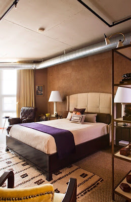
Designing what he calls a Washington loft (fundamentally open, though a little more divided than a NY loft) for an urbane returning ex-pat, in true loft fashion Santa-Cruz defined the space by continuity of a black, brown and neutral-toned palette (the riff!) throughout its 2,300 s.f., which included a rare 900 s.f. terrace. "Not a lot of people had looked at the unit because they thought maintaining a terrace of that size would be a big deal," Santa-Cruz said of the relatively new Union Row condominium at 2125 14th St. NW. "But for many reasons it was actually the loft’s biggest asset."

Charged with reimagining a conventional, mid-level package which included standard cherry flooring that permeated the entire loft, in addition to oddly-hued brown/black/green marble countertops and plain maple cabinetry, the designer also needed to integrate exposed aluminum Washington DC architecture and design - 14th Streetductwork and sprinkler pipes in the Washington DC architecture and design - interior renovations11-foot ceilings without evoking a cold, factory-look.
“The combination was not very attractive—or sophisticated,” Santa-Cruz said of the materials and finishes in general. “It had no character.” What’s more, though the space was contemporary in flavor, the homeowner, a real estate developer with 14 years abroad, had culled some personal, very traditional pieces from his London flat and had his own ideas about color, opting at first for neutrals.

In the bedroom
To that end, and to accommodate the homeowner but up the ante, Santa-Cruz elected to use a neutral tone on at least one wall in the more public spaces, and to continue this as the wall flowed into the master bedroom. In a NY loft, he explained, this kind of accent might be reflected in an exposed brick wall, but absent that element, continuity was established with color. Two other bedroom walls were painted a Benjamin Moore dark brown (“I call it Godiva chocolate,” the designer said). Washington DC architecture and design - Nestor Santa Cruz Strategic use of vinyl wallpaper resembling brown pony skin squares, from French company Elitis, provided a rich architectural accent on the remaining wall behind the bed. “He was a little hesitant about the brown color in the bedroom,” Santa-Cruz said of his client. “He did want a masculine apartment, but in the neutrals. I told him, ‘You know, it’s paint. Let’s test it and we’ll go from there.’” With a headboard in neutral flax linen from home décor mecca And Beige, color was again provided with the integration of a black faux-alligator dresser from the client’s London residence, and the addition of a rich grape Loro Piana cashmere throw that also belonged to the client.

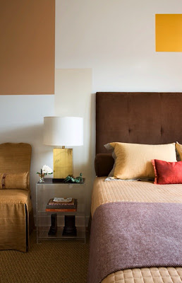
In the guest bedroom, the designer retained the homeowner’s former bed adding a chocolate headboard that complemented strategic Mondrian-like paint squares on the wall. Washington DC architecture and design - Nestor Santa CruzWith a precise charge to the painter, Santa-Cruz said he drew every elevation and created the composition, selecting and manipulating colors that included gold leaf, brown, beige and ivory. “I essentially created my own wallpaper –my own mural,” he said of the custom design (ad)venture, having eschewed the idea of wallpapering the entire room in favor of the more creative painting process. Influenced by iconic 20th Century French minimalist Washington DC commercial real estate and design - Nestor Santa Cruzinterior designer Jean-Michel Frank, who worked with artists using screens and fabric as their canvas, Santa-Cruz revealed his goal was to create a “…cocoon that would make the guest feel important and special in a very personal way.” It is a one-of-a-kind design.

The art deco diet
In the loft’s living room area, the homeowner had imported a sofa from his London residence that was reupholstered for a more cosmopolitan look, and sited to take in the extensive view out through the terrace. An antique Chinese black lacquer armoire from London conceals the TV. To feed his client’s voracious appetite for all things art deco, Santa-Cruz distinguished between what he called “Miami art deco” and a more elegant French art deco with softer materials and forms. Accordingly, reproduction French 1930s art deco pieces helped punctuate the loft (Santa-Cruz has many period sources in Argentina that were utilized), including a reupholstered chartreuse chair at a small bedroom desk that reflects the color of the draperies.
Acknowledging that often floor plans in Washington force a dining room and living room, even though the space is just square, Santa-Cruz said he decided a formal dining area was not required. To that end, a robust 19th Century French steel table from Georgetown’s Marston Luce Antiques, of printing establishment provenance, Beautiful design, Washington DCwas employed in the loft both as dining table and desk. “We made it sort of an English library feel,” the designer said, with the addition of a hardy leather chair.

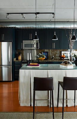
In the kitchen, possibly the project’s biggest design challenge, Santa-Cruz said the nondescript maple cabinetry was spray painted a matte black, reminiscent of English pubs and club bars which are traditionally mahogany. City Real Estate - Washington DCAn island – part of the loft’s original package—had been exposed underneath with four legs and a shelf. Electing to skirt it in the British style, the designer used outdoor “umbrella fabric” to resist incursions from daily use. A glass top was added, and a bit of Hemingway-esque drama created by the addition of a 3-by-4-foot black-and-white portrait of a Cuban campesino by his 1950s automobile, estimated to have been taken in the last decade. Photographed by British photographer Chris Simpson, the client had seen it in the home of a London friend and commissioned a print for himself. The print was subsequently flown to the U.S. via private jet to avoid any freight fatalities. “It was one of the last things we did and is like having an extra window,” Santa-Cruz said of the expansive portrait. “It makes that kitchen and gives it an edge.”

Fluent in duct
Also regarded among the loft’s edgier aspects, exposed aluminum ductwork and black sprinkler pipes meander through the space. A debate about enclosing what some may consider rogue components in drywall and creating soffits was ultimately settled by determining that to do so would make the apartment look smaller. With much of its character predicated on these anomalous elements, the pipes and ductwork crown the space much like a residential tiara and in fact become an integral part of the décor’s dialogue.
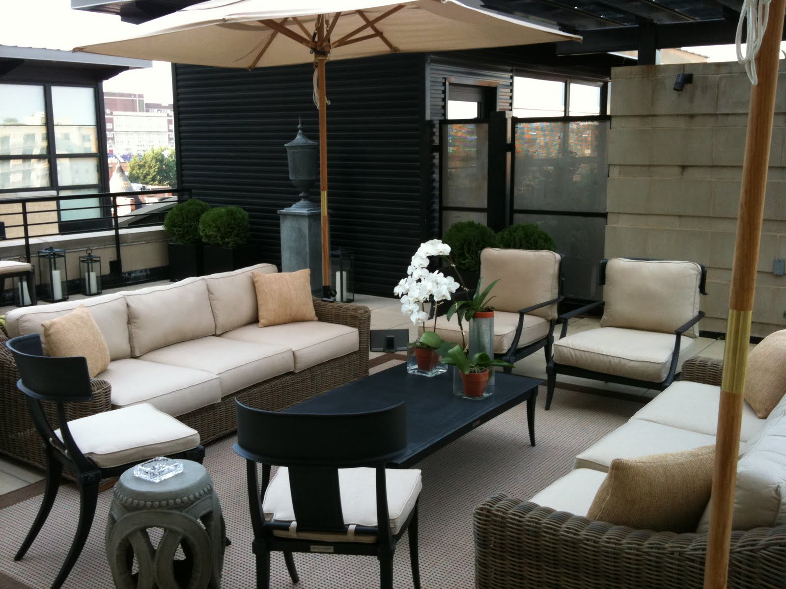
Washington DC retail for leaseFor the designer, addressing a 900 s.f. terrace was unprecedented though not as daunting as some might think. Extending the loft’s living room and essentially creating a continuous indoor/outdoor living space, Santa-Cruz pulled from a variety of Restoration Hardware collections to create an eclectic, comfortable and durable domain. These included an outdoor sisal rug, wicker furniture and metal chairs.
“The whole idea was to flow the design in/out,” Santa-Cruz said. “When you’re outside and look back into the apartment, it’s a great experience, especially at night, because you think you’re in one room.”
Noting that his work on the Union Row loft is about “proportion, texture and color as an accent,” Santa-Cruz maintained the space flows as though the homeowner, who incorporated his own cherished pieces, had put things together himself. “He’s well-traveled, very well-connected and has been in some beautiful homes,” the designer said of his client, the loft redolent of an uncommon life.

Sunday, August 07, 2011

Your Next Place

0 comments
By Franklin Schneider

While millions of Americans were off in the Civil War, shooting muskets at each other across muddy pastures and having unanaesthetized limb amputations, others were building this house. Now you can own this monument to their unpatriotic levelheadedness for just over a million dollars. (Contrast this with the product of my father's draft-dodging – a totaled motorcycle, several “bad trips” and … me. Pathetic.)

Located in historic Naylor Court, just a stone's throw from downtown, this restored antique rowhouse exudes more class than a sackful of duchesses. Heart pine floors, an amphitheater-like living room, an elegant family room with french doors opening onto the backyard, one of the largest kitchens I've seen in a while, with a granite-topped island that seats four. A sinuous staircase leads upstairs, to four spacious bedrooms and four baths.


The impeccable master bath could probably hold thirty people (just stating a fact, not making a suggestion). The two-car garage in back has custom mahogany doors that are probably worth more than my last two cars. There's a beautiful deck overlooking the backyard, and a huge magnolia tree in the front yard. If the magnolia market takes off, you could be sitting on a veritable gold mine.

937 N St. NW
Washington DC 20001
4 Bedrooms, 4 Baths
$1,124,999


Washington D.C. real estate news

Friday, August 05, 2011

Part of Kelsey Gardens Redevelopment Moves Forward

5 comments
Commercial real estate news - Addison Square in Shaw by Metropolitan Development
A couple of highly anticipated commercial developments in Shaw - CityMarket at O, Addison Square (Kelsey Gardens redevelopment) - have been stalled due to a lack of financing, caused by a delay in receiving loans from the swamped U.S. Dept. of Housing and Urban Development (HUD).  But a break-off-piece of Addison Square will now go forward, with the land in control of a new owner/developer. 

Twelve townhouses, formerly a part of Addison Square, will be built at 8th and P St, NW (751 P Street) by Capital City Real Estate (CCRE), which bought this part of the PUD from Metropolitan Development in March. The project consists of six 2-unit townhouses, for a total of 12- 2bed/2bath units, each around 1100 square feet. Anthony Bozzi, of CCRE's brokerage company Stages Premier Realtors, confirmed that construction will be underway soon, and sales will begin next spring, with a price point aiming for $500,000 per unit. Bozzi added that the project will come across visually like a string of rowhouses, retained from the original Lessard Group design. Though there is no parking designated at each unit, townhouse owners will have the option to buy a spot in a garage that will be built whenever the rest of the Kelsey Gardens redevelopment moves forward, but exactly when that will be is unknown. Metropolitan had hoped to sell the entire PUD back in March of 2010, however developers can now pick it up piecemeal, or investors can align with Metropolitan Development, who has the property listed for sale.

Washington D.C. real estate development news

New Details for U Street Condo Project

7 comments
Construction of the residential building planned for 11th and V Streets, NW, which DCMud reported last February, has added a few details to their plans. In April, Loford LLC selected Ellisdale Construction & Development as general contractor for the project, who is currently bidding subcontractors for the project (with the deadline one week from today). Now, Ellisdale has posted an image of what the 33-unit building may look like (very conceptual), and the owner has indicated that the project will be condominiums. The $4.5 million project will consist entirely of new construction. A two-story building on site will be razed - although the permit has not been approved - to make way for a 6-story (plus underground garage), 38,160 s.f. building. The garage and first floor will be constructed using concrete and metal framing, above which there will be five floors of wood framing. The 33 units vary from 615 to 750 s.f. No architect has been selected for the project yet. 

 Developer Habte Sequar purchased the land in August of 2010 for $2.7 million. Sequar is in the midst of developing another condominium at 14th and R Streets, which began construction last month, as well as the Renaissance at Logan and the Josephine Condos at 440 Rhode Island Ave., NW. 

Washington D.C. real estate development news
 

DCmud - The Urban Real Estate Digest of Washington DC Copyright © 2008 Black Brown Pop Template by Ipiet's Blogger Template