By  Beth Herman
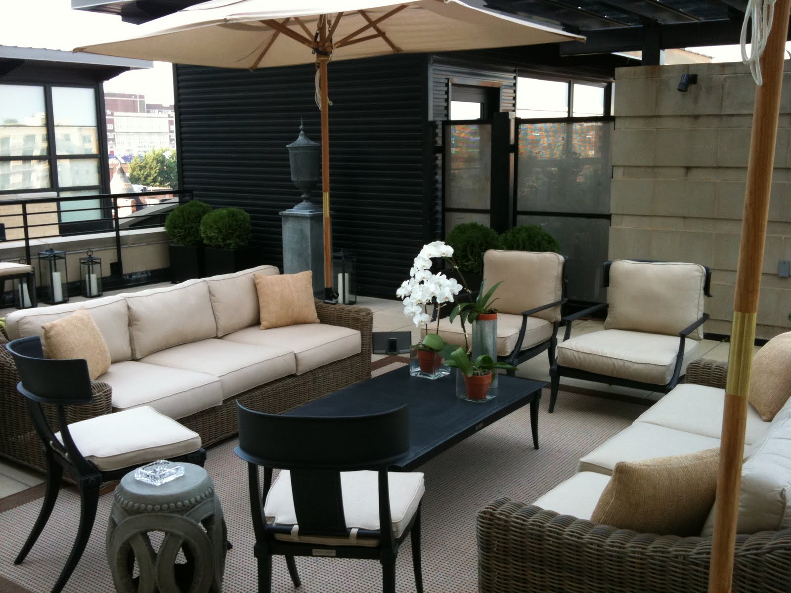 For the designer, addressing a 900 s.f. terrace was unprecedented though not as daunting as some might think. Extending the loft’s living room and essentially creating a continuous indoor/outdoor living space, Santa-Cruz pulled from a variety of Restoration Hardware collections to create an eclectic, comfortable and durable domain. These included an outdoor sisal rug, wicker furniture and metal chairs.
 Beth Herman
One doesn’t have to love composer Aaron Copland (as I do) to appreciate award-winning interior designer Nestor Santa-Cruz’s equally exalted riffs in his bachelor client’s singular living space.
Designing what he calls a Washington loft (fundamentally open, though a little more divided than a NY loft) for an urbane returning ex-pat, in true loft fashion Santa-Cruz defined the space by continuity of a black, brown and neutral-toned palette (the riff!) throughout its 2,300 s.f., which included a rare 900 s.f. terrace. "Not a lot of people had looked at the unit because they thought maintaining a terrace of that size would be a big deal," Santa-Cruz said of the relatively new Union Row condominium at 2125 14th St. NW. "But for many reasons it was actually the loft’s biggest asset."
Charged with reimagining a conventional, mid-level package which included standard cherry flooring that permeated the entire loft, in addition to oddly-hued brown/black/green marble countertops and plain maple cabinetry, the designer also needed to integrate exposed aluminum  ductwork and sprinkler pipes in the
  11-foot ceilings without evoking a cold, factory-look.
 ductwork and sprinkler pipes in the
  11-foot ceilings without evoking a cold, factory-look.
“The combination was not very attractive—or sophisticated,” Santa-Cruz said of the materials and finishes in general. “It had no character.” What’s more, though the space was contemporary in flavor, the homeowner, a real estate developer with 14 years abroad, had culled some personal, very traditional pieces from his London flat and had his own ideas about color, opting at first for neutrals.
In the bedroom
To that end, and to accommodate the homeowner but up the ante, Santa-Cruz elected to use a neutral tone on at least one wall in the more public spaces, and to continue this as the wall flowed into the master bedroom. In a NY loft, he explained, this kind of accent might be reflected in an exposed brick wall, but absent that element, continuity was established with color. Two other bedroom walls were painted a Benjamin Moore dark brown (“I call it Godiva chocolate,” the designer said). 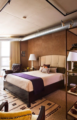 Strategic use of vinyl wallpaper resembling brown pony skin squares, from French company Elitis, provided a rich architectural accent on the remaining wall behind the bed. “He was a little hesitant about the brown color in the bedroom,” Santa-Cruz said of his client. “He did want a masculine apartment, but in the neutrals. I told him, ‘You know, it’s paint. Let’s test it and we’ll go from there.’” With a headboard in neutral flax linen from home décor mecca And Beige, color was again provided with the integration of a black faux-alligator dresser from the client’s London residence, and the addition of a rich grape Loro Piana cashmere throw that also belonged to the client.
 Strategic use of vinyl wallpaper resembling brown pony skin squares, from French company Elitis, provided a rich architectural accent on the remaining wall behind the bed. “He was a little hesitant about the brown color in the bedroom,” Santa-Cruz said of his client. “He did want a masculine apartment, but in the neutrals. I told him, ‘You know, it’s paint. Let’s test it and we’ll go from there.’” With a headboard in neutral flax linen from home décor mecca And Beige, color was again provided with the integration of a black faux-alligator dresser from the client’s London residence, and the addition of a rich grape Loro Piana cashmere throw that also belonged to the client.
In the guest bedroom, the designer retained the homeowner’s former bed adding a chocolate headboard that complemented strategic Mondrian-like paint squares on the wall.  With a precise charge to the painter, Santa-Cruz said he drew every elevation and created the composition, selecting and manipulating colors that included gold leaf, brown, beige and ivory. “I essentially created my own wallpaper –my own mural,” he said of the custom design (ad)venture, having eschewed the idea of wallpapering the entire room in favor of the more creative painting process. Influenced by iconic 20th Century French minimalist
 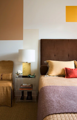 interior designer Jean-Michel Frank, who worked with artists using screens and fabric as their canvas, Santa-Cruz revealed his goal was to create a “…cocoon that would make the guest feel important and special in a very personal way.” It is a one-of-a-kind design.
 With a precise charge to the painter, Santa-Cruz said he drew every elevation and created the composition, selecting and manipulating colors that included gold leaf, brown, beige and ivory. “I essentially created my own wallpaper –my own mural,” he said of the custom design (ad)venture, having eschewed the idea of wallpapering the entire room in favor of the more creative painting process. Influenced by iconic 20th Century French minimalist
  interior designer Jean-Michel Frank, who worked with artists using screens and fabric as their canvas, Santa-Cruz revealed his goal was to create a “…cocoon that would make the guest feel important and special in a very personal way.” It is a one-of-a-kind design.
The art deco diet
In the loft’s living room area, the homeowner had imported a sofa from his London residence that was reupholstered for a more cosmopolitan look, and sited to take in the extensive view out through the terrace. An antique Chinese black lacquer armoire from London conceals the TV. To feed his client’s voracious appetite for all things art deco, Santa-Cruz distinguished between what he called “Miami art deco” and a more elegant French art deco with softer materials and forms. Accordingly, reproduction French 1930s art deco pieces helped punctuate the loft (Santa-Cruz has many period sources in Argentina that were utilized), including a reupholstered chartreuse chair at a small bedroom desk that reflects the color of the draperies.
Acknowledging that often floor plans in Washington force a dining room and living room, even though the space is just square, Santa-Cruz said he decided a formal dining area was not required. To that end, a robust 19th Century French steel table from Georgetown’s Marston Luce Antiques, of printing establishment provenance,  was employed in the loft both as dining table and desk. “We made it sort of an English library feel,” the designer said, with the addition of a hardy leather chair.
 was employed in the loft both as dining table and desk. “We made it sort of an English library feel,” the designer said, with the addition of a hardy leather chair.
In the kitchen, possibly the project’s biggest design challenge, Santa-Cruz said the nondescript maple cabinetry was spray painted a matte black, reminiscent of English pubs and club bars which are traditionally mahogany. 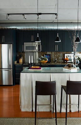 An island – part of the loft’s original package—had been exposed underneath with four legs and a shelf. Electing to skirt it in the British style, the designer used outdoor “umbrella fabric” to resist incursions from daily use. A glass top was added, and a bit of Hemingway-esque drama created by the addition of a 3-by-4-foot black-and-white portrait of a Cuban campesino by his 1950s automobile, estimated to have been taken in the last decade. Photographed by British photographer Chris Simpson, the client had seen it in the home of a London friend and commissioned a print for himself. The print was subsequently flown to the U.S. via private jet to avoid any freight fatalities. “It was one of the last things we did and is like having an extra window,” Santa-Cruz said of the expansive portrait. “It makes that kitchen and gives it an edge.”
 An island – part of the loft’s original package—had been exposed underneath with four legs and a shelf. Electing to skirt it in the British style, the designer used outdoor “umbrella fabric” to resist incursions from daily use. A glass top was added, and a bit of Hemingway-esque drama created by the addition of a 3-by-4-foot black-and-white portrait of a Cuban campesino by his 1950s automobile, estimated to have been taken in the last decade. Photographed by British photographer Chris Simpson, the client had seen it in the home of a London friend and commissioned a print for himself. The print was subsequently flown to the U.S. via private jet to avoid any freight fatalities. “It was one of the last things we did and is like having an extra window,” Santa-Cruz said of the expansive portrait. “It makes that kitchen and gives it an edge.”
Fluent in duct
Also regarded among the loft’s edgier aspects, exposed aluminum ductwork and black sprinkler pipes meander through the space. A debate about enclosing what some may consider rogue components in drywall and creating soffits was ultimately settled by determining that to do so would make the apartment look smaller. With much of its character predicated on these anomalous elements, the pipes and ductwork crown the space much like a residential tiara and in fact become an integral part of the décor’s dialogue.
 For the designer, addressing a 900 s.f. terrace was unprecedented though not as daunting as some might think. Extending the loft’s living room and essentially creating a continuous indoor/outdoor living space, Santa-Cruz pulled from a variety of Restoration Hardware collections to create an eclectic, comfortable and durable domain. These included an outdoor sisal rug, wicker furniture and metal chairs.
“The whole idea was to flow the design in/out,” Santa-Cruz said. “When you’re outside and look back into the apartment, it’s a great experience, especially at night, because you think you’re in one room.”
Noting that his work on the Union Row loft is about “proportion, texture and color as an accent,” Santa-Cruz maintained the space flows as though the homeowner, who incorporated his own cherished pieces, had put things together himself. “He’s well-traveled, very well-connected and has been in some beautiful homes,” the designer said of his client, the loft redolent of an uncommon life.


5 comments:
Looks like a big improvement to the spartan digs at Union Row, but the island skirt with glass top looks pretty foolish.
Great space! Can't believe it's the same buidling I was interested in, I almost bought one unit. Yes the kitchen looks very smart now, and hides all storage. I want to move in now.
What wonderful space! The gentleman who lives there must be the perfect man, refined, sophisticated, classic, indeed uncommon.
How did you find this space? This is a good story, as it shows the client and his designer truly connected.
I have been in this building and have seen several units, and I doubt there any other as nice as this one.
A job well done for sure
Not everyone can afford and interior designer but from what I've seen of these condos, people don't know what the hell they are doing design-wise. I know it is all subjective but just because there are exposed ducts doesn't mean you have to stay spartan. Nice work!
Post a Comment
Commercial ads will be deleted, so don't even think about it.