
Q&A with Bob Wilkoff of Archaeon, Inc. Architects
By Beth Herman

Because of a contemporary mom’s burgeoning interest in professional hockey, predicated on a Washington Capitals' championship season, the cramped first floor of a late 1970s 2,800 s.f. residence in Potomac, Maryland, underwent a significant reorganization. The goal was for client advantage in viewing much-anticipated games on the family’s flat screen TV from the kitchen and other points. With a few strategic slap shots, Bob Wilkoff of Archaeon, Inc. Architects brought her game plan home.
DCMud: Describe the home’s interior and some of the challenges for you in opening it up to the space that featured the TV.
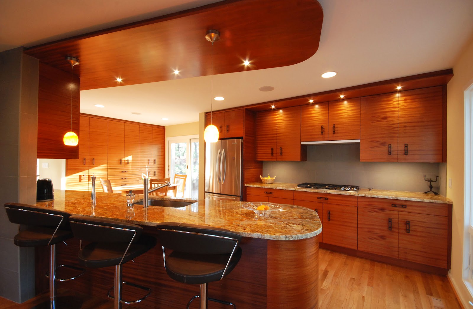
Wilkoff: The
house was dated and compartmentalized—no open flow from space to space. There
was a convoluted access to get from the garage and entrance foyer into the
kitchen through a series of corridors, and a tight breakfast room. The kitchen
was landlocked in the back corner of the house. There was also a very small
family room that was adjacent to the kitchen but not contiguous to it in any
way: You still had to go through the breakfast room, through a corridor, back
into the hall, past the laundry room to get to the family room.

DCMud: Were there any prior renovations at all?
Wilkoff: The
kitchen had been redone about 15 or 18 years ago and had held up well, but it
was claustrophobic. A built-in computer desk in the corridor between the
breakfast room and main entrance hall wasn’t used, becoming just a catch-all
for things. It wasted a lot of square footage.
 DCMud: So how
did you begin to use the superfluous square footage?
DCMud: So how
did you begin to use the superfluous square footage?
DCMud:
What was the process?

 Wilkoff: We opened up as much of those areas as we could. We took out the knee wall handrails in the entrance foyer stairwell -- a
typical ‘70s detail where you have a half-height drywall partition up to a wood
cap handrail. It had some bold forms but also closed everything in. There was
no sense of a vision beyond the space of those walls. A balcony over the foyer
that overlooked the dining room had that same detail, so we cut out all of
those drywall handrail walls down to the stringers of the stairs and landings,
and put in a stainless steel cable rail design which opened everything up
dramatically without changing the space of the stair structures at all.
Wilkoff: We opened up as much of those areas as we could. We took out the knee wall handrails in the entrance foyer stairwell -- a
typical ‘70s detail where you have a half-height drywall partition up to a wood
cap handrail. It had some bold forms but also closed everything in. There was
no sense of a vision beyond the space of those walls. A balcony over the foyer
that overlooked the dining room had that same detail, so we cut out all of
those drywall handrail walls down to the stringers of the stairs and landings,
and put in a stainless steel cable rail design which opened everything up
dramatically without changing the space of the stair structures at all.
DCMud: And the rest of the square footage?
DCMud:
So really without picking up any square footage, you incorporated a great deal
of wasted space into the two new living spaces—and the hockey mom client
achieved her vantage point(s) in grand style.

DCMud: A real game changer. And speaking of focus, what D.C. building would you say has inspired you the most as an
architect?
Washington D.C. design news


2 comments:
Would have been cheaper and easier to purchase a kitchen t.v.!
Absolutely beautiful!
Post a Comment
Commercial ads will be deleted, so don't even think about it.